My Perfect Ice Cream made from '' Tron '' for the Crypto Art and Design Challenge (Round 12: Tron)
My conceptualization of the Crypto Tron...
For those who do not know Tron is a Chinese currency created in 2017 and as soon as it came out on the market it attracted the attention of the entire public, the idea of this Crypto is the commercialization of properties and services paid to all the programmers and operators that integrate this network, according to the founders, this network improves the connection between the person-to-person interaction, obtaining as a result, more speed and transparency in the transactions of the Crypto and the products that can be bought in it. Reading out there that can compete against the Apple Store and the Google Store, to be honest I am very impressed with this little Crypto.
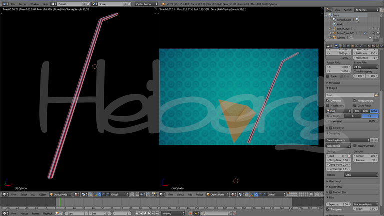
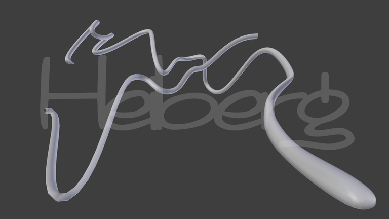
Now I will show you the basic scheme of this Crypto currency
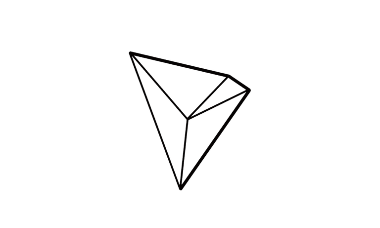
As you can see, the way I found more fun and different dynamic than doing it was to imagine it as a hollow inverted pyramid, and the best way to take advantage of this form was to turn it into a pyramid cone of ice cream, at the beginning I wanted to work with cubism, but I ended up doing an analogy of colors and shapes that would have made the 3D modeler Zigor Samaniego, although I consider that the final design met my expectations, the level in the designs of Zigor are of another world, I didn't have as much time as I wanted to model I fully appreciate the trend of this 3D modeler, but I think the results were quite good, if you are reading this Zigor, I hope with time to make a design that reaches the level you do!
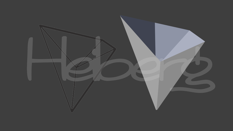
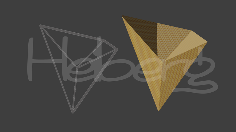
Returning to the subject, the first form and texture of the Crypto currency was as follows:
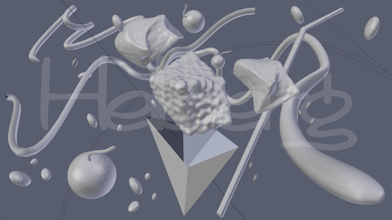
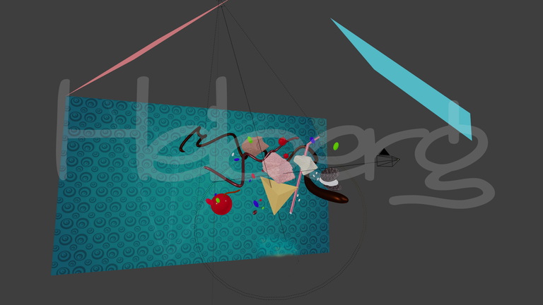
The Scene...
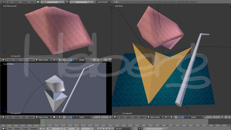
Once I had the main idea of the Crypto currency, the rest was to follow my idea of ice cream, would I complete it together with the ice cream on it? No, that would cover all the Crypto currency and it would not be understood. In the end what I did was an exploded scene, elements in the air floating in space, and I started with the first thing that came to my mind, a cigarette or straw, or whatever they call it in your country, I just added it next to the ice cream basket, and that's where my design began. I also added a background with pretty striking colors, as Zigor would.
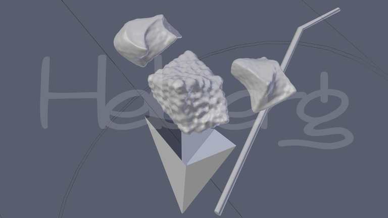
Then I was modeling from a cube the ice cream that was on top of the basket, then I was deforming it little by little until at least the main base of the ice cream cone, and with some modifiers I was giving it the necessary relief to make it look like an ice cream for real. It should also be noted that it is the first project where I am working with textures along with 3D modeling. But I told them that I was very short of time and needed to be ready as quickly as possible, due to the time of the contest. The result was as follows:
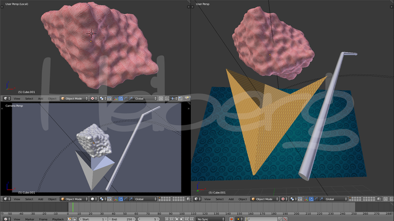
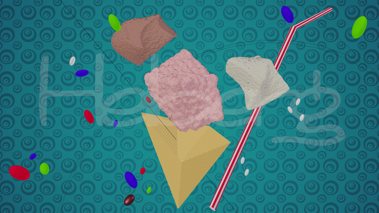
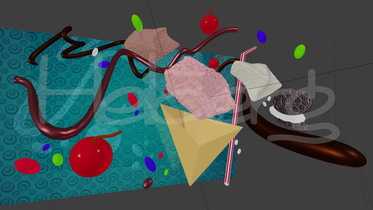
After seeing the scene one is noticing what is missing and what is needed to generate more dynamism in the project, in my opinion, formally lacked other elements around the project that would improve and focus the view towards the central element, the cone and ice cream, and in matters of reality and design, a single flavor of ice cream is not the most appetizing, so I modeled two more flavors around the main scene, a flavored ice cream, and a chocolate-flavored ice cream. The process was like this:

The Complements
1.- To give more life to the project
2.- To give more dynamism to the scene
3.- To make the scene look more charged and cover the empty spaces
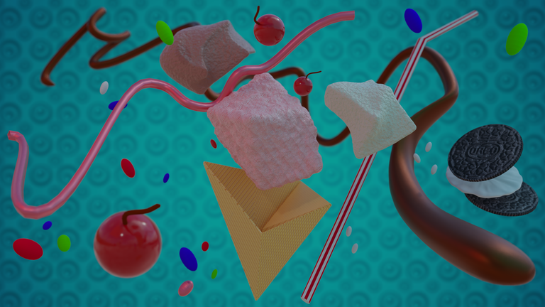
The truth that these specific elements helped me to cover more the scene and to give me an idea of the points of the image that I had to improve, I will show you next an image with the scene before, and the new scene with the candies and their respective textures:
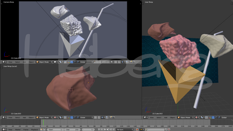
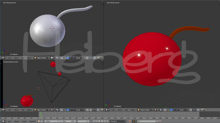
I continued adding punctual elements, this time in the form of cherries, from a cylinder I was molding the desired shape, the cherry really does not have much problem to model because it is made from primitive objects of the program, but the texture is the one that gives the touch and realism to those forms, here I show you how it was:
The Syrup can never miss in an ice cream ...
As I put it in the title, that jet of syrup never fails when it comes to an ice cream, and I could use that resource as an organic element that would give much more life to my project, in addition to the organic elements are predominant in the designs Zigor, I think I could get much out of this culinary tool. So from a 3D line I was creating two patterns of '' syrup '' that would intersect visually and create a better formal liking for the scene. As you will see, not only is designing the main element, but it is necessary to give life to the project, if you want to win.
##The Final Touch For the Perfect Ice Cream ....
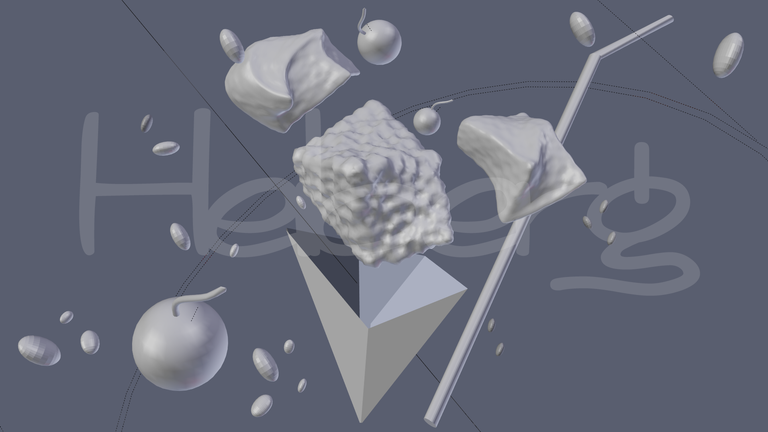
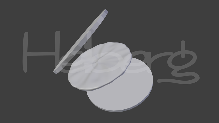
I loved how my project was left and I was about to leave it, however I saw a very important empty space in my project, that space that tied the syrup on the right side of the scene (you can see it in the previous image) but I hardly saw the space I knew I had to place, and I had been missing to fill the space as well as my perfect ice cream, from 3 circles I was creating 3 cylinders flattened one on top of another and moving them little by little to be able to create the perfect shape, Although I do not understand much at the beginning, I just added the texture, it was completely understood, I do not have to say it for you to understand, it is enough to just observe what I modeled:
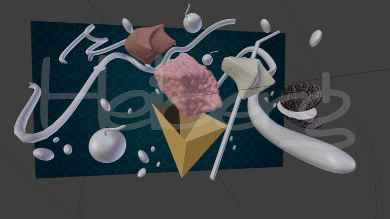
Already the scene was ready, you just had to add the best possible lighting to complete the project, and voila, it was just to render, here I show you some images of how the final scene was and how I used two red and blue rectangles with texture light for the lighting of the scene (a trick that many modelers and 3D animators use):
The Final Render: an Ice cream made by Tron
Well friends, until here came the post of this day, I hope you liked the process, the truth takes about 3 days in this, maybe if I had started before I could have improved maybe not the quality because I liked it very much as it was, but if the focus more towards the style of Zigor as I had thought at the beginning, I hope that if you see it I will be happy with my design, and I hope you like it too! this post is for you community, and if you liked it, if you have any quotation, if you want me to do some design for you, whatever you want can write me in the comments, and do not forget to Reesteem, and upvote to support me and follow posting this type of content. With nothing more to say, I say goodbye to you and see you next time!
¡Thank you for all!

Dear friend, you do not appear to be following @artzone. Follow @artzone and get added to our voting list for valuable up-votes!
I can swear I was following you guys, I did already!, thank you for your comment!.. :D
Congratulations! This post has been upvoted from the communal account, @minnowsupport, by Ceheiberg from the Minnow Support Project. It's a witness project run by aggroed, ausbitbank, teamsteem, theprophet0, someguy123, neoxian, followbtcnews, and netuoso. The goal is to help Steemit grow by supporting Minnows. Please find us at the Peace, Abundance, and Liberty Network (PALnet) Discord Channel. It's a completely public and open space to all members of the Steemit community who voluntarily choose to be there.
If you would like to delegate to the Minnow Support Project you can do so by clicking on the following links: 50SP, 100SP, 250SP, 500SP, 1000SP, 5000SP.
Be sure to leave at least 50SP undelegated on your account.