Hello guys, this is a post about comic character designing. Comic character designing is kind of trickier than making characters in novels which only goes by words. You see, to be able to make a character effective in comics, it should be appealing, unique and striking. Somewhat, a good character can be described by a single word. A good example here is Monkey D. Luffy which can be described with the word adventurous. A good character has a good name that can be easily remembered, unique and fits for the the role itself. But screw all of that for today, cause we will be going more into designing the appearance. 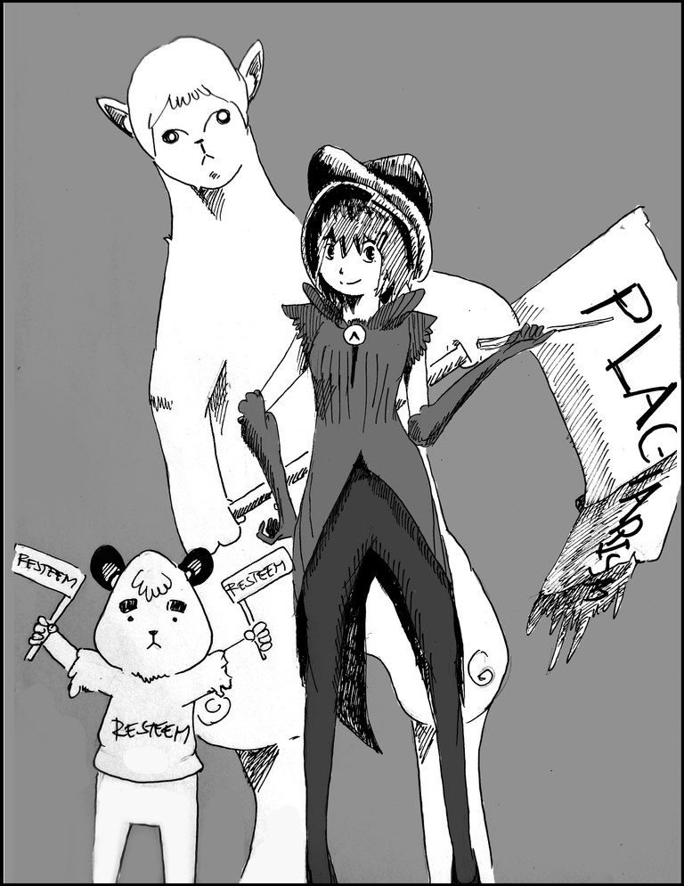
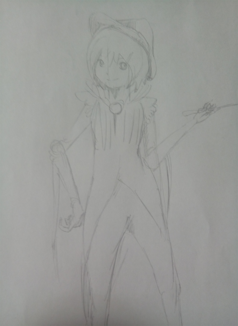
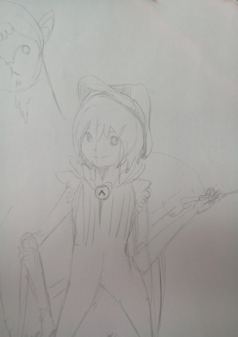
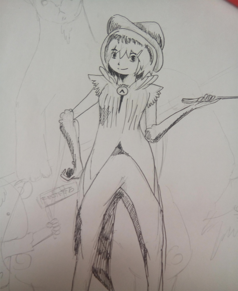
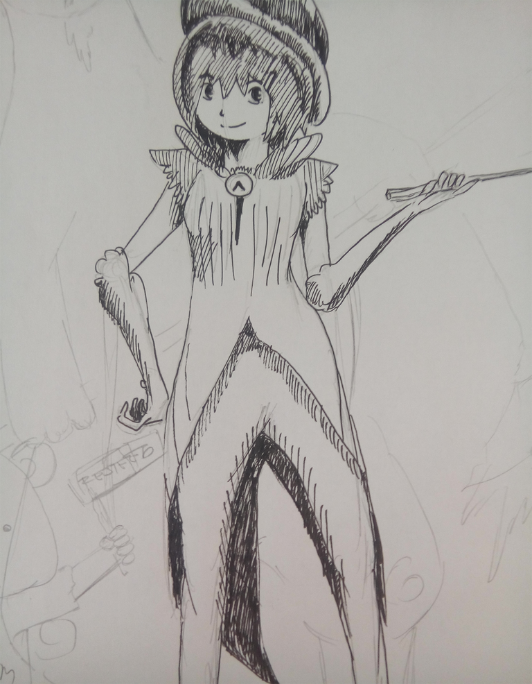
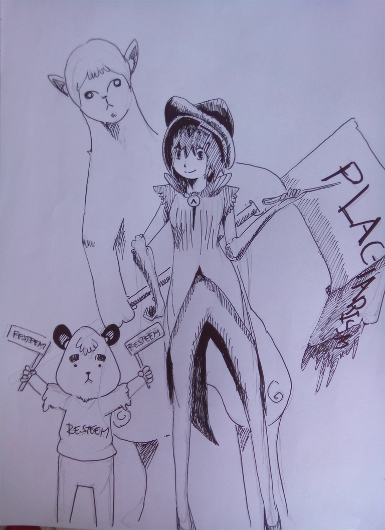
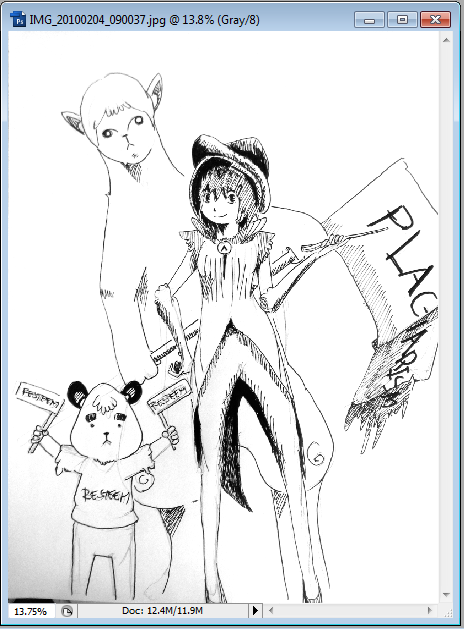
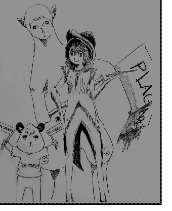
Here above is a really generic looking girl that I drew recently, I added her some clothing to make her look a little more fashionable and added two small and big companions with her.
Without further ado, let us get drawing and discuss things as we go through the process.
Let's Do Designing With Hurricane!
When designing a character, you should always visualize first what kind of nature the character and the story should have. Is it a fighting story? A comedy? A romance? Or horror.
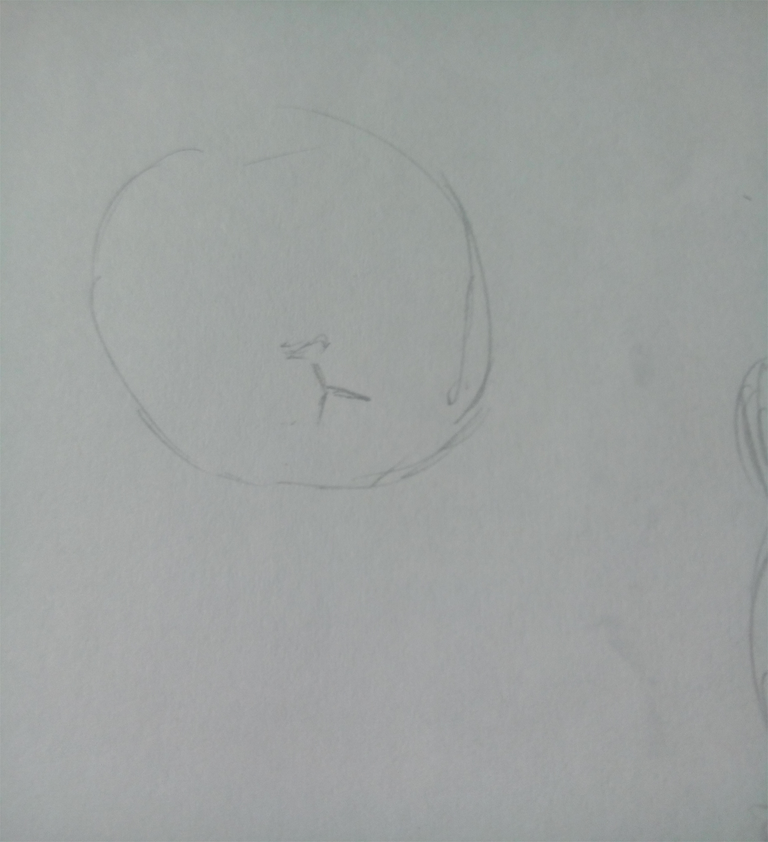
Then after thinking of the genre, then you pick out the traits of the character. Should she be charming? Should she be cool or stubborn? Is she out going or shy? Things like this should be considered out so you can pick the proper eye shape,face shape, dress and maybe the abilities of the character as well.
Here, I decided to do an adventure story with some magic and action into it. I wanted it to have some mystery but still have the charming atmosphere with the characters and the drawings. Do you think these characters above justify the traits I'm looking for?
Want proof?

First, I chose a female character. Female characters are easy to work with since you can change their clothes in every installation of the stories you made. And on the top of that, these female characters are eye candies for male audiences and can appeal young girls to patronize your work as well.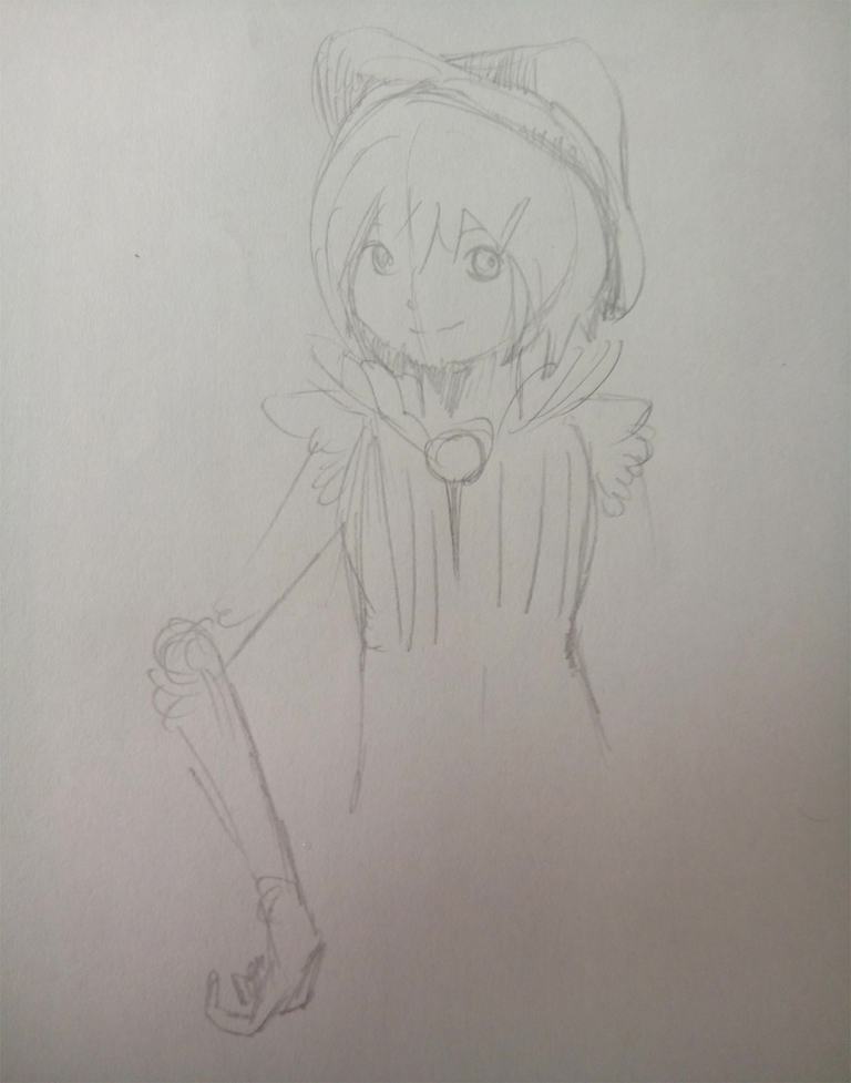
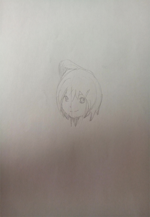
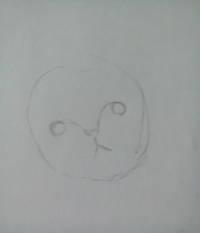
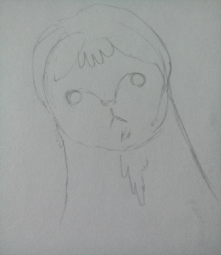
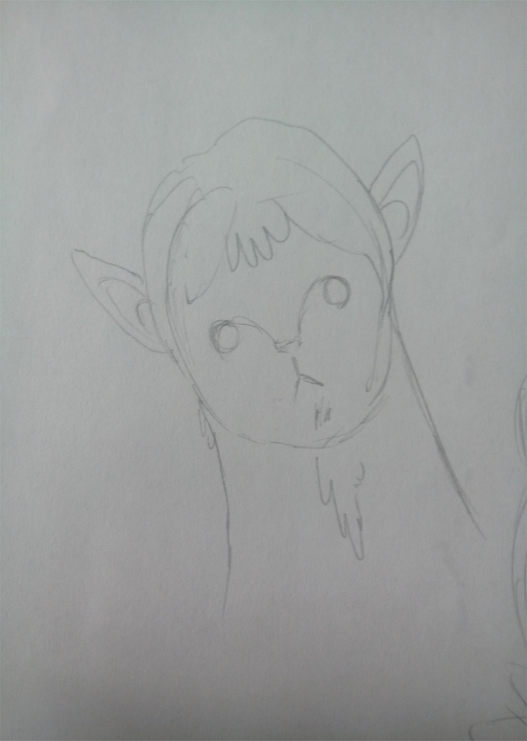
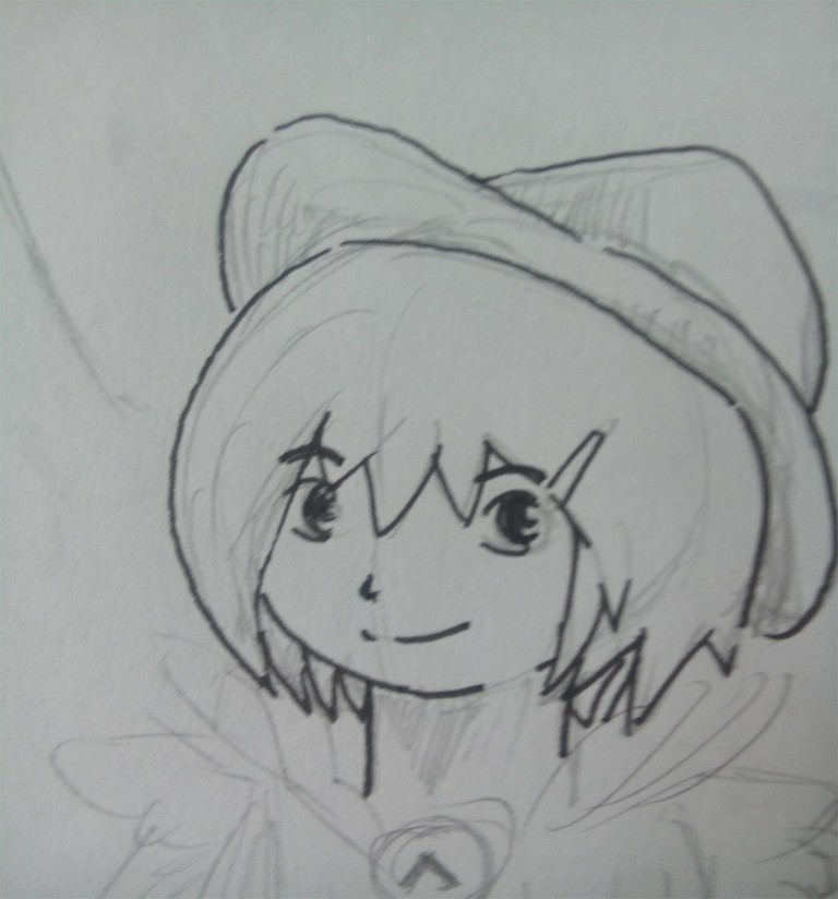
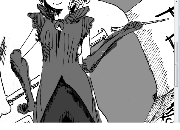
I chose bulging anime eyes for her so she looks charming. Yes, eyes like this represents the trait that is really good for the role. Knowing which kind of eyes, shape face and hair requires some researching, maybe I'll do another post about that later for my next post.
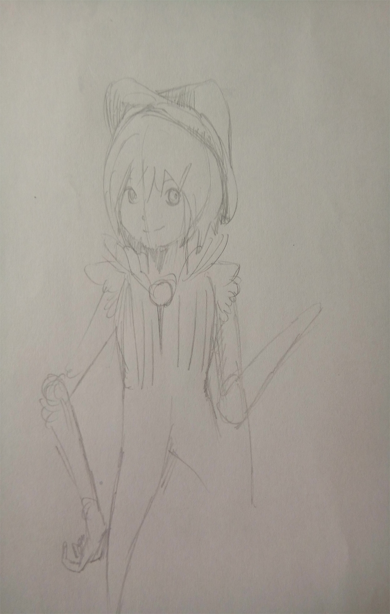
I added some frills on her clothing so she would look more appealing.
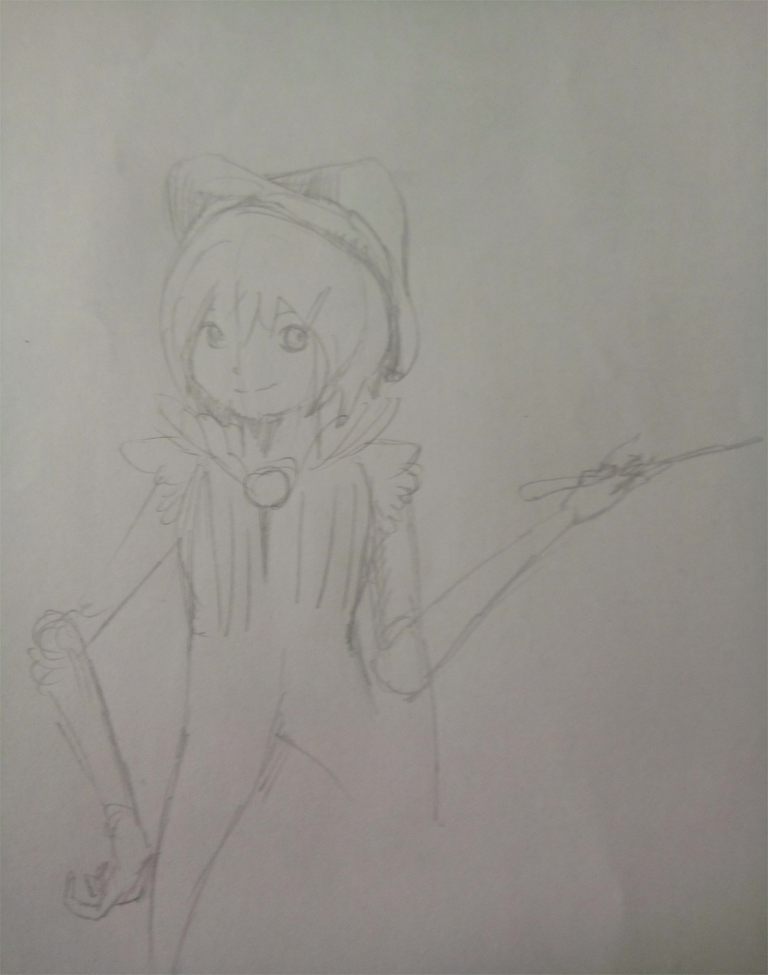
The I gave her a wand. That will make the viewers think that she has magic while the truth there is none. LOL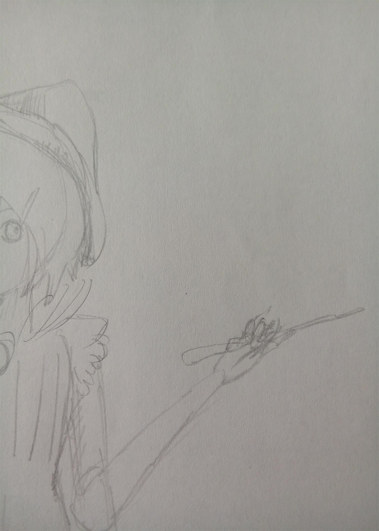
Seriously, the wand gives some hint on what the story is about.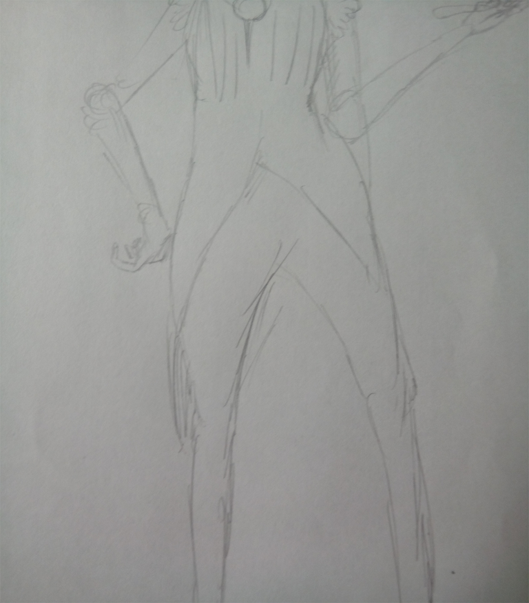
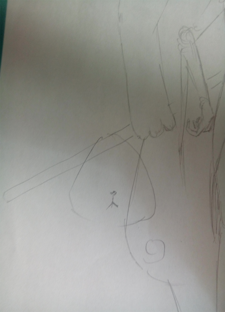
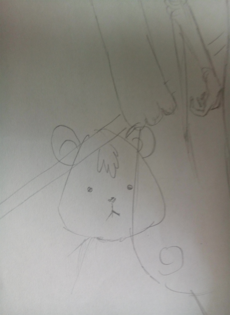
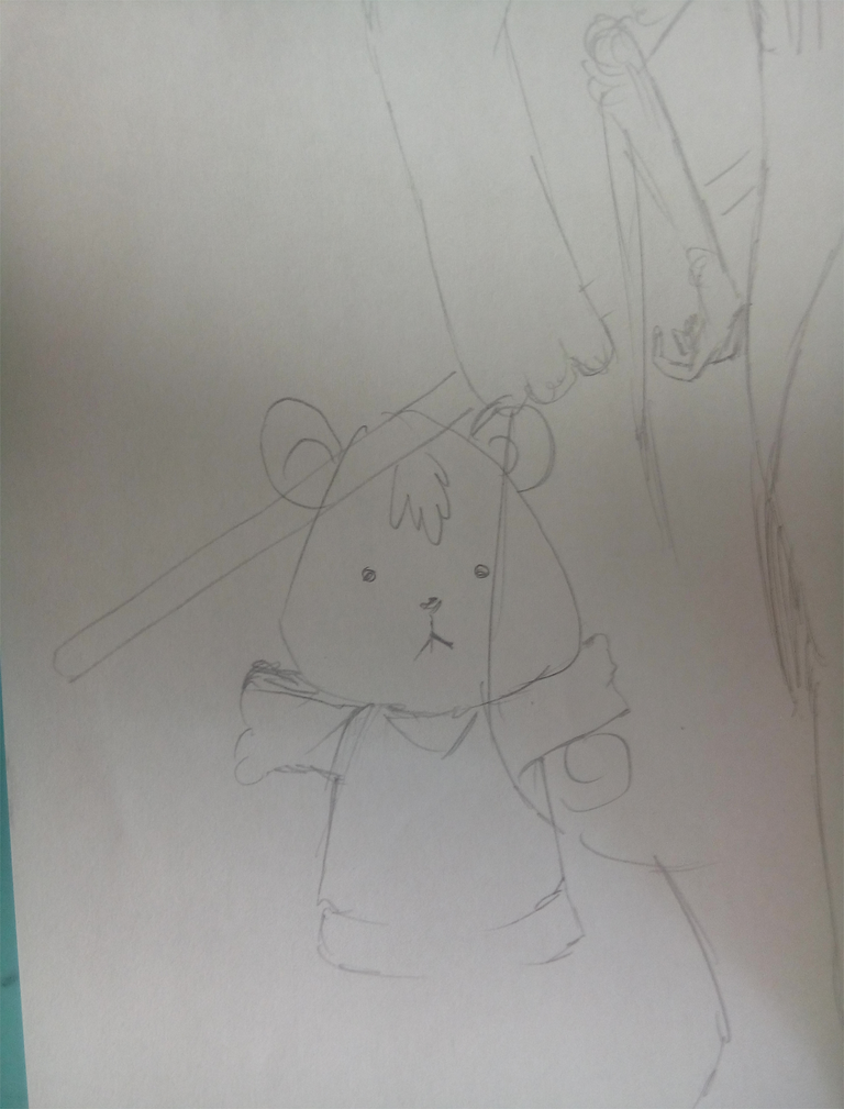
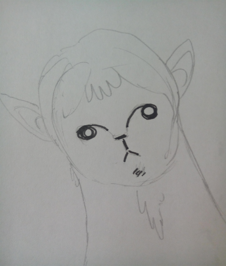
Then I added another character.
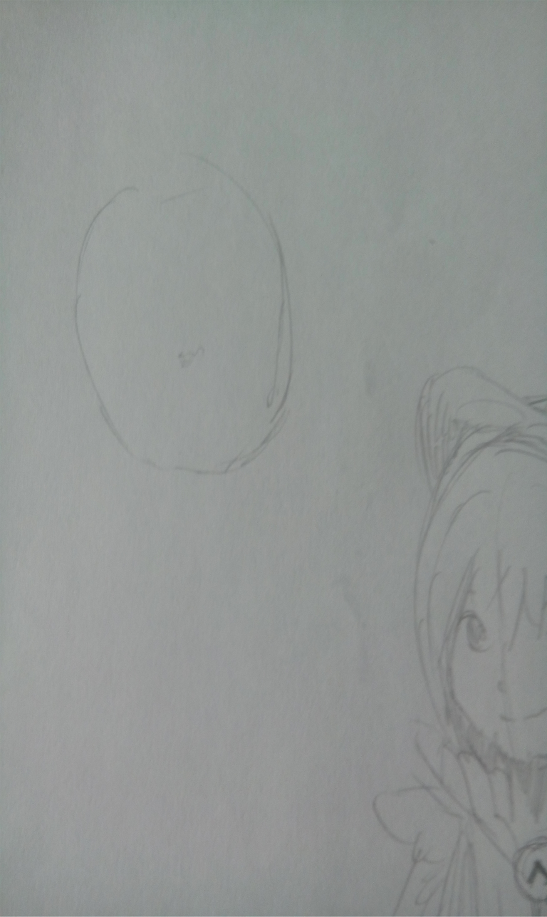
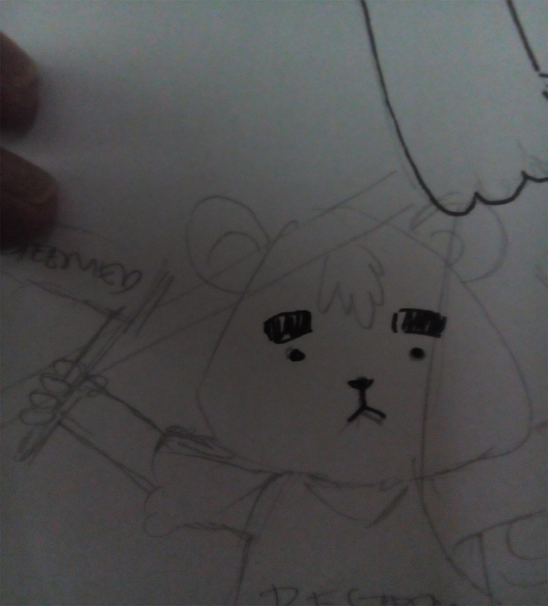
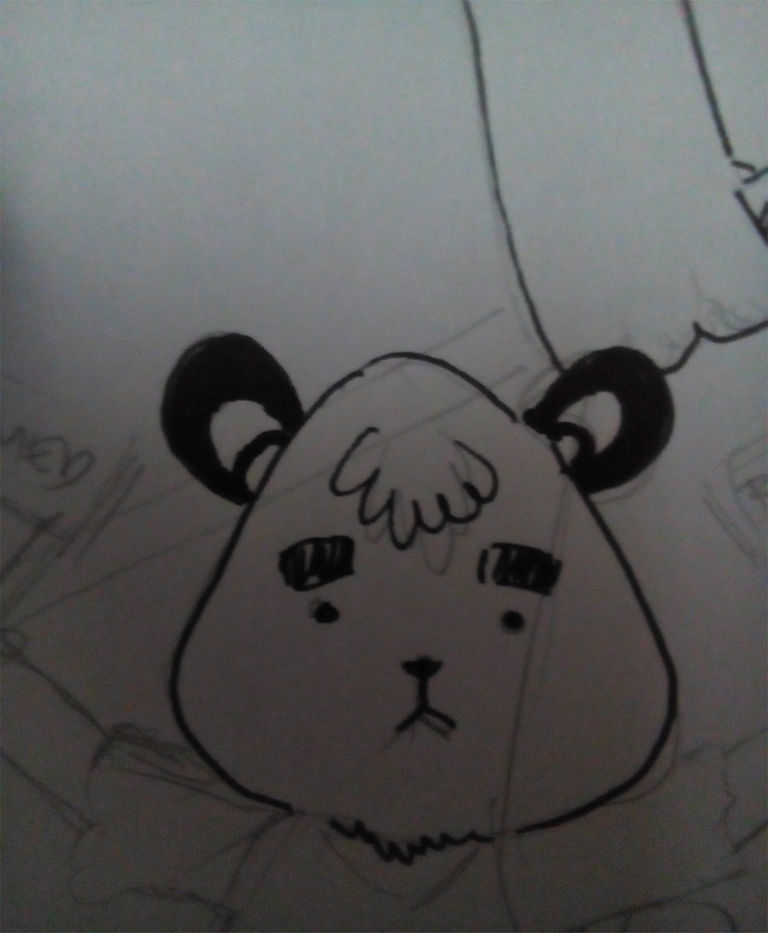
A big fella that looks like a bear.
And has bat ears.
Weird things like that is also another form of appeal.
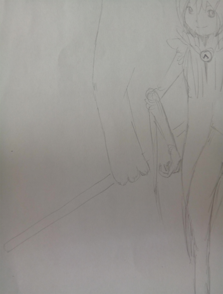
Just check out Tim Burton's work and get freaked out on how weird his works are.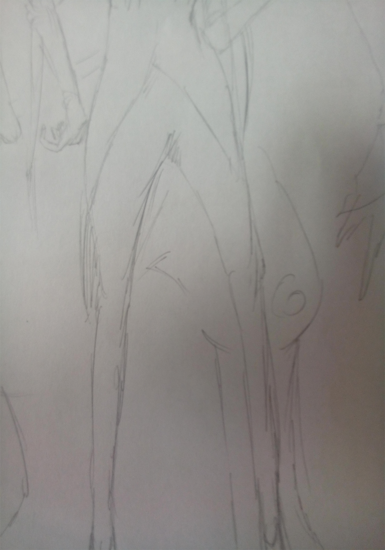
But even so, Tim Burton's works are phenomenal because of that. So don't be afraid to try weird stuffs for your pieces when you're designing.
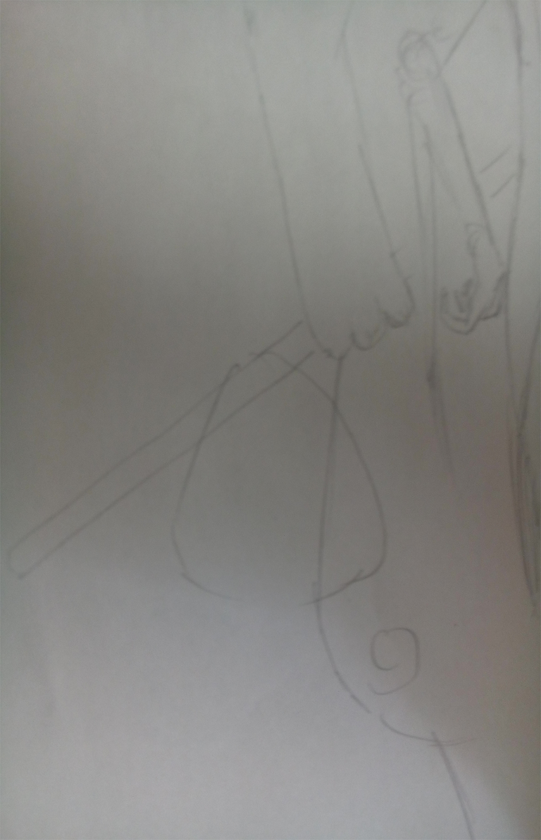
Here, I added another character.
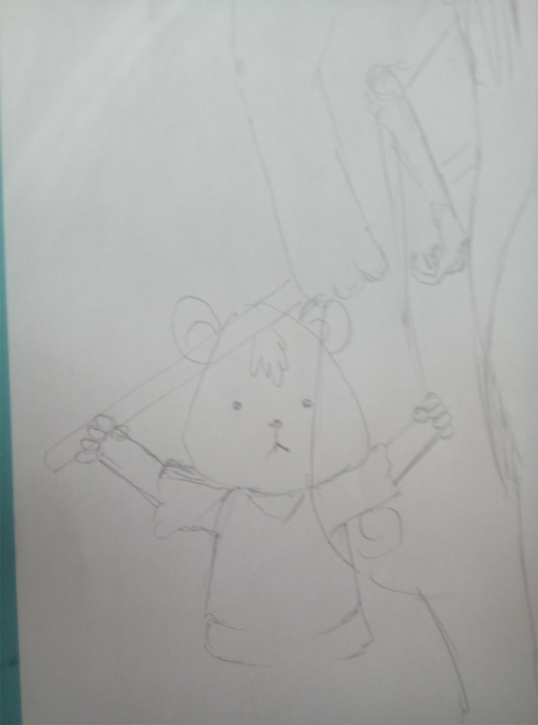
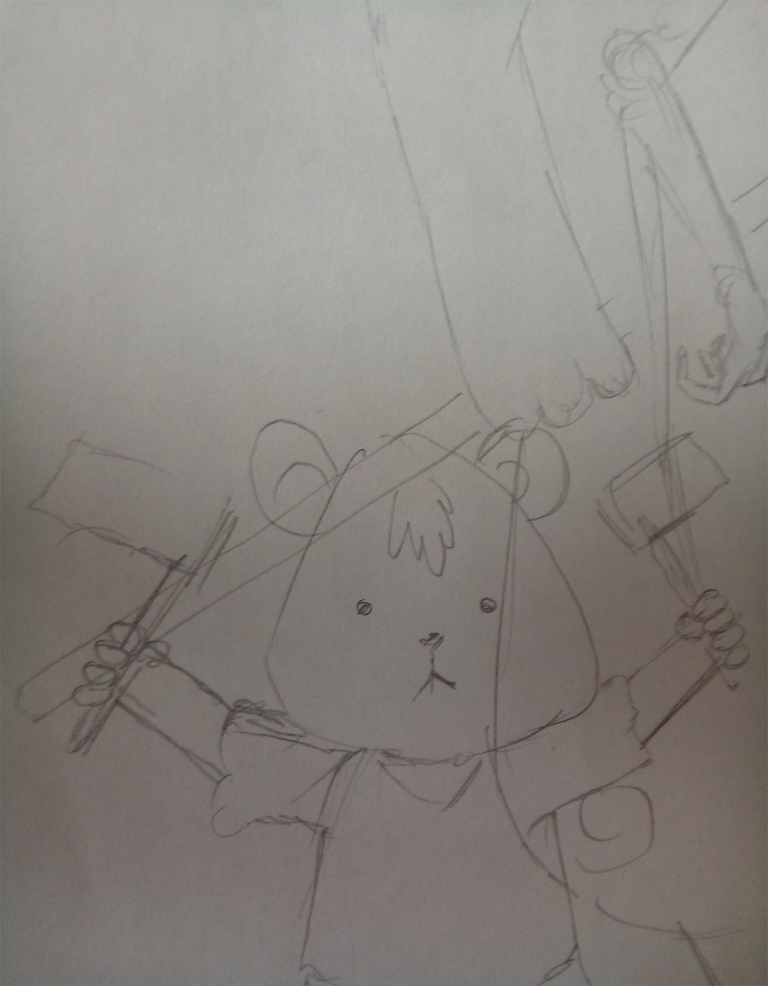
It's a little bear that holds two flags with the word resteem.

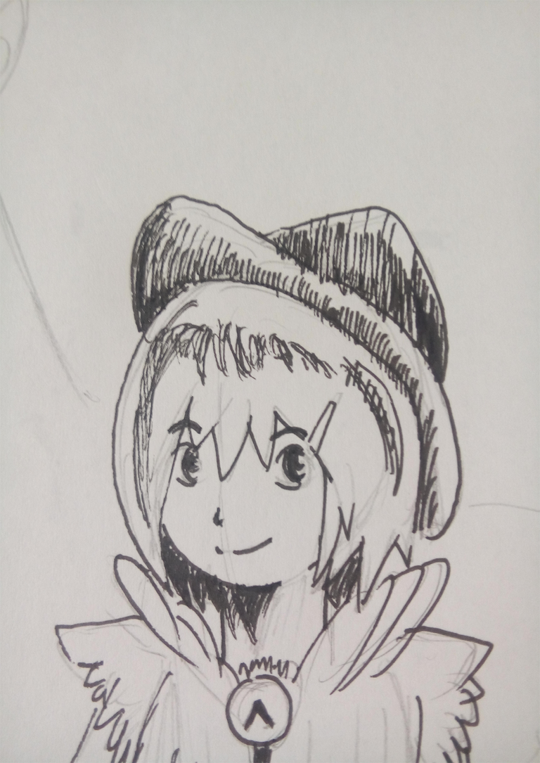
With that said, I'll put the upvote emblem on her circle brouche.
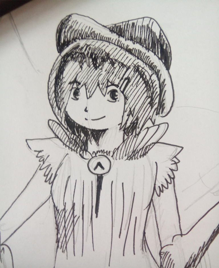
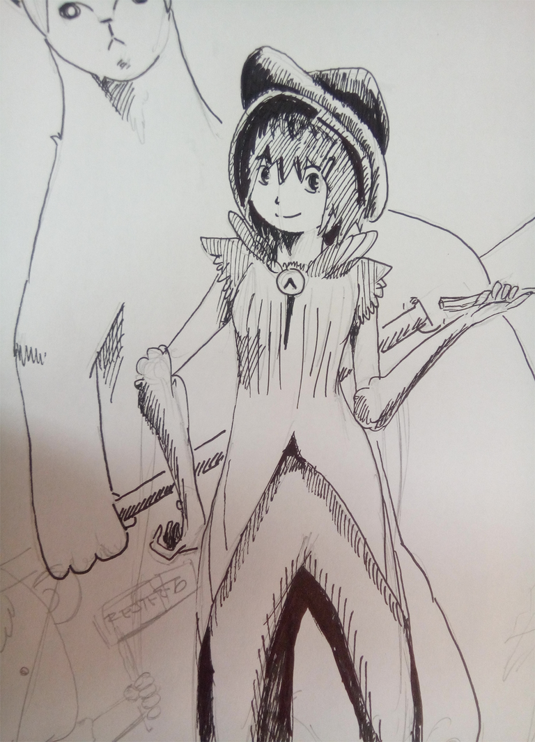
Then I started inking the drawing.
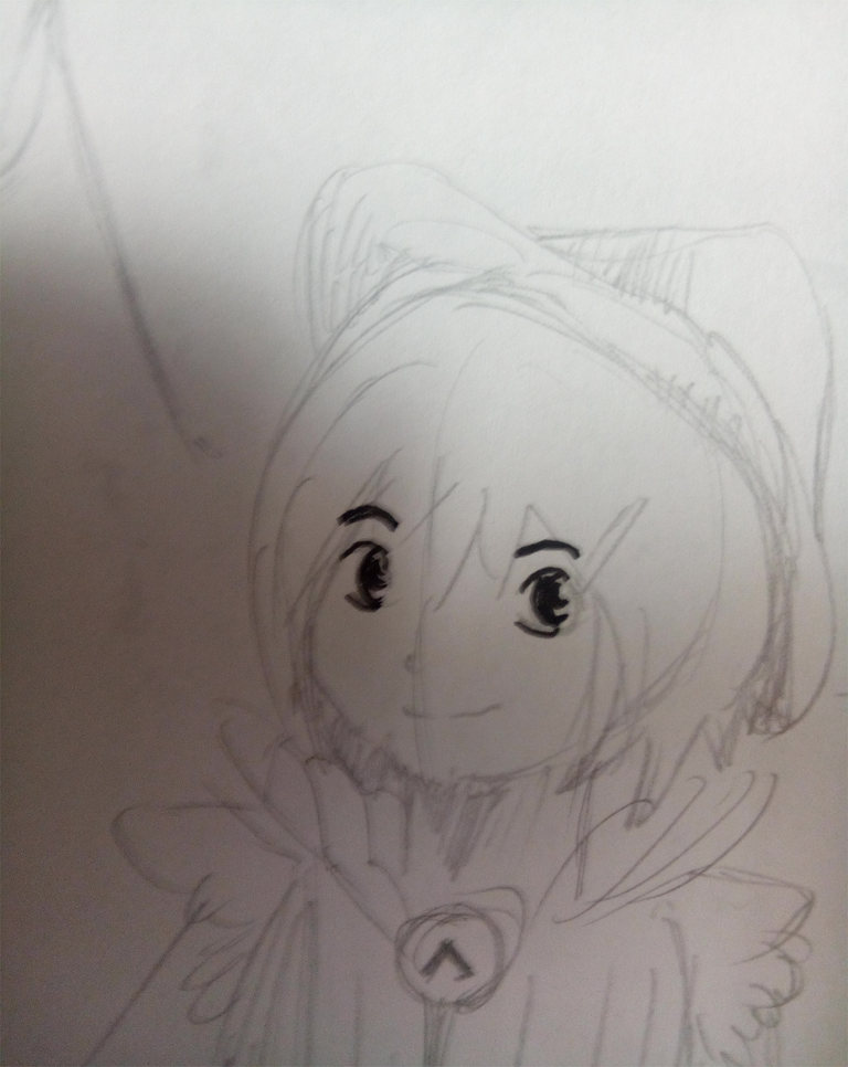
After putting the first inks on the main female character I then added more lines. These lines are called hatches. Their purpose is to add more depth and design to the drawing.
I then started inking big fella.
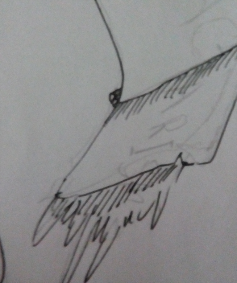
 I then inked the flag big fella was holding. I enjoyed inking that flag, to tell you, inking the flag was my most favorite part of doing this drawing.
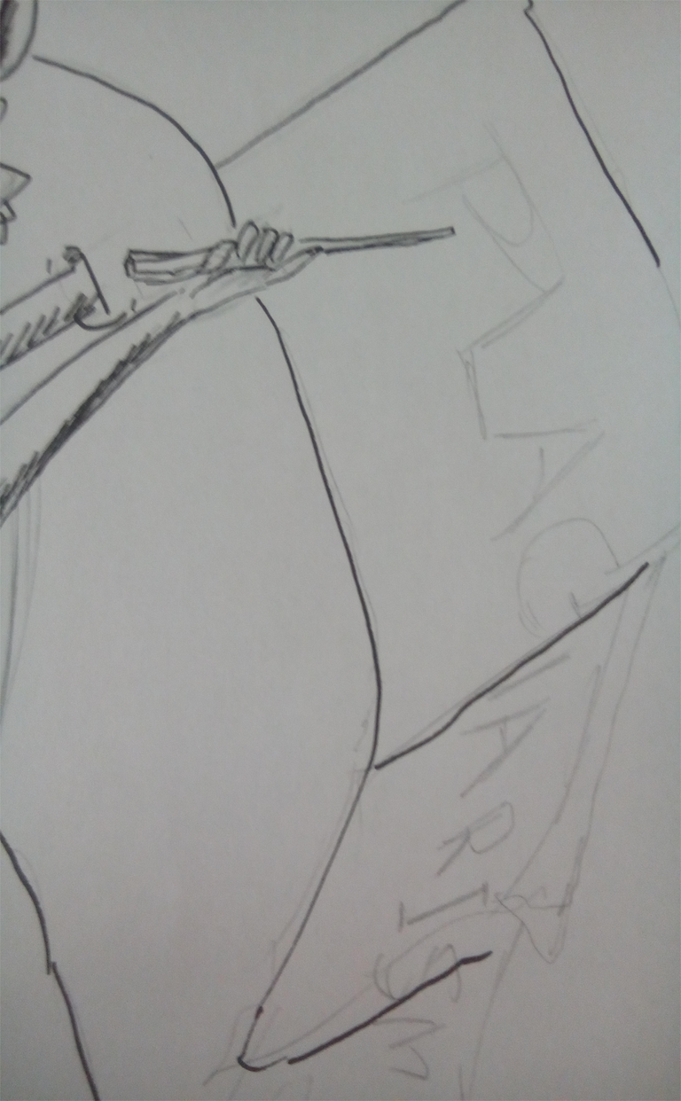
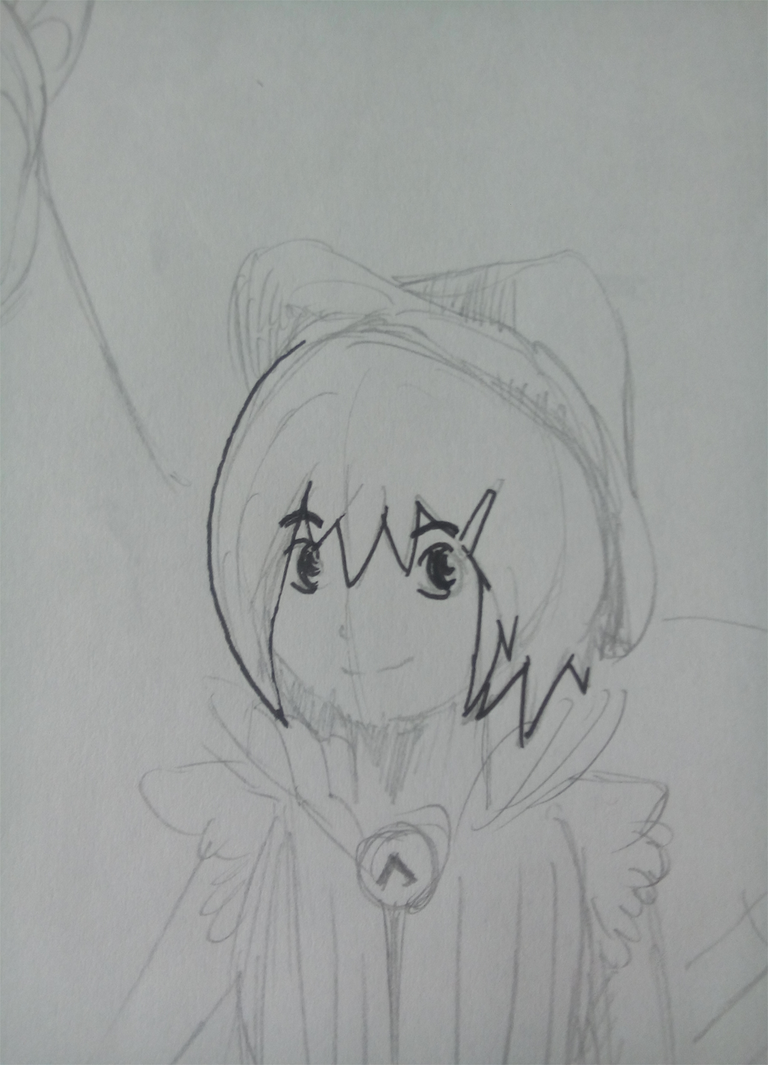
 I added a text.
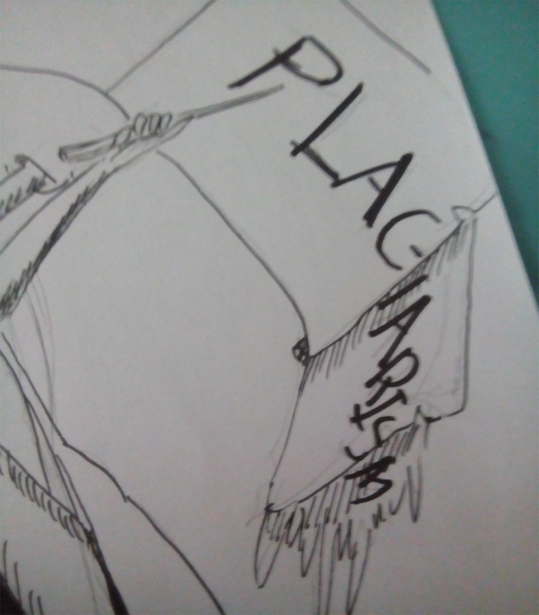
Then finished everything with inking up small fella.
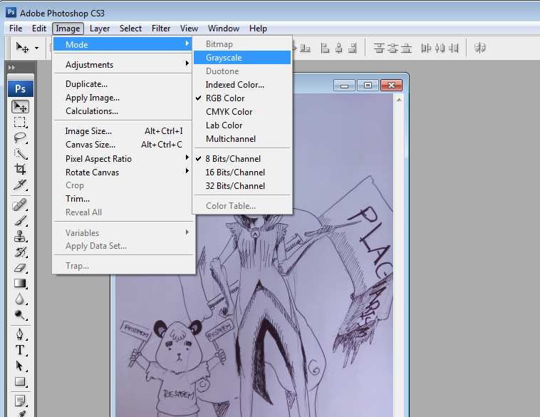
There, inking and drafting is now complete. Just to add more pow on the drawing, lets add some gray tones with Photoshop Cs3( cause that is the only version I have).
Adding some Tones(Bonus Content)
It's so easy to work on a drawing with Photoshop. Just take a picture with your Cellphone Camera (at least 8 mega pixels) then open the photo in Photoshop.
Convert the file into grayscale. Just follow like below.
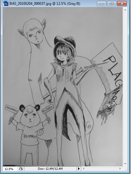
It should be like this.
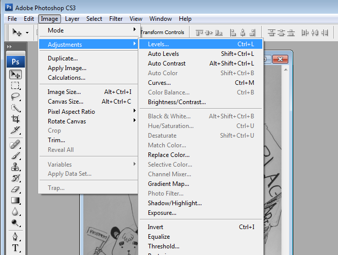
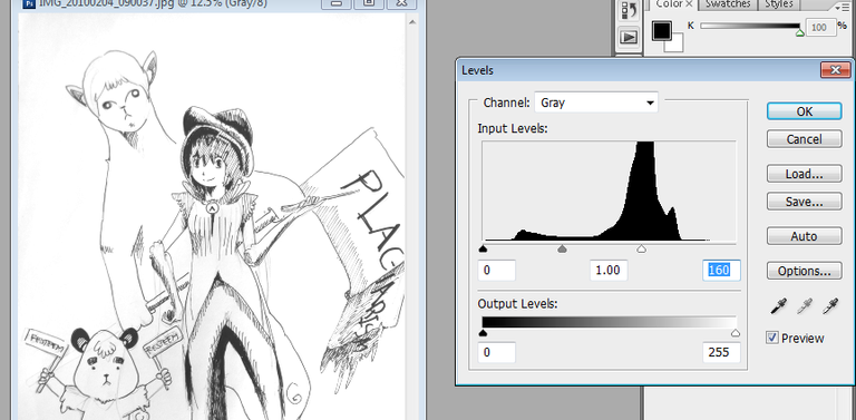
Then adjust levels.
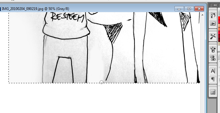
Clean the dirt and unwanted blemishes with brush(make sure you clicked the white color in the swatches palette)
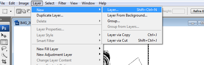
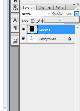
Add a new layer.
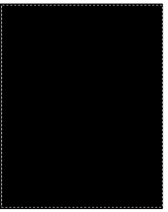
Select the whole picture and fill with black. Then adjust opacity.
Erase some of the parts to make the character more visible. Make variations by adding multiple layers and adjusting the opacity differently per layer(so you get contrast).
And there you have it! Small fella's arm is missing a line, haha. At times like that, just go back to the background layer, adjust your brush size to the same line as small fella's line arm is and pick the black color. Then draw the arm. It's easy! Try it!
Thank you for reading this post, I love you all, muah, muah, muah!!!!
STEEM OWWWWWNNNN!!!!!