Hey there to everyone who will read this post, I want to greet you all! Belated Happy fork day!!! Fork yeahh!!!
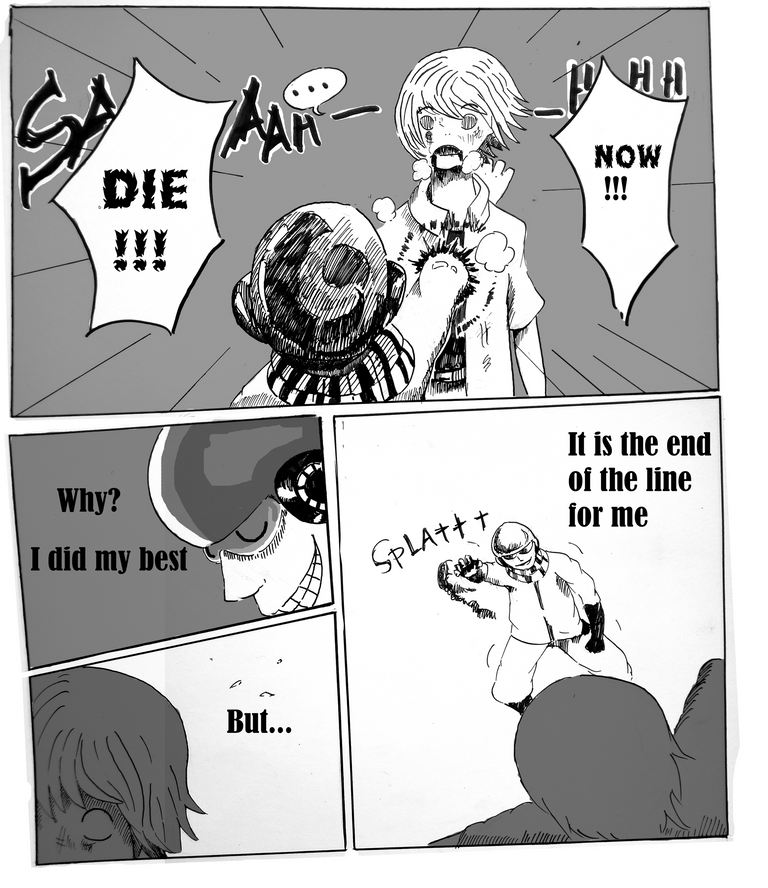
So today's topic is all about making a manga page. As you can see, I already have that page done above. Hmmm, I don't have much to say in the introduction but please, if you read this post, just enjoy it! With knowing at least someone had read my work and enjoyed it is more than enough than worth it! Got it? Hehehe, those last two lines rhymed good.
With out further ado, lets get drawing.
Let's do Manga Pages with Hurricane!
First thing to when doing a manga page(after you already did the story panel or the rough draft of the story) is to take a manuscript paper and do the panel lines.
Panel the page out with the correct number and shapes of how the manga panels should go. 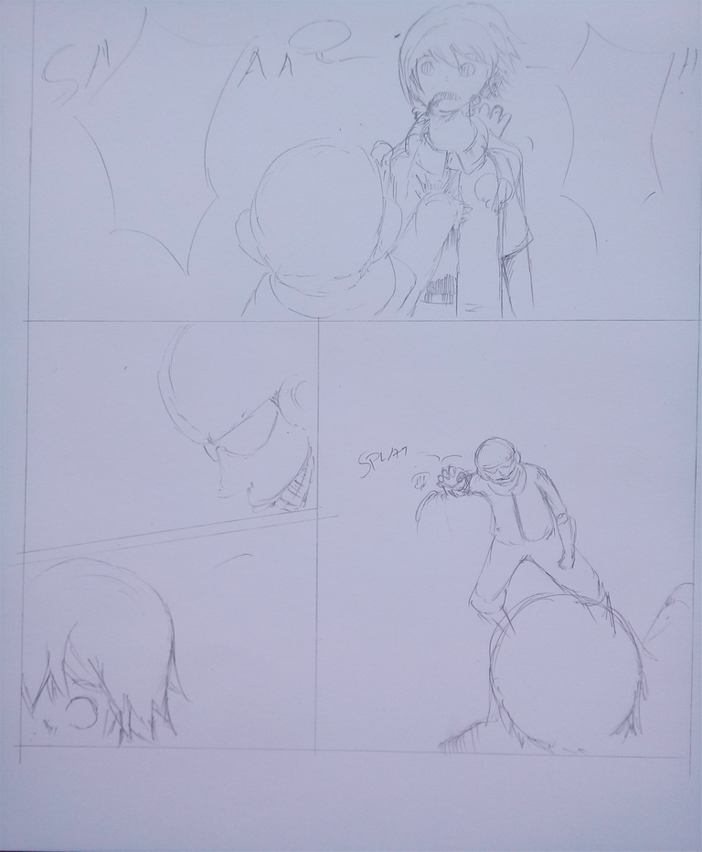
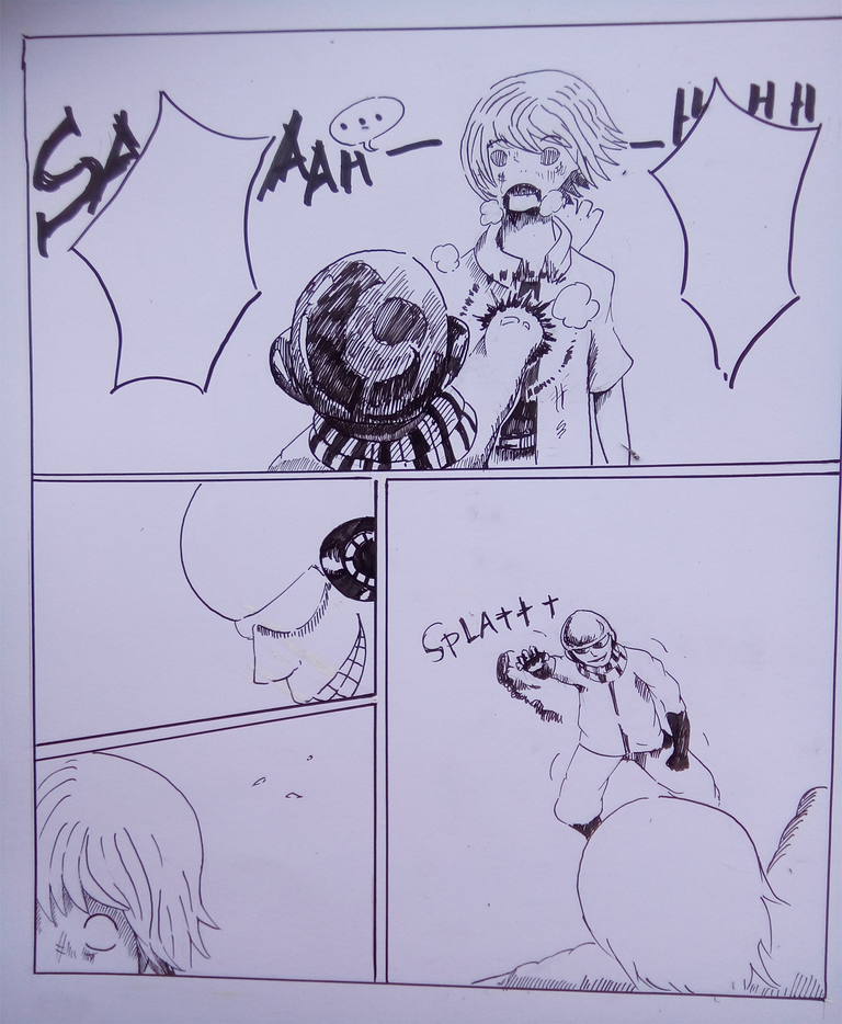
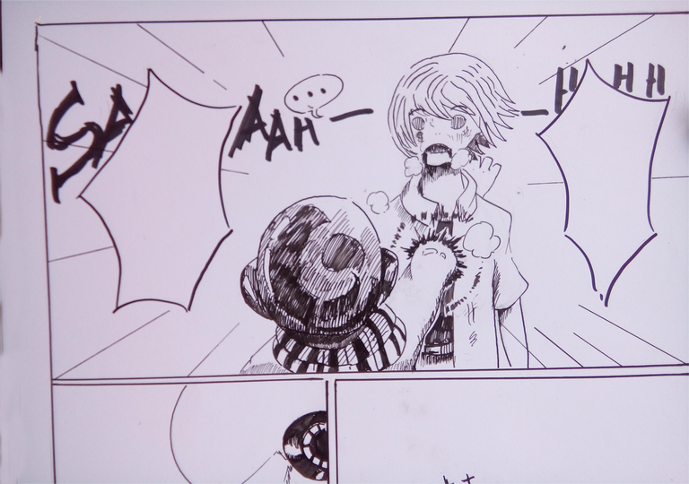
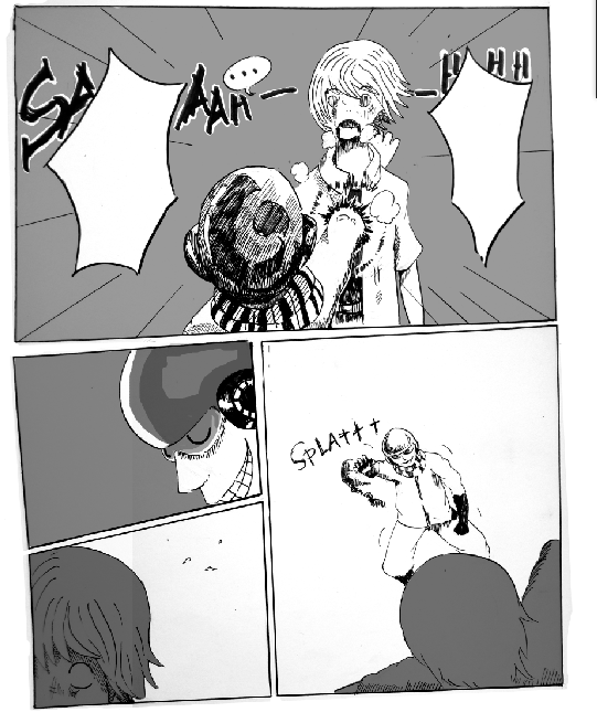
What I wanted for this manga page's first panel is a big panel. This part took almost half of the page.
The big panel choice will give the dynamics of surprise or climax for this part of the scene in the manga page.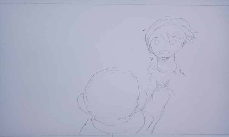
I used some basic principles of perspectives here to show some dynamics. As you can see, a guy is showing his back and did an attack to another character. The perspective is applied in the attacking arm, just in case you can't see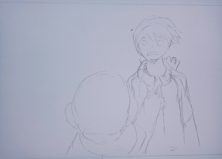
I added some details.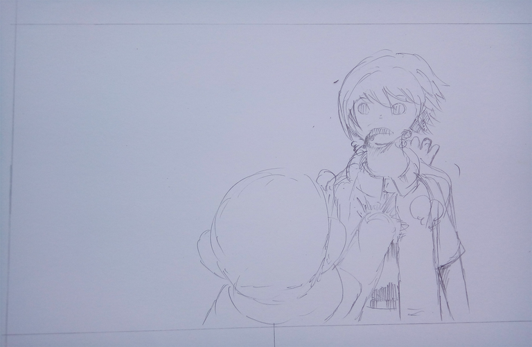
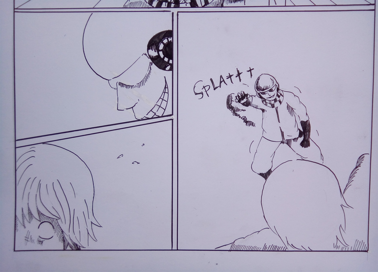
Then I moved to another panel. Here, I wanted to show an impression of momentary stop for the characters. One of the characters is about to die now, it is really a good opportunity to show some sentimentality for his death with doing a time stop like scene
This panel then is the same as the above panel, it gives that time stop impression.
Then the character that attacked pulled his arm from the dying characters chest. At this scene, the impression of momentary stop already had ended.
Can you see what I wanted to convey here? Doing or just planning the pages is like doing movie scenes.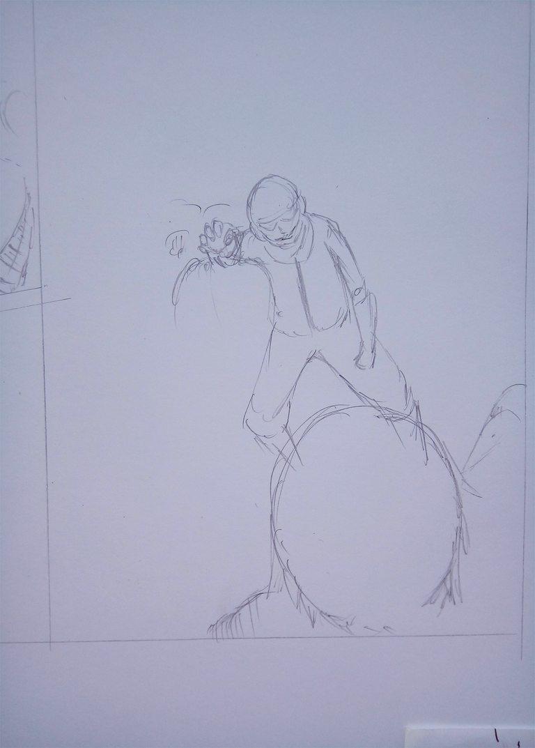
Inking
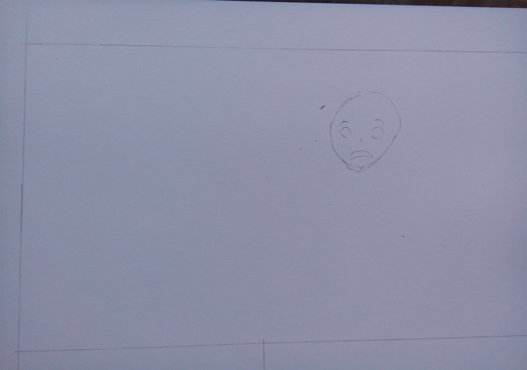
I inked out the border and the panels first.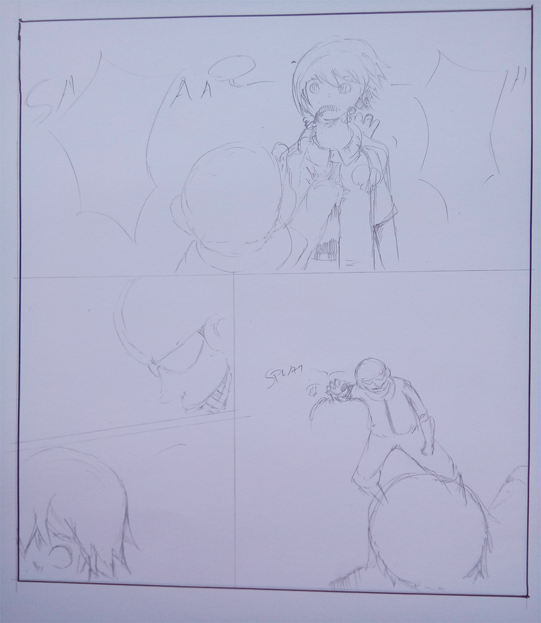
Then did the characters.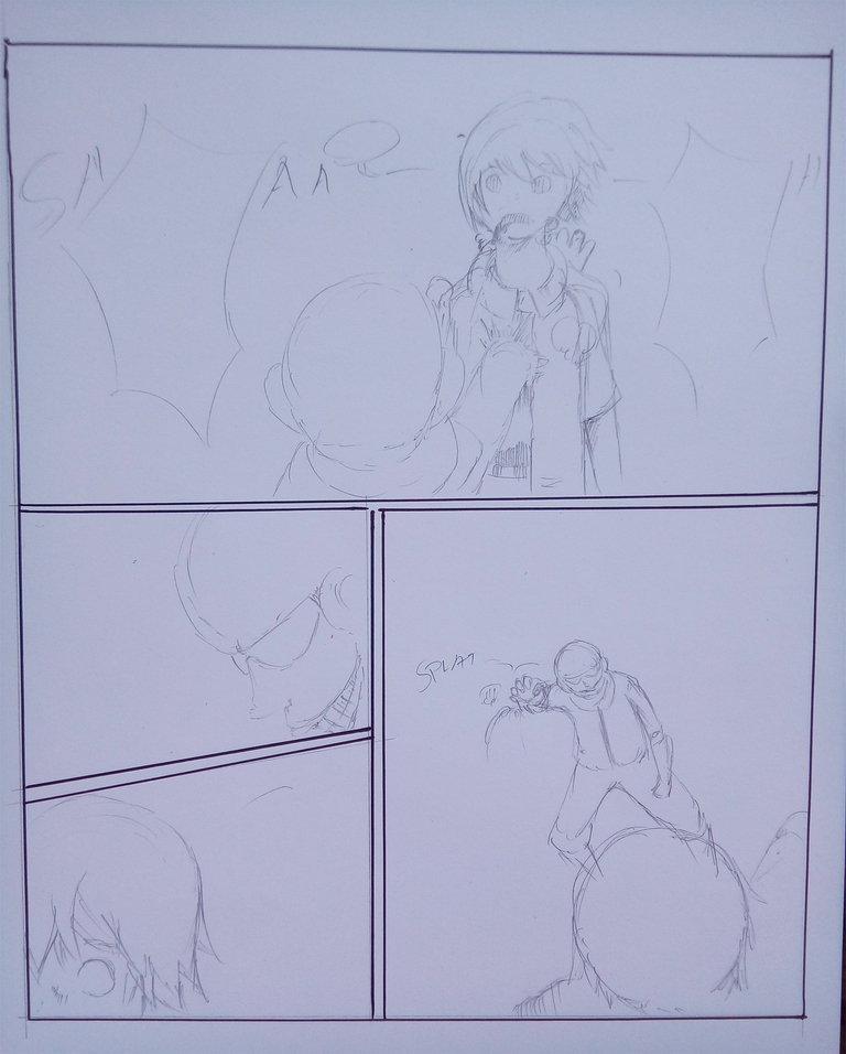
Making manga pages is all about motions, in order to make an effective manga page a lot of factors is needed to be looked at.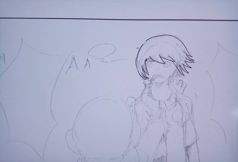
One of them is the motions. A good manga page has a lot of motions rather than just texts. Well, it may vary by genre but action, adventure, story and even horror relies more on motion rather than just texts. I would rather just read novels if the manga page has a lot of texts. 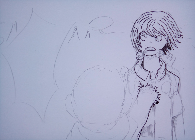
Another thing is impact. Dynamics and character appeal contributes on impact.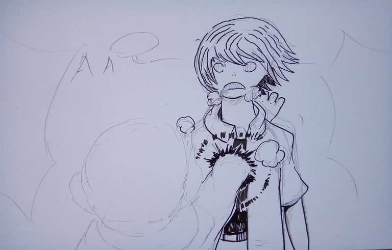 Doing manga in general is like a painting, if you do the same panel variations again and again per page then the whole manga as a whole becomes monotonous which will make it boring. As you plan the manga pages with your story boards always put into your mind how will the reader's eyes will move across the pages.
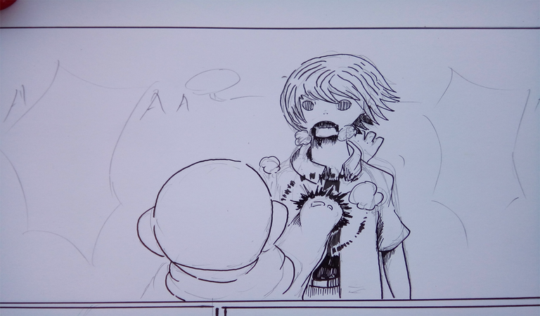
Then I fleshed out the page with adding more lines.
I then inked the speech bubbles. This speech bubbles also shows some dynamics. I drew them spiky and edgy to show the impression of shouting. There is no standard shapes for the speech bubbles, but you can just simply adapt or copy other author's way of making them, or if you can, do your own style of them. That would be really cool. 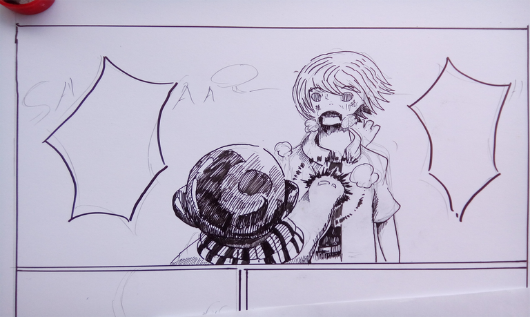
Here I added some fragment looking drawings to emphasize that time stop thing that I did mentioned earlier. Those fragments helped the page to emphasize what does the author(me) wanted to convey for that very panel.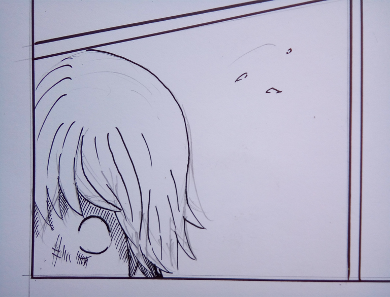
I added some sound effects and motion lines. Same with speech bubbles, the sound and the lettering for the sound effects has no standards.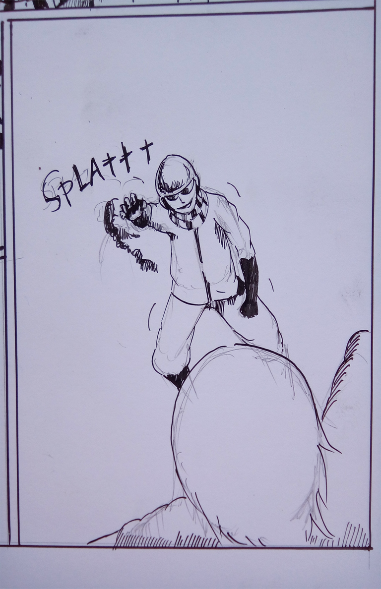
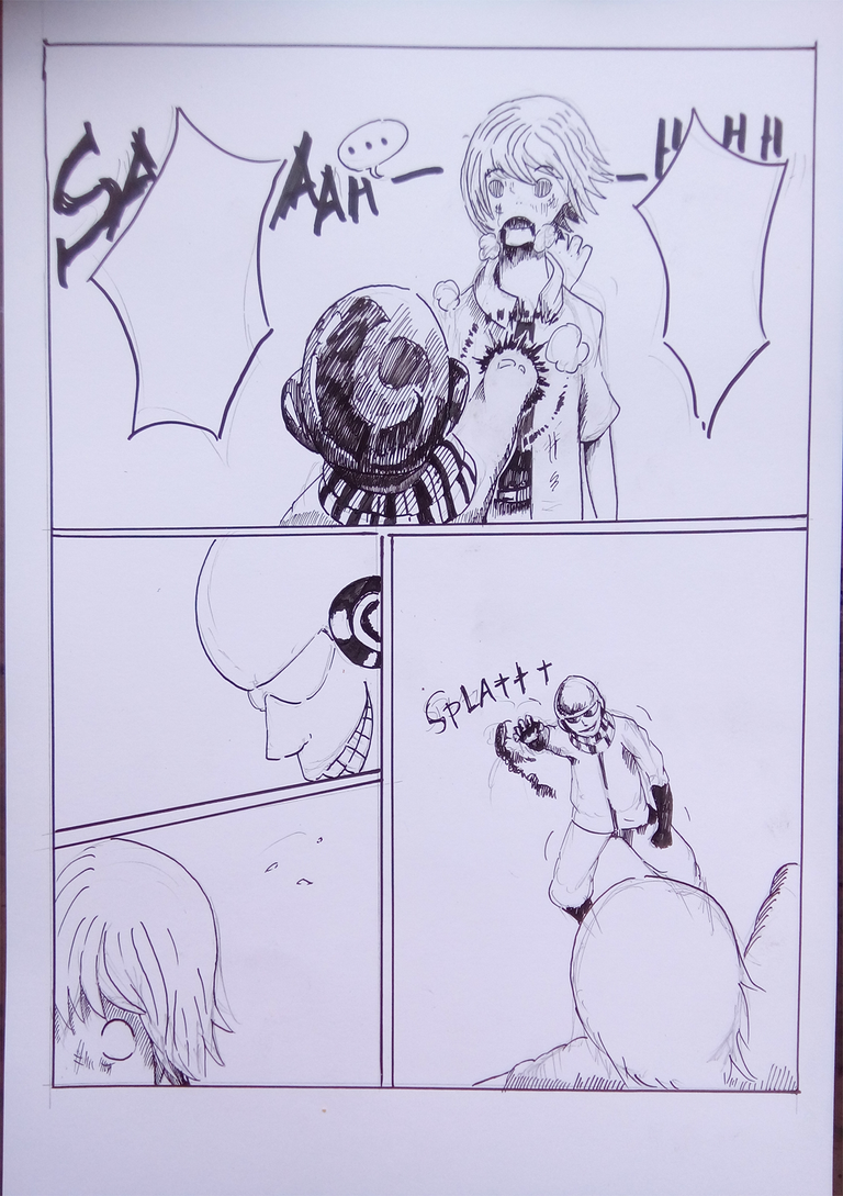
I then erased the pencil marks.
I wanted to add some more dynamic lines for the first panel to give more dramatization to this scene.
For me to do so, I made a mark at the middle of that panel.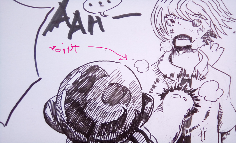
Then draw lines from that point towards the panel lines.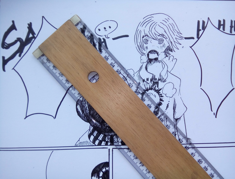
Like this.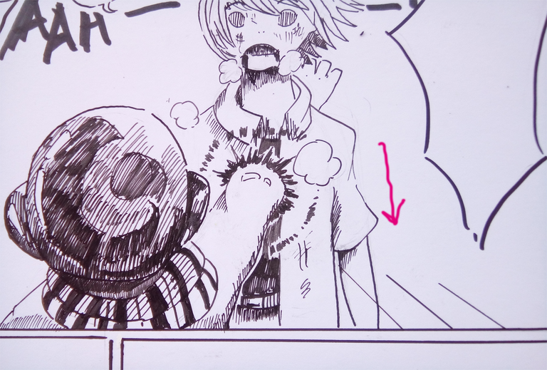
There you have it, just remember to be moderate when adding these lines. Adding too much of it can just make the page look not good with too much of it. I think knowing the right number and lengths for these lines takes some practice too to have that sense of knowing the right number and sizes. So, just try it out.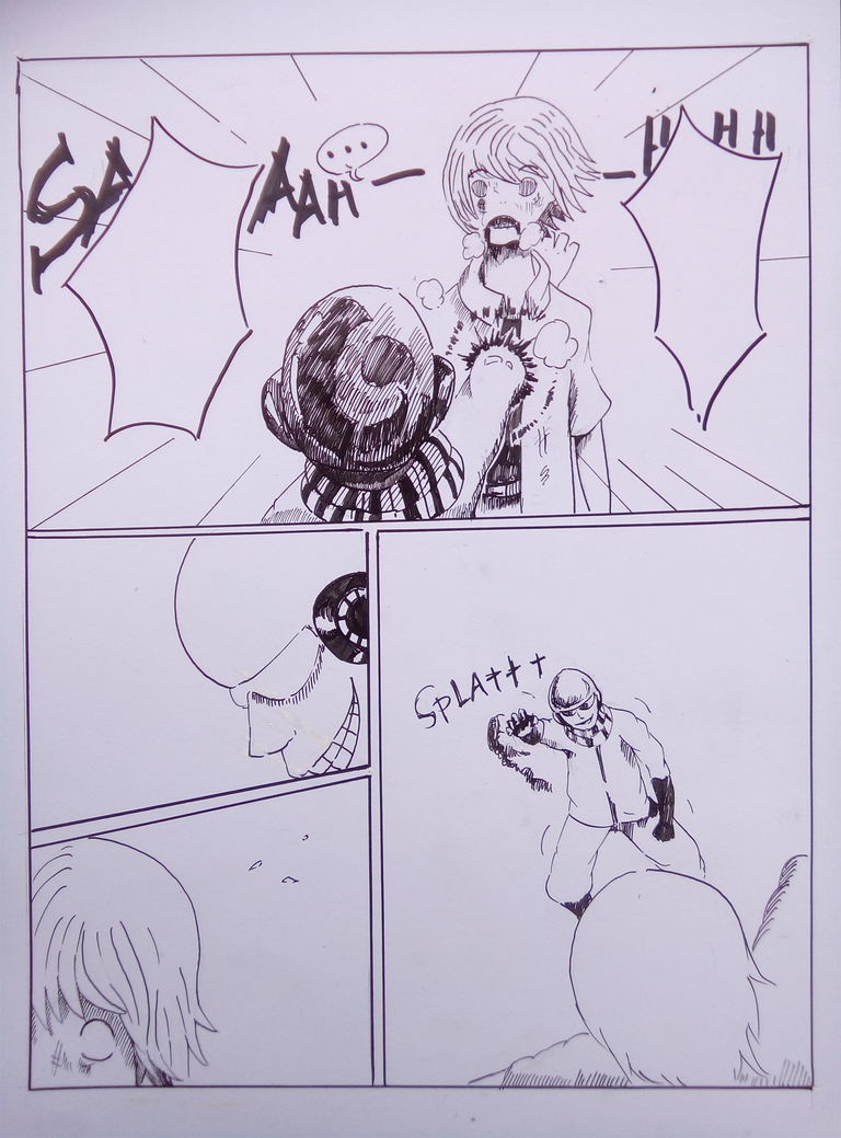
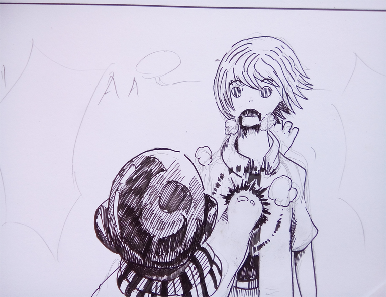
We are now done here with doing the traditional parts of doing the manga page.
For it to be prepared for editing in Photoshop, a scanner would be really convenient. But since I wanted everyone to be able to do these kind of really productive hobbies, I will do the taking of pictures with my 13 megapixels camera phone. These kind of phones with such camera can be bought from the ranges 65-90$. It's really cheap for such a useful phone that can contain some crypto wallets and be used for quality steemit blogging. The brand of my phone is Alcatel. I am not sure what model is this but a word Pixi is written behind it. Bought it for 90$ but I think there are cheaper ones out there. :D
To make the resolution higher, I divided the photo shots into two parts, the top of the page and the bottom part.
Part One
Part Two
Now, Let's do Photoshop!
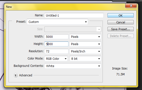
First thing to do is make a new page(after you opened file/s to work on)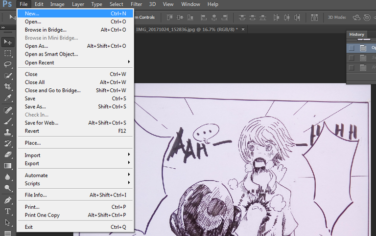
Set it to a large setting so you will have a lot of space for your work(if you plan on doing the taking of photos into many parts like I did.
BTW, you can decide to take each panel separately if you prefer a higher quality for the supplied image. Just decide it yourself.
I took the parts off with the move tool.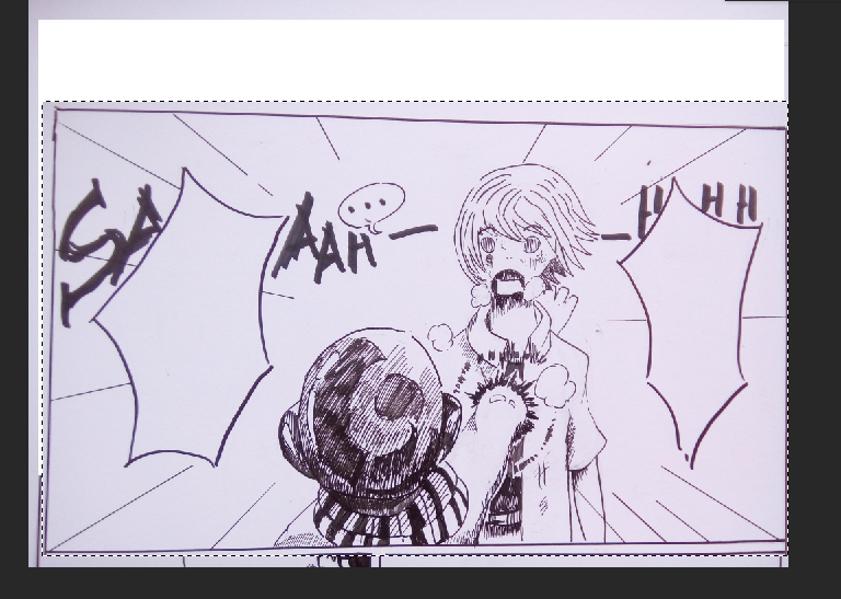
Then placed them in the new page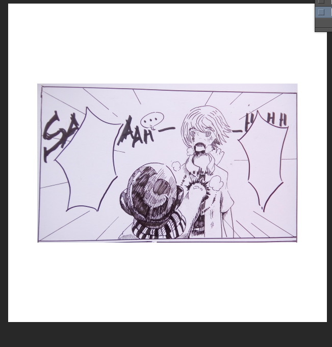
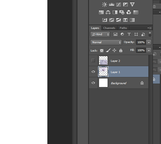
They might over lap like this but do not worry. As long as each parts are on a different layer, they will be okay.
Just click the eye on the layers section to make a part invisible, this way you will be able to do your page easier.
Like this.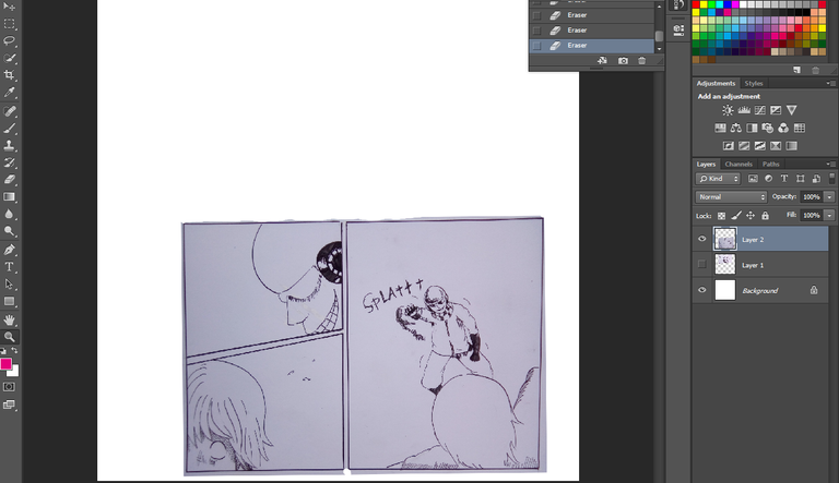
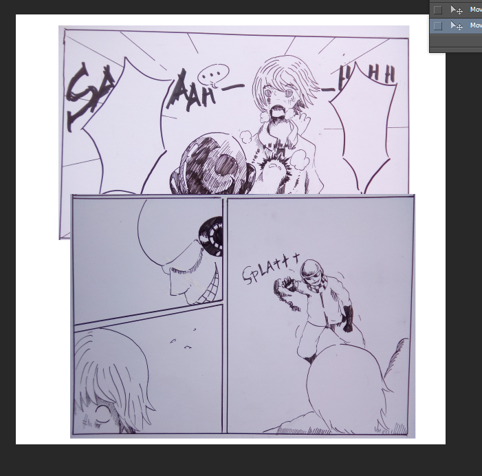
If you want to cut an image into many parts with irregular shape, you can just simply use the pen tool. Click around the object and then connect the anchors. When the pen anchors encloses, left click the enclosement and click make selection
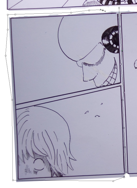
See? Now, transform and align by pressing CTRL+ T. Just make sure that the object you want to transform is selected.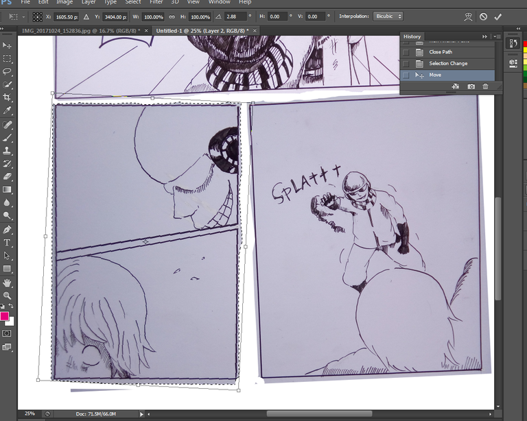
There.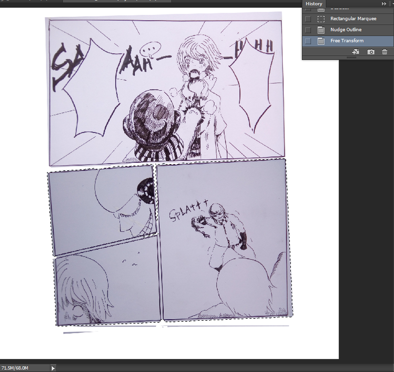
Adjust brightness of till all the object has the same tone like in the picture below.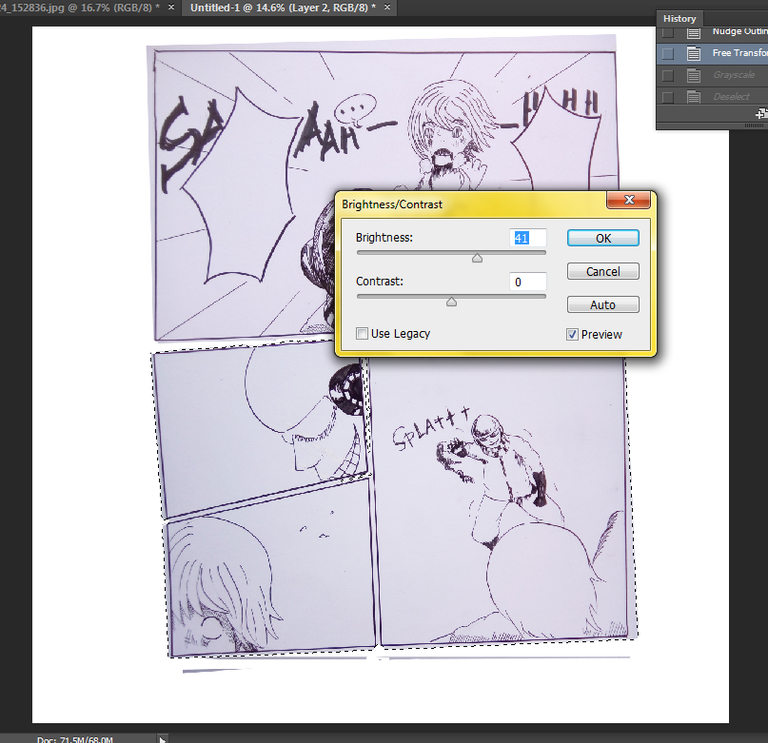
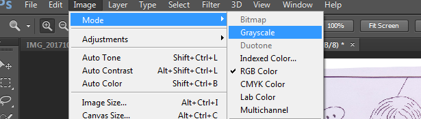
Apply grayscale.
Adjust levels.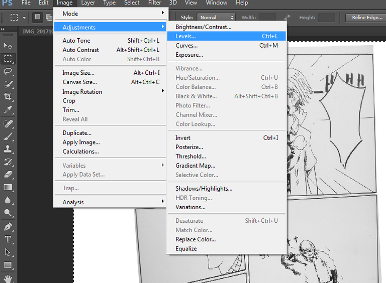
It should look like this. Clean from dirt and those dark shades.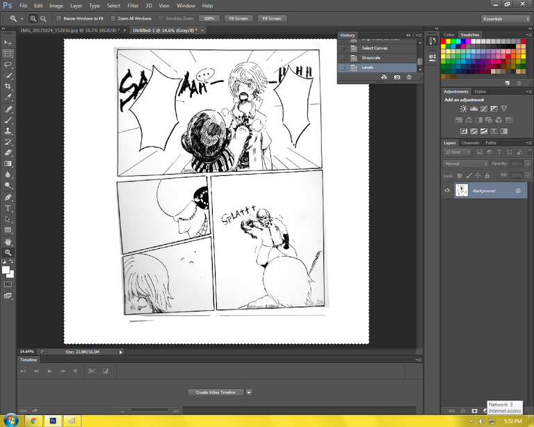
If some parts are still dark, select the dark part with a selection tool like the square marquee tool. After you do so, adjust the brightness again.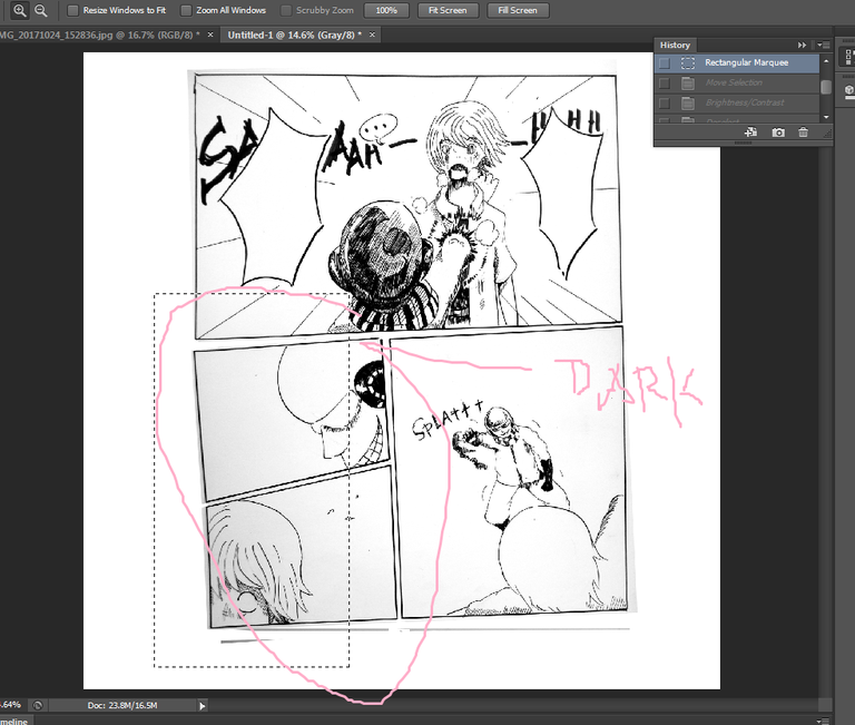
There, much better.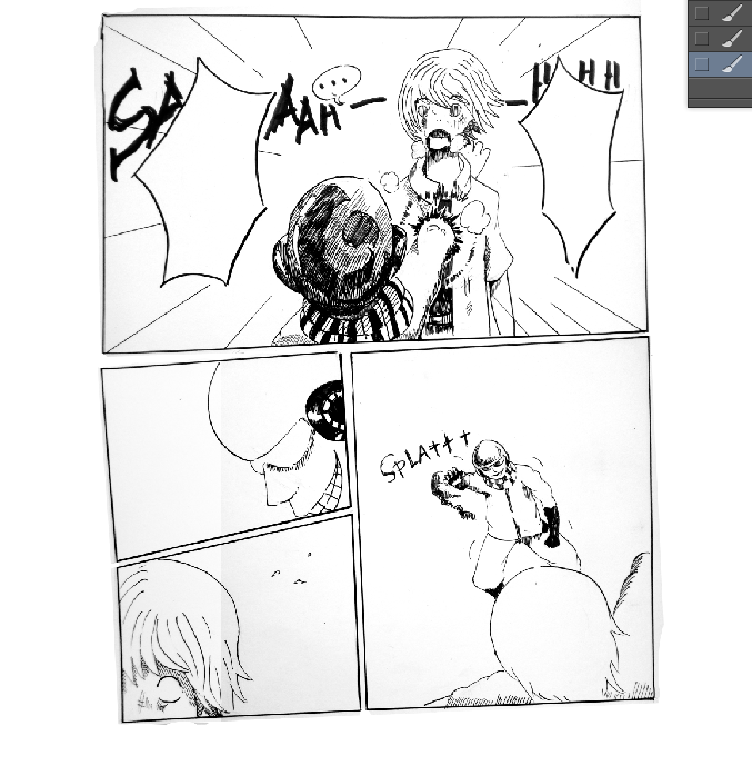
Add a layer.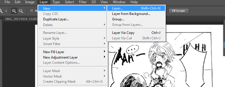
Select again a panel and fill it with black.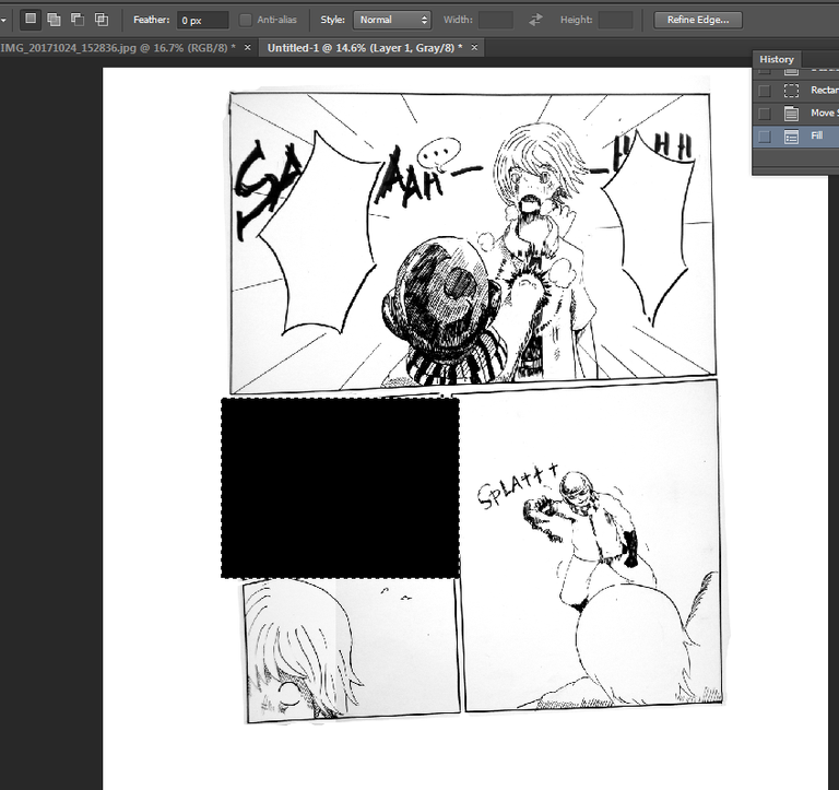
Adjust opacity and the black part should look like below.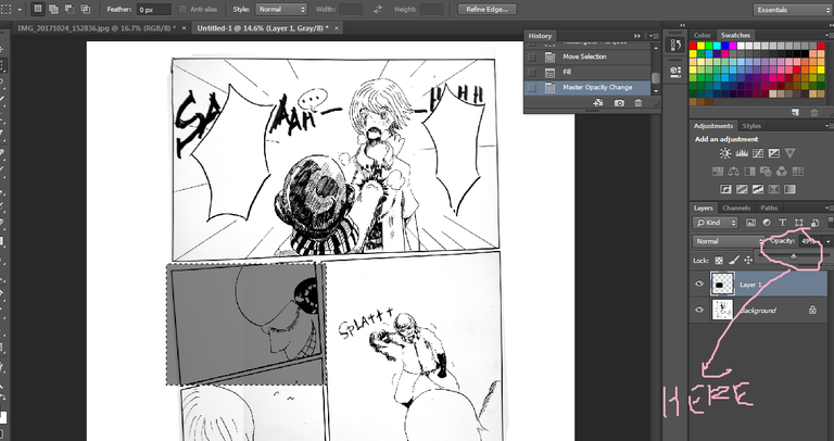
Erase the excess gray tones like shown below. Neat huh?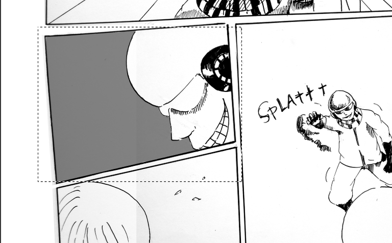 You can use it more like what I did on this panel.
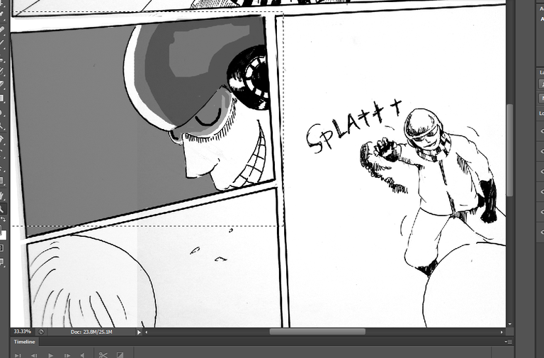
There, almost done! Just need the texts.
I then added the dialogues. Just look for free fun fonts over the net, there are tons of them. Me, I use 1001fonts.com.
So there you have it, a complete comic page. How was it?
Thank you for reading this post! I love you all muah,muah, muah. Steem OWWWNNNN!!!!
Upboated!

Very nice. :)
Upvoted.
This is a terrific post. Thanks for putting in the time to not just make some great art, but share the whole process. I really liked your reasoning behind why you split the panels up the way you did, and how the relative size and shape of the panels impacts the way the art is viewed and emotion it conveys. I think that guy is finished LOL fist through the heart! Glad I found you and happy to follow you @hurricanepike! Looking forward to more :) Cheers - Carl
This is really amazing. Thank you for sharing this. Nice concept and perspective. It really communicate it's message. The process are wow
Congratulations @hurricanepike, this post is the most rewarded post (based on pending payouts) in the last 12 hours written by a Dust account holder (accounts that hold between 0 and 0.01 Mega Vests). The total number of posts by Dust account holders during this period was 2478 and the total pending payments to posts in this category was $1028.79. To see the full list of highest paid posts across all accounts categories, click here.
If you do not wish to receive these messages in future, please reply stop to this comment.
How about some hentai? LOL jk
dozo, sempai
What the... oh
Congratulations @hurricanepike!
Your post was mentioned in the hit parade in the following category:
Nice work on this fantastic post! Not only do you have a good, clean style (no extraneous designs pulling attention away from the action) but your explanations are easy to understand. The "time stop" panels are generally my favorites. Thanks for using a camera method instead of a scanner to transfer the page to your computer.
Thanks for the tutorial!
i like it,
please teach me when