I recently decided that it was a good time to remake my Etsy shop. I get a lot of good feedback about the jewelry I design and make, but so far the photos weren't of really good quality, and I needed to do some serious work on them.
Over the past week or so, I've been taking many photos of my items, using my new lightbox that I'm very happy about, and my Honor 10 smartphone-camera (which is totally awesome). My conclusion is that no matter how good the photos you take may be, if you want to use them commercially, you really have to edit them, at least a little, to make the details pop.
I'll give you an example.
See this beautiful photo, how sparkly everything looks, right? The colors are in the right balance, the tones and contrast are exactly as they should be.
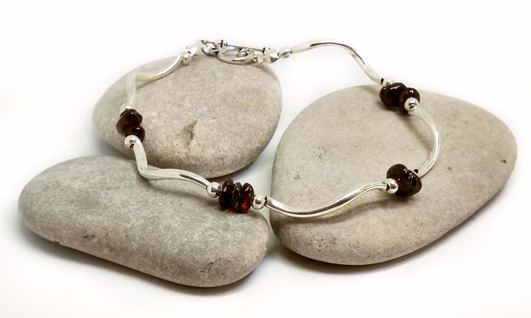
While this is a beautiful photo, it didn't start that way. It started as a nicely staged photo, but with a lot more room for improvement. Want some proof? Here, I'll show you.
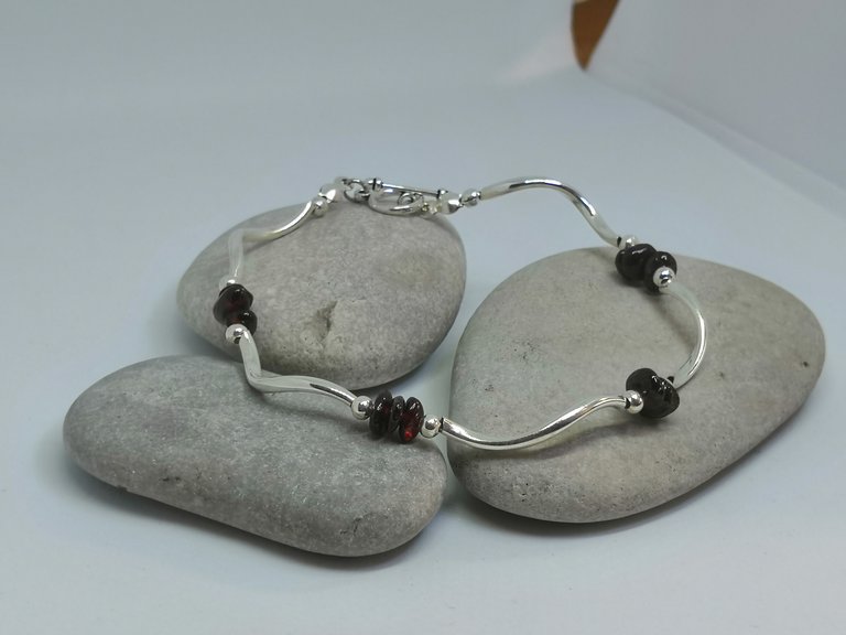
Could you believe that the two photos are actually the same one?
To get the good results that I did, I had to use several photoshop tools that are very useful when you know how to operate them.
The first is Levels, which sorts out, in general, how bright or dark your photo will be.
Then I used Brightness/Contrast to determine the slightly more delicate details.
The third took I used was Color Balance, to get some of that blue away and make sure the dark red looks like it does in reality, and that the colors are... well, balanced. This tool only requires slight adjustments, but you really have to know how to use it, and be prepared for many mistakes at the beginning.
With only slight changes, the Exposure tool helped to emphasize the deep crimson of the stones.
Then, for the grand finish, I added a very weak Photo filter, in the surprising color of dark orange. You can't really see that one, can you? :-)
To wrap up everything, I went over the edges and the background with the Dodge tool, which brightens up slightly darker corners and shades that can make your photo look less beautiful and professional.
This was the basic process. In some of the photos (which I will publish in the near future) I used local healing brushes and some masks to work only on some of the photo, and not on all of is, but that's more advanced stuff.
If you liked this post, please upvote and resteem, and maybe follow me on Steemit, too!
To take a look at my photos (mainly Paris related), visit my Instagram account.
For planning your dream vacation in Paris or France, come visit my website.
Or, if you just want to see more pretty things, go to my Etsy shop and see what I have there for you :-)
And in the meantime – don't forget to have a wonderful day.
Good one and informative for me.
Thank you!
Thanks! I'm glad to help out :-)
Very nice tutorial, thank you :) !tip
Anytime, and thanks for the tip!
🎁 Hi @leurbanexplorer! You have received 0.1 SBD tip from @cardboard!
@cardboard wrote lately about: Cardboard'S Twitter (Retweet With #Share2Steem Test) Feel free to follow @cardboard if you like it :)
@tipU voting service | For investors.
Congratulations @leurbanexplorer! You received a personal award!
Click here to view your Board
Do not miss the last post from @steemitboard:
Vote for @Steemitboard as a witness and get one more award and increased upvotes!