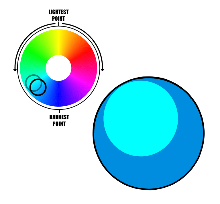
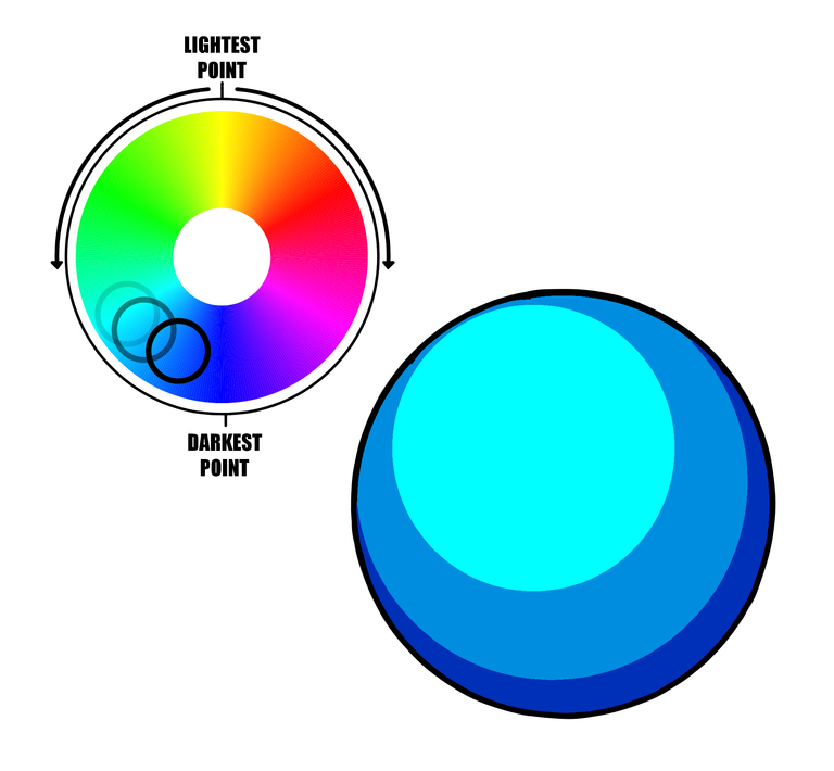
So, there are some different ways of using them, specially, when it comes to shadows.
Literally every element in the art has an important role to make. For example, the light.
There is something you need to have in your mind when you’re making an art and there is colors and light.
Of course, in some way this is something that many people already know, and it’s also something you can find in internet. In my case, it’s something I developed by myself, and now its super easy. But here it goes.
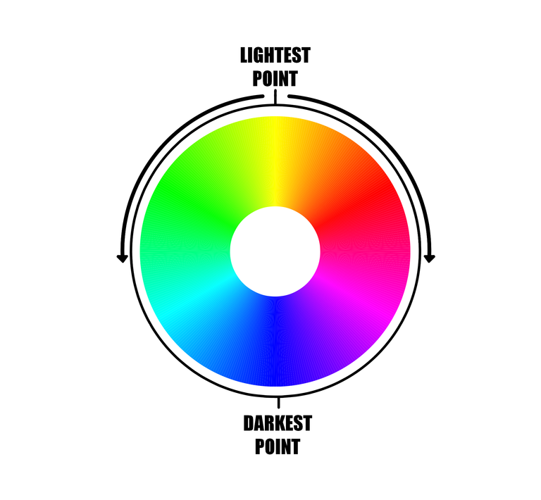
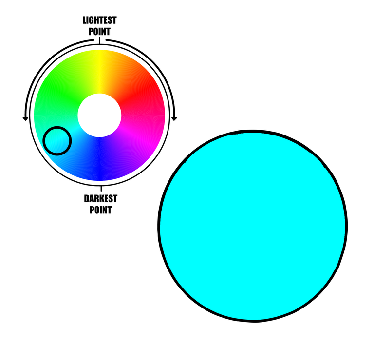
Well. You can see it as a simple color wheel.
But it is also a super simple guide that will help you a lot (believe me).
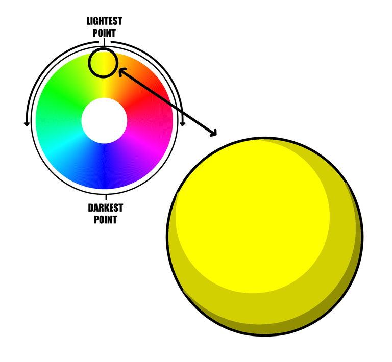
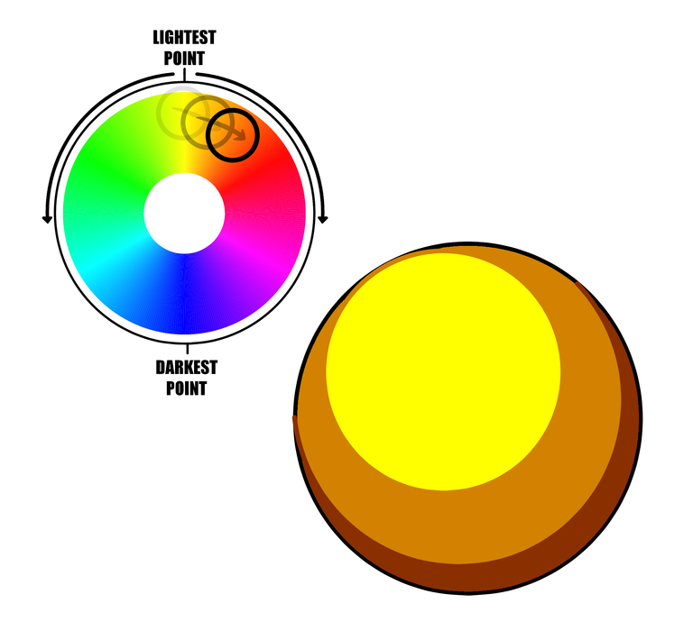
This, ladies and gentlemen, is not the best way of making it. The best way, is using our color wheel.
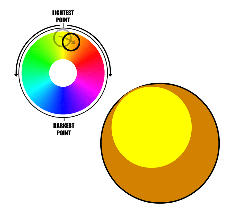
Now our yellow ball has a more pretty shadow, making it a little bit more red, and of course, making it darker in the dark scale.
Congrats, you champions.
Now you know how to give a better color to your art when your shading something
 !
!
Interesting that I've never looked at a color wheel like this. Thanks for the information. Could definitely make some vivid art this way.
Not being a 2D artist I never considered this approach, but that does make a lot of sense. Would love to see a piece using this technique, does anyone have a good example?