
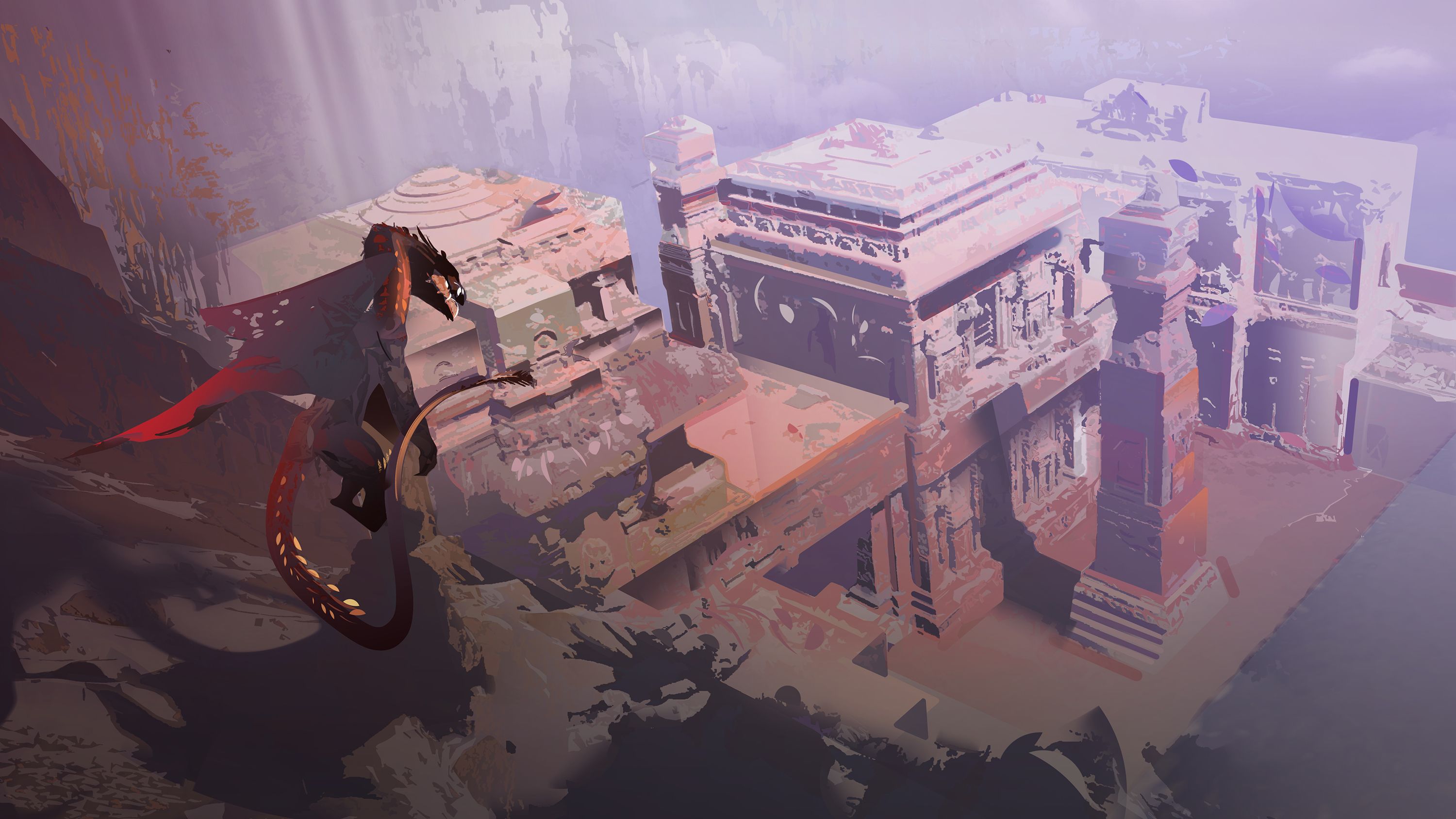

Affacciandosi sulle antiche rovine - Illustrazione digitale
Tecnica: illustrazione digitale realizzata in Adobe Photoshop. Circa 3 ore di lavoro.
Queste vacanze di Natale ho finalmente regalato la Playstation 4 al mio compagno, dopo circa 17 anni che non acquistavo una nuova console. Il primo gioco che abbiamo giocato (e terminato) è The Last Guardian, l'ultimo capolavoro di Ueda, con la stessa linea grafica dei suoi precedenti Ico e Shadow of the Colossus. Rovine antiche con un leggero feeling tra il mesopotamico, il precolombiano e il classico, abitate da bestie enormi. Dovendo fare un'ambientazione per un volantino, mi sono quindi lasciata ispirare.

Overlooking ancient ruins - Digital illustration
Technique: digital illustration with Adobe Photoshop. Done in about 3 hours.
Past Christmas holidays I finally bought my partner a Playstation 4, after about 17 years that i hadn't put my hands on a new console. The first game we played (and finished) is The Last Guardian, the latest masterpiece by Ueda, with the same game design of his previous Ico and Shadow of the Colossus. Ancient ruins with a feeling between Mesopotamian, Pre-Columbian and Classic, inhabited by enormous beasts. Having to paint an enviro for a flyer, I let myself be inspired.


x8ZhzMPErJHjcUEpcm2Zo5ni6Dwf7/1.jpg)
Avevo pensato ad una scena che si sviluppasse più o meno in senso verticale (proprio come The Last Guardian) e volevo una creatura che la dominasse dall'alto. Quindi ho eliminato la possibilità di avere il cielo, creando una griglia prospettica che ponesse lo spettatore sopra la scena. La ragione per cui uso sempre colori molto saturi per costruire le mie griglie prospettiche è per poterle vedere anche a opacità diminuita e per poterle distinguere dal disegno stesso.
I had thought of a scene vertically built, more or less (just like The Last Guardian) and I wanted a creature to dominate it from above. So I abandoned the idea of having a sky, and I created a perspective grid that puts the viewer over the scene. The reason I always use very saturated colors to construct my perspective grids is to be able to see them even at lowered opacity and to distinguish them from the painting itself.

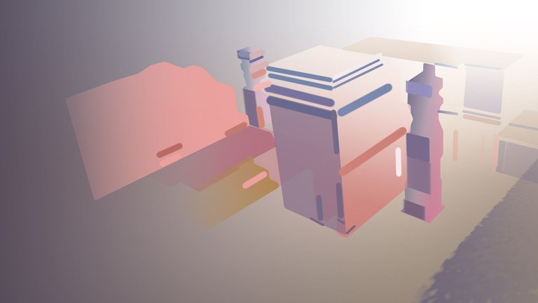
Tenendo aperte, nel secondo schermo, 2 o 3 foto di reference come il mio solito, ho cominciato a posizionare gli ingombri. Quando devo dipingere elementi geometrici, uso spesso una base costruita con le selezioni seguendo la griglia prospettica. Ho anche deciso di usare un colore blu-viola per quelle che sarebbero state le mie ombre e un colore rosa-arancio per le luci.
Keeping 2 or 3 pictures for reference on my second screen, I began to block in the volumes. When I paint geometric elements, I often build a base with selections along the perspective grid. I also decided to use a blue-purple color for what would have been my shadows and a pink-orange color for the lights.

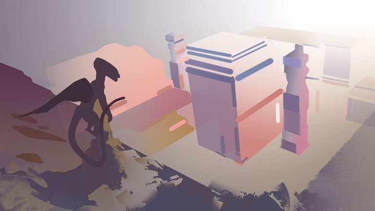
Ho pensato di inserire una cornice rocciosa, con uno spuntone sul quale disegnare un drago, aggrappato. La cornice avrebbe dovuto essere molto in ombra per poterla staccare dal resto della scena. L'ingombro del drago l'ho ovviamente inserito secondo la regola dei terzi.
I thought of framing the scene with rocks, with a dragon resting on a spike. The frame should have been darker, to be able to detach it from the rest of the scene. Obviously, I placed the dragon according to the rule of thirds.

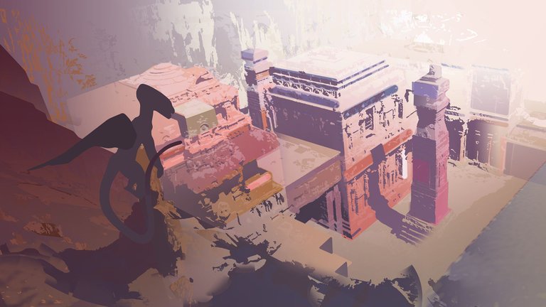
Il resto è stato principalmente un aggiungere texture, pennellate e colori, in maniera abbastanza caotica. Per applicare le texture (magari prese da foto o rielaborate sotto forma di pennelli) uso sempre lo strumento Distorci di Photoshop, che mi permette di posizionarle secondo la griglia prospettica.
The rest was mainly adding textures, brushstrokes and colors, quite chaotically. To apply textures (sometimes taken from photos or saved as brushes) I always use the Photoshop Distort tool, which allows me to place them according to the perspective grid.

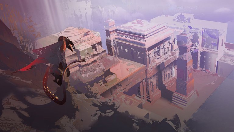
Ancora texture, pennellate e colori fino a quando ho raggiunto un risultato gradevole. Ho deciso di mettere qualche pennellata particolarmente satura sul drago perchè attraesse maggiormente attenzione. Non ho usato lo stesso grado di saturazione sulle rovine per creare un effetto di lontananza secondo le regole di prospettiva atmosferica.
More textures, brushstrokes and colors until I have achieved a pleasant result. I decided to put a few saturated strokes on the dragon, to draw attention. I did not use an equal degree of saturation on the ruins so to create distance according to the rules of atmospheric perspective.
Bellissimo lavoro e tutorial prezioso!
Grazie mille, mi fa piacere essere di aiuto agli artisti in qualche modo :-)
Complimenti, è una creazione che fai apparire semplice nella tua spiegazione, mentre mi rendo conto che è molto complessa essendo anche io un utilizzatore di photoshop (ambito fotografico).
Come dico sempre, è un po' come la matematica... ci sono delle basi da seguire e su cui costruire il resto! Grazie comunque, ora vado a vedere le tue cose!
Certo.. io per esempio, in Photoshop ho impostato delle procedure automatiche di base che applico su tutte le foto che elaboro per lavoro (mi occupo di post produzione).
Hey I love this post so I included it in my weekly curation, you can see it here: https://steemit.com/art/@juliakponsford/ocean-of-art-15-dive-in-and-discover-some-promising-new-steemit-artists-minnowsupport-curation-team
WOW, thank you so much, i'm now going through all the artists you mentioned and following! So much talent. I will keep an eye on your weekly curations!
hey that's so cool congrats! this post is amazing!
I love how you work with textures. I would love to see a tutorial about how you create your texture library, and also where you draw the inspiration for color from.