
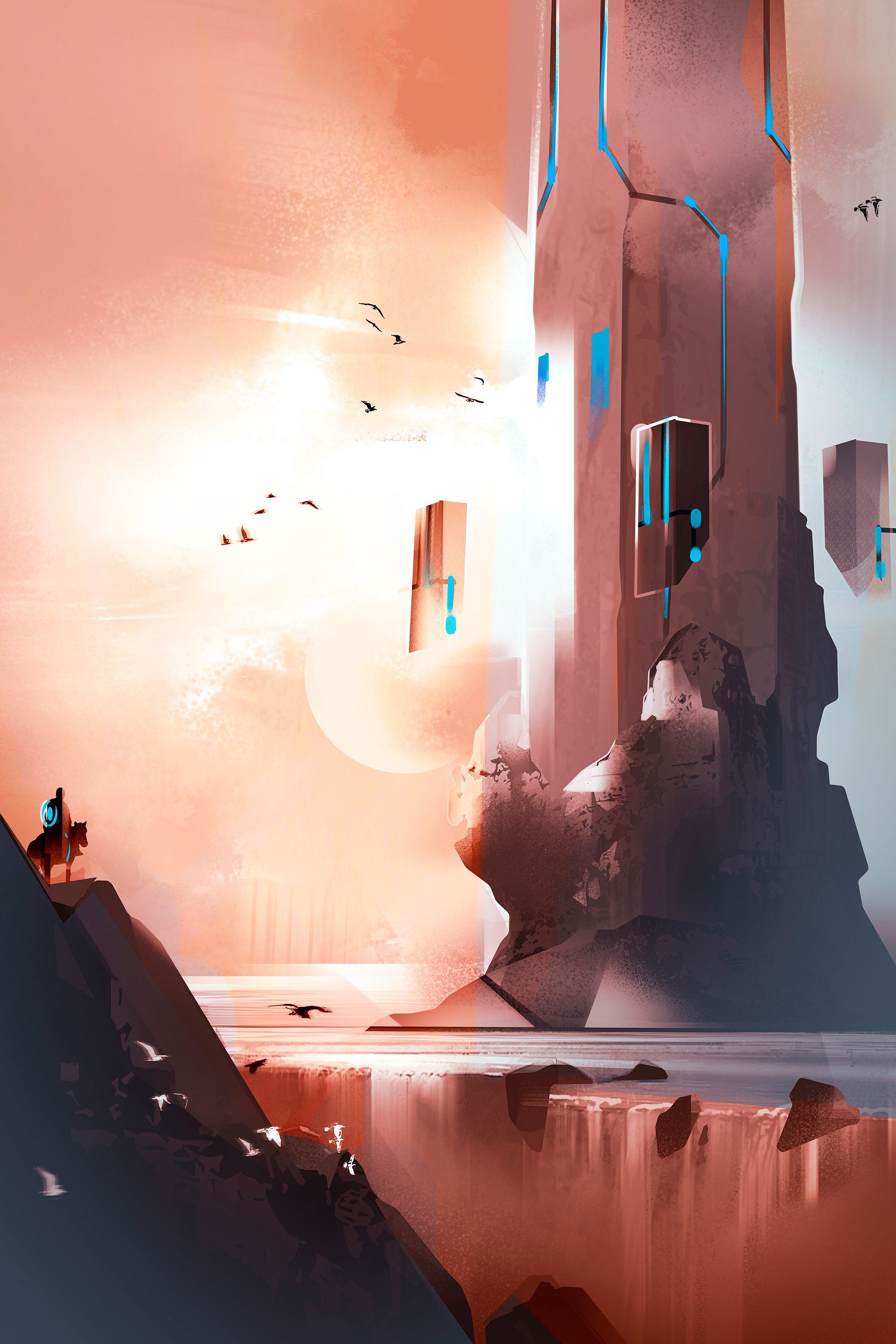

Torre di roccia - Speed painting
Tecnica: speed painting molto veloce in Adobe Photoshop. Circa 30 minuti di lavoro.
Ambientazione fantasy per il Jenny's Art Contest Week #11 di @topkpop.
Mi piace immaginare strutture architettoniche fatte di pietra. Non sono una fan del fantasy classico con castelli in mattoni con merli, bastioni e cinte murarie. Generalmente le mie architetture fantasy sono geometriche e fatte a blocchi di pietra... perlomeno quando sto disegnando direttamente dalla mia fantasia.

Rock tower - Speed painting
Technique: very quick speedpainting in Adobe Photoshop. About 30 minutes of work.
Fantasy enviro for the Jenny's Art Contest Week #11 by @topkpop.
I like to imagine architectural structures made of stone. I'm not a fan of classic fantasy brick castles with bastions, battlements and walls. Generally my fantasy architectures are geometric and made of stone blocks... at least when I'm drawing directly from my imagination.


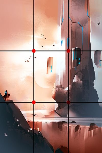
Un modo molto semplice per comporre è usare la regola dei terzi. Consiste nel disporre i propri elementi su un reticolo immaginario ottenuto dividendo l'immagine con due linee orizzontali e due verticali. I punti di interesse sono gli incroci tra le linee, perchè è dove l'occhio guarderà dopo aver visualizzato il centro.
A very simple way to compose is using the rule of thirds. It consists of arranging the elements on a virtual grid obtained by dividing the image with two horizontal and two vertical lines. The points of interest are the intersections of the lines, because it is where the eye will focus after viewing the center.

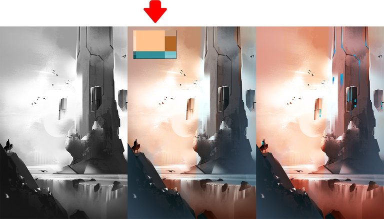
Lavorando in digitale abbiamo il vantaggio di poter dipingere in greyscale e aggiungere colore in un secondo momento. In questo caso ho scelto una palette (in alto a sinistra) contenete colori complementari che ho usato per le luci (colori caldi) e per le ombre (colori freddi). La palette l'ho creata con uno dei tanti siti web che generano schemi colore in automatico, per poi portarla in Photoshop e campionarla con Alt+click. I colori li ho aggiunti creando nuovi livelli e stendendoli con il pennello o con le sfumature. Per fondere il colore con l'illustrazione sottostante, occorre usare i metodi di fusione e sperimentarne gli effetti. Generalmente vanno bene Colore, Sovrapponi o Luce soffusa.
Working digitally we have the advantage of being able to paint greyscale and add color at a later time. In this case I chose a palette (top left) containing complementary colors that I used for the lights (warm colors) and for the shadows (cold colors). I created the palette with one of the many websites that automatically generate color schemes, then pasted it to Photoshop and sampled it with Alt+click. I then added color by creating new layers and laying it down with brush or gradient. To blend the color with the illustration underneath, i used blending modes and experimented with their effects. Generally Color, Overlay or Soft light are good ones to use.
Glad to see you are still posting. Your work is really awesome. The technical tips you give about Photoshop and your process are terrific.
Thank you so much for thinking so, it makes me want to post more :-D at some point i'll try to share materials as well (psd's, brushes, etc)
That would be dope. Like that we can learn a lot from each other!
Really great work. Thanks for sharing the process as well, always helpful seeing how other people go about making their art!
I'm an art teacher in real life, it's my duty to share ;-) Thank you so much. Now i'll go check your stuff out.
Pardon, I know who you are, for some weird reason Steemit said i wasn't following you, although i'm sure i was already. Oh well!
No worries! I've had the same thing happen. Even had the "follow" show on steemdb but still not show correctly on here.
Hey, welcome to steem. I like your work, i'll support you here the best i can :)
Thank you so much, i've followed you by the way!
I just found your profile, excellent work and the tips are nice too! Can't wait to see more of your stuff. Btw I have tried to color greyscale images but I can't make it work.
Mi piace moltissimo il tuo stile! Bellissima mano e grandissimo gusto per la scelta delle gamme di colori!
Thanks for sharing! I love the tips you are sharing and your style is great! Following :)