Very nice! To make the type stand out more, I'd recommend using slightly lighter illustration colors (although I'm assuming your palette is limited with markers). You could also reduce the size of the illustration to give the type more whitespace. The type looks really great though, nice work!
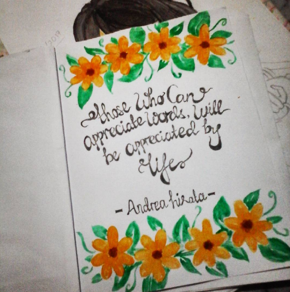
Good attempt. The most important thing in these kind of designs is the balance and it seems you got that pretty right!
Thank Youu xD
Very nice! To make the type stand out more, I'd recommend using slightly lighter illustration colors (although I'm assuming your palette is limited with markers). You could also reduce the size of the illustration to give the type more whitespace. The type looks really great though, nice work!