Laying Out a Poster Idea with @storybird
For this post, I'd like to share my thought process for putting a poster concept together!
Starting Out
Anytime I am asked to create a poster, I like to chat with the requester regarding any preferred formatting, how it will be digested by viewers (print, web, etc.), assets they want to include, what their goals for the piece are, and if they have a particular vision for it already. Requesting to review their past poster designs can be helpful to make sure that you don't go down a creative road that has already been traveled.
Starting Materials
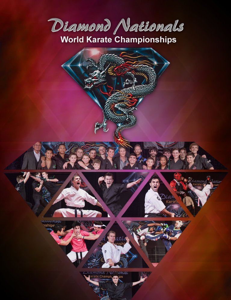
I was supplied with a logo, an array of photographs, and asked to leave room for informational text that would go on the top layer. The poster in this post is what went to the client before the text was included.
Cleaning
My first step is always to clean or correct any assets I receive. For this particular project, I re-did the logo crop they supplied and corrected the images slightly. It's like having clean building blocks to construct something, and the end product will always be more refined if this important step is taken.
The Bigger Picture
My first question to myself was: what is the bigger approach that will frame and communicate the idea in a clever or meaningful way that relates to the client's identity? Is there a way to incorporate the elements in a clean, graphic way? For posters, I like things to be creatively simple.
Breaking it Down
Based on the title of the event, masking images into the facets of a diamond seemed to be an effective way to collage the photographs cleanly and thoughtfully.
The crown of the diamond wanted to be wide so that the group photograph would be centrally visible. Since the crown of the diamond was initially faceted, it cut out the faces of a few people. Though I didn't personally know the individuals, I wanted to put myself in the shoes of someone seeing the poster and possibly being bummed that they were cut out of the image. Merging the top shape was a simple solution to possibly making someone's day better!
For the triangle pieces below, it was important not only to feature the images that were most dynamic but to also play with the placement of each image within the upside-down and right-side-up triangles. This was influenced by the shapes the athletes were forming with their bodies. Sometimes, it takes a lot of playing around with, but it is often worth it when you look at old iterations of the file and notice the improvement that came with just a little extra time and care.
Background
I reviewed the colors that have been used in past years. My gut wanted red, but a solid red felt overbearing and flat at the same time. For this poster, I wanted to create a new color combination for them using a gradient mix of colors with some simple facets layered on at low opacity for texture. I vignetted it a bit around the edges to draw more focus towards the center of the poster.
Thanks for reading, Steemians! I hope this was somewhat helpful! Until next time!
Ca-caw!
You just got a vote from Sndbox-Alpha! For more information, click here
It looks great. I'm thoroughly enjoying browsing your blog and seeing the different aspects to your work. I'm so glad you commented on my post!
I appreciate it so much, @kiwideb! Likewise - I'm so thrilled to find wonderful people with similar interests.