STILL UPDATING WITH ADDITIONAL MARKET INDICES AT TIME OF POSTING.
Everyone's talking about Trump's booming economy. "The stock market is soaring!"
"It's at it's highest point in history. Does that mean Trump is responsible for it and the catalyst?"
Daily, I see and hear folks on social media, the news, online articles, Youtube, and even at coffee shops; talking about the soaring economy and the work Trump has done to make it happen, why he is doing a better a job than Obama. I also hear the inverse, what and why he's not. - It's a hot topic.
There's a lot of mixed opinions and personal feelings behind a lot of what is said, posted, and written. A lot goes into liberal vs. conservative arguments and vice versa; including a lot of data and research. Other times, zero data to back up any argument whatsoever. Tensions soar, opinions overshadow real facts. "Obama had the worst recession recovery in history!" "Trump is riding the market momentum of Obama's coattails!"
Here is an actual example that is based on singular market data research, but could be misleading without all of the proper elements.
Trump has seen a 35 point gain on the NASDAQ in 1046 DAYS compared to Obama's 48 point gain in 8 years, and most supporters believe that economic growth during his term outweighs Obama's, and will continue to do so.
However, when comparing an actual percentage increase of only 1.57% per month for Trump to date vs. a 2.7% increase per month for Obama during his term on the Nasdaq to date; one can see that a 1.1% difference of growth is actually a big deal, and price point increases do not reflect the overall percentage of gains or losses on the S & P 500 for example, or in our economy. This is something that should be broken down, understood, and clarified. We'll get there.
Trump supporters believe he has made the economy soar and done a much better job than Obama; while Democrats disagree and cite historical date from Obama's 8 years in office. Most of the "historical" data people cite is inaccurate.
So far Trump has only served 1046 Days, and the economy has continued to rise- he's fought his way to continued growth- but with the trade war, impeachment hearings, and a recession looming; many wonder how long it will last or if he will be able to keep up the momentum. A bit rocky along the way, but so far, so good. The market keeps pushing up.
However, the data comparison should be measured in percentage gains over each year that reflect overall market performance growth, rather than the number of price points added to each index during a specified time frame. The measured weight of increase is based on the overall market, not just points stacking. I've yet to see anyone break down actual historical market data, from the most traded stock exchanges; to back up the argument for either side.
Most of the time everyone goes about the way they gather data and present "facts" the wrong way. They cite a news media source, a political fact checking site that is partisan or biased, they show a poll, just rinse and repeat a meme, or something they saw on social media, or heard from their friends & family. Most of these studies, charts, and diagrams are usually inaccurate or are often based on skewed data to maintain a political agenda. A lot of people just say, "Look at where the stock market is today, who's in office, and has it ever been this high before? Okay, then. Nothing else to say."
The amount of misinformation out there is outright frightening. I'm about to blow some people's minds.
So, I set out to do some real homework and research unbiased, non-partisan, actual historical market data and real time data for 3 major indices- during the terms of each President. The results are shocking to say the least. I'm only focusing on the existing data that reflects actual performance in the first 1046 Days, then the overall performance of Obama's 8 years, then the hypothetical performance if Trump serves another term- and continues growth at the same rate. I'll go ahead and give myself a +3/-3% margin of error on my data, not that I need it; but I'm sure someone's going to say my numbers are slightly off when they run a price scale and they come up with something slightly different on the 15 minute chart or weekly chart vs. the Daily. Well, I dialed it down to the hourly chart, so knock yourself out- all are accurate when scaled depending on the time frame, and the ratios match from chart to chart.
The reality is real market exchange data doesn't lie when spread out over the last 11 years, 8 for Obama, and 1046 Days for Trump. The growth or decline in major stock indices has always been a strong signal as to how the overall economy is doing. This growth can be measured, by percentage points that reflect the overall market rise, not just price points increase; on a timeline for each presidential term. I am not including jobs figures or GDP. This is strictly stock market exchange data managed and maintained by each exchange.
Price data from major indices reflects how investors feel psychologically about the market, volatility, volume, but also reflects when money enters and exits the market based on global events and real growth or decline.
First, I had to build a hypothesis for how I would gather and present the information. These are the variables I came up with.
I wanted to choose 3 sources of data related to the stock market; data that is unbiased and cannot be manipulated historically.
The 3 major market indices I chose were the NASDAQ, S & P 500, Dow Jones Industrial Average, eventually I will update with the Wilshire 5000, and Russell 3000. These 5 are the most followed indices in U.S. stock markets. If you prefer other indexes, the overall percentage data will almost template on top of each other with regard to the rate of change.
The Nasdaq has more than 3,300 companies and has the highest trade volume of any other U.S. stock exchange.
The S & P 500 shows data from the top 500 companies and is considered to be the best market-capitalization weighted index to review data from. This index is considered to be the most reliable since it groups the top companies.
The Dow Jones Industrial Average includes 30 companies but is not considered by experts to be an accurate representation of overall market performance, compared to other indices. (I included it because it is one index that shows a hypothetically different picture in Trump's favor. You'll see why when I go over it.)
The Wilshire 5000 Total Market Index is a market-capitalization weighted index that shows the market value of all U.S. stocks.
The Russell 3000 Index measures the performance of the 3,000 largest publicly held companies in America, specifically with respect to total market capitalization measurement.
These indices cover everything from farming, real estate investment trusts, insurance, financial investments, technology, manufacturing, to industrial production.
They can be found just about anywhere online, via any large trade brokerage that has charting tools for it's customers, or any well known charting software. The data is pulled from combined historical and live international markets exchange data. You can Google any of these exchanges for more information on them or to see that the data I will present matches the data on those charts.
Where can one source this information and really dive in?
I use Tradingview.com, a charting tool website that pulls data from international markets exchange data. I am not an affiliate marketer for Tradingview nor do I receive a commission of any kind from Tradingview. I have an active Pro Account for trading stock options, forex, and crypto asset charting. The website has tools that allow me to see market information across multiple time frames; while using various tools to plot the price, and determine my trading strategy going forward- with the timeline referenced on the bottom of the chart.
Next, the timeline. Obama entered office the beginning of January 2009, ended at the end of 2016. Trump entered office January 2017. In order to show the scale of the timeline so it will fit on one screen, I chose the 1 DAY time frame. To accurately plot the data I scaled down to the 1 HOUR time frame, placed markers at the appropriate dates and at the bottom of the hourly candle, then snapped back to the 1 DAY time frame to squeeze the image on one screen. Over the timeline on a chart you can see the price change and volatility swings. The tools I use to overlay on the chart, allow me to accurately measure the percentage of change over a period of time.

Then, I use a percentage/price range tool that measures the price, but mainly the percentage of change from the bottom of the candle at the beginning of each starting point, in the time line I want to set it to; and then where I want it to stop. The measurement takes the highest price during the timeline and subtracts the lowest price during the timeline specified, then divides the remainder into the starting price, producing a decimal percentage.
For example: I want to measure the percentage of market rise from the beginning of 2014 to end of 2015.
If The Nasdaq was at 3500 points at the start of 2014 and 4700 points at the end of 2015 the formula would look like this:
4700-3500 = +1200 points change
1200 (point difference) / 3500 (the starting point of the measured range) = 0.34285 X 100 = 34.285%
The range tool measures this formula automatically and displays the result above the shaded box.
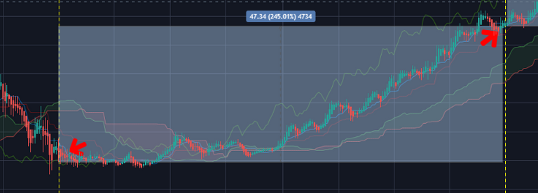
In this example the price range shadow box is grey. At the top of the grey box you can see the number of points in price change over that period, and the percentage of change over that timeline. In the charts you will see a price range green shadow box for increase/gains and red for decreases/drops.
Voila, it's really that simple.
So, now we will do this for each index, and discuss each one.
Starting with the S&P 500
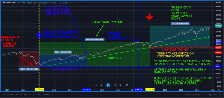
Starting in January when Obama entered office, the S&P 500 (and other indexes) was still in decline, and continued down approximately 20% before recovering 20% back to where the market was when he entered office. However, the most shocking aspect of this particular recession was that from October 2007 until March 2009, the market dropped approximately 57% during President Bush's term and into the beginning of Obama's term, before starting it's recovery. The S & P 500 fully recovered to it's last highest point in in October 2007, by March 2013. The S&P 500 then continued to gain for an overall increase of over 220.14% over the rest of Obama's term. The average comes out to 2.29% per month gain over the term.
220.14% DIVIDED BY 96 MONTHS (8 years) = 2.293% per month.
Trump took office on January 20th, 2017, and per the chart, there is no disputing the steady upward momentum of the S & P 500. It was already gaining, and there is a clear support line set by 2 tests during Obama's term. You can see it very distinctly on the chart. You can also see it test support 2 more times during Trump's term so far.
During the 1045 Days Trump has been in office, he has endured a 20% market drop and recovery that started in September 2018 and recovered by April 2019. In just under 3 years, Trump has seen a fast recovery from a market correction, but there has been no recession event to date, to test the market the way it was tested under the Bush and Obama administrations. Trump has presided over a 70.98% increase in overall gains in 1045 Days.
70.98 DIVIDED BY 1045 DAYS = .0679% GAIN PER DAY
.0679 X 365 = 24.78% ANNUAL DIVIDED BY 12 MONTHS = 2.065%
IF TRUMP CONTINUES AT THIS RATE, HE COULD REACH 99.12% GAIN OVER 4 YEARS X 2 = 198.24% IN 8 YEARS.
He would have to maintain a steady growth of .0679% daily to reach this figure.
At the current progress and momentum, if we just use current annual rate of S & P 500 gains; Trump would be almost within 20% of attaining the S & P 500 growth seen under Obama, but would NOT reach 220.14% of overall gains, to match the gains made during the term of Obama.
However, there is still a year and 2 months to go to reach the 4 year mark, and if re-elected, there will be 4 more years of data to compile when his term is finished. He could very well match or exceed Obama's figures, but it will be a challenge he is confident to take on. As it stands currently, the data shows he is still behind in the first 1045 Days in office compared to Obama, and can't take credit for the starting momentum of the S & P 500 when his term started. The market data clearly shows it was already bouncing along support created and tested during Obama's term. Support was tested first on October 4th 2011 and January 19th 2016, the day before Trump took office.
Trump has not yet reached the percentage of gains, of his predecessor; during the same 1045 Days. He has presided over steady growth, with almost exactly the same amount of market correction (-20%) when comparing percentage of market drop. Although, the correction was at a much steeper rate of decline, 593 points lost during the correction in 2018 vs. 315 points (Obama's largest loss on the S & P 500) lost during the last weeks of Obama's term. Trump presided over a much faster recovery from that correction, in fact; just 7 months. It took Obama 4 years to bring the S & P 500 back to the point it was during the Bush Administration in October 2007, before the recession. Not only did Obama enter office during a recession, he presided over a full recovery in 4 years, and over 200% growth of the S & P 500 in 8 years.
While many will try to dispute this, the numbers don't lie. This may not be impressive to Republicans because of the previous records of other Presidents that presided over the many recessions or The Great Depression; it is important to remember "The Great Recession (during Obama's term) was the worst financial crisis in the United States since the 1929 Depression. It also was the longest-lasting: from December 2007 to June 2009. The subprime mortgage crisis was the trigger. That created a global bank credit crisis in 2007. By 2008, the credit crisis had spread to the general economy through the widespread use of derivatives." (Credit: KIMBERLY AMADEO U.S. Economy Expert for The Balance https://www.thebalance.com/the-history-of-recessions-in-the-united-states-3306011)
Trump has not had anything of this magnitude to contend with yet during his term. For the rest of the index data, I will just show the numbers by comparison.
Now let's look at the NASDAQ (NDX)

Trump's Nasdaq Index Numbers:
STILL SERVING FIRST 4 YEAR TERM. ONLY 1046 DAYS OF ACTUAL DATA AVAILABLE.
112.58% ACTUAL GAIN IN FIRST 1046 DAYS IN OFFICE
112.58% DIVIDED BY 1046 DAYS = 0.1076% PER DAY
0.1076% X 365 DAYS = 39.27% ANNUAL
39.27% DIVIDED BY 12 MONTHS = 3.273% PER MONTH GAIN
3.273% PER MONTH GAIN X 96 MONTHS = 314.21% GAIN POSSIBLE (HYPOTHETICAL) IF MONTHLY GAIN STAYS THE SAME.
Obama's Nasdaq Index Numbers:
355.31% ACTUAL GAIN OVER 8 YEARS. 355.31 / 96 MONTHS (8 YEARS) = 3.70% PER MONTH ACTUAL GAIN OVER 8 YEARS.
181.34% ACTUAL GAIN OVER THE FIRST 1046 DAYS IN OFFICE
181.34% DIVIDED BY 1046 DAYS = 0.173% PER DAY
0.173% PER DAY X 365 DAYS = 63.145% ANNUAL
63.145% ANNUAL DIVIDED BY 12 MONTHS = 5.26% PER MONTH ACTUAL GAIN TO DATE THE FIRST 1046 DAYS IN OFFICE.
181.34% Obama - 112.58% Trump = 23.875% (First 1046 Days)
As of today Trump is 23.875% percentage points behind where Obama was in his first 1046 Days in office on the Nasdaq.
Now let's look at the Dow Jones Industrial Average Index (DJI)

Trump's Dow Jones Industrial Average Index Numbers:
79.71% ACTUAL GAIN DIVIDED BY 1046 DAYS IN OFFICE = 0.0762% PER DAY X 365 DAYS = 27.81% ANNUAL
27.814% DIVIDED BY 12 MONTHS = 2.3179% PER MONTH ACTUAL GAIN TO DATE.
2.3179% ACTUAL GAIN PER MONTH X 96 MONTHS = 222.52% GAIN POSSIBLE (HYPOTHETICAL).
Obama's Dow Jones Industrial Average Index Numbers:
184.39% ACTUAL GAIN OVER 8 YEARS.
111.67% ACTUAL GAIN IN 1046 DAYS
111.67% DIVIDED BY 1046 DAYS = 0.1067% PER DAY ACTUAL GAIN
0.1067% PER DAY ACTUAL GAIN X 365 DAYS = 38.95% ACTUAL ANNUAL GAIN OVER FIRST 1046 DAYS
38.95% ACTUAL ANNUAL GAIN DIVIDED BY 12 MONTHS = 3.25% PER MONTH ACTUAL GAIN
111.67% Obama - 79.71% Trump = 31.96% (First 1046 Days)
As of today Trump is 31.96% percentage points behind where Obama was in his first 1046 Days in office on the Dow Jones Industrial Index.
(What I'd like to invite from readers in the comments, is what do you think Trump is doing to specifically to fire up the economy and keep it rising, and can you help provide statistical data or research to help support it with facts, other than the tax cuts. It is clear that the majority of tax cuts have opened up the economy for the upper class to invest more money, and corporations to hire more people and invest more because they pay less in taxes in some cases, especially since minimum wages have been increasing. This has created jobs and investment opportunity, but is there another cost or elephant in the room we are missing? What is the Catalyst for the "booming" economy?)
Congratulations @kryptoking1! You have completed the following achievement on the Steem blockchain and have been rewarded with new badge(s) :
You can view your badges on your Steem Board and compare to others on the Steem Ranking
If you no longer want to receive notifications, reply to this comment with the word
STOPVote for @Steemitboard as a witness to get one more award and increased upvotes!