this is a log level chart of the total crypto marketcap over the last year: 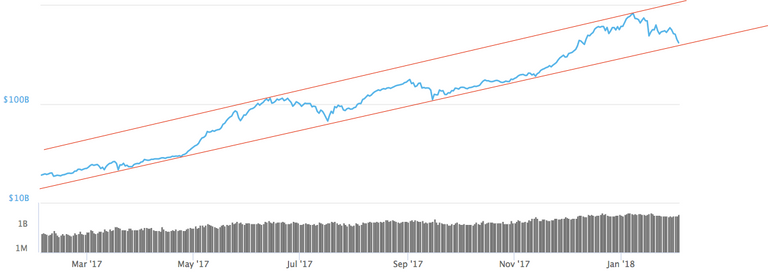
To me that looks just like a healthy correction and no bubble burst. What do you guys think?
You are viewing a single comment's thread from:
this is a log level chart of the total crypto marketcap over the last year:
To me that looks just like a healthy correction and no bubble burst. What do you guys think?
I think that is the most beautiful chart I have ever seen - thanks for the perspective :)
Beautiful
Can I please get that full size buddy? Edit: dw - it's big if I copy link :)
I'm new on steemit, so I don't really know how to post it differently than i did. Or what exactly do you mean by full size?
It's all good, Steemit just makes comment pictures heaps small, but if you right click on them and copy they come out full size :)
Got it :)
that's because it's a cut out from https://coinmarketcap.com/charts/