
I am sure that many of you are using MS PowerPoint in your business life to attract your clients or managers to tell your story. As a past consultant, I saw many bad presentation styles and I don't like them. People are lost me during their bad style presentations. I have couple of methods and I want to share them with you. Of course, it's very subjective but I love them and may be you will like it too.
What is bad styling presentation ?
There are couple of features of bad styling presentation for me.
- Wrong colors
- Absence of photographs
- Default charts and figures
- Using too much icons
- Using free shutter stock images (oh please don't use business hand shaking thing)
Also I love presentations with wider templates like 16:9 or 16:10
Actually above entrance is a bad styling for me. Default template, small screen, bad coloring (sure it's depend on your content)
Let's make a simple example and with that, I want to show you some of my strategies. In this examples, I use images from Pixibay and it's totally free for commercial use.
I uploaded some examples to my file.army profile and you can download any of them.
https://file.army/mertbarbaros
In this post, let's make a presentation for fashion e-commerce store and let's say we are a marketing consultancy company. Content is not much important for now
Entrance
I love dark colors and overlays. However, this industry generally love colorful images to attract their customers specially if they are providing goods to woman.

Using a simple and mono color images with simple objects (in this example a woman) is a good idea. But may be you want some serious thing like:

So, use overlays. It's so simple. Just create a rectangle and arrange an opacity (I choose %50 in this example) Overlays are so good to combine images and texts. Some of my friends are thinking them making a mask like this to all of this image is better because this one is colorful. Yeahhh, you can consider that too.
Section Screen
If you will use sections, you should create a section screen for your great entrance to that chapter. (I'm gonna pass all the index screens they are so default and good )
If your presentation is not public and confidential, I think with a good quote, using Behance portfolios are pretty good idea. In this example I use the artwork of Pierre Grenet Photography / AD / 3D Astoriastudio you can check their artwork on Behance

Again overlay at the bottom and just a simple bottomLine. By the way, you can always change your overlay. Color, shape, opacity... Any thing, it's so good!
Content Page
OK, let's start with simple ideas. Don't use too much text, make your content page as clean as possible. You can combine icons and images or just use images. Personally, I don't like pages with only icons.
You can always check nounproject.org for great icons. For creative commons it's free but for commercial use, You should pay the price to designer.
In this example I used the art work of Mercedes from Behance again. You can check it from:
https://www.behance.net/gallery/58340143/Portraits-for-Stylist-magazine

In the above example, I used combination of some icons and the image. Good looking images will attract your audience in the saloon. For the same simple content, let's use different design and put the image to the middle of the screen with resizing and clipping.

This sweet kid is from https://www.behance.net/gallery/43245261/nalle art work. Using in the middle of screen needs little bit adjustment. I just copy that image and clip it then resize de background. It's done.
Also in the above example, I want to talk about using data a little bit. If you will show 3 or 5 killer data don't put the whole table or graph. It's very good to use the number and the content like this.
Charts
You can make pretty much every design with MS Excel to your charts, and graphs. There is a game changer book about it called Storytelling with Data. I definitely encourage you to buy this book and use those techniques. Here is the Amazon Link:
https://www.amazon.com/Storytelling-Data-Visualization-Business-Professionals/dp/1119002257

In this type of data, highlight the killer point like this.
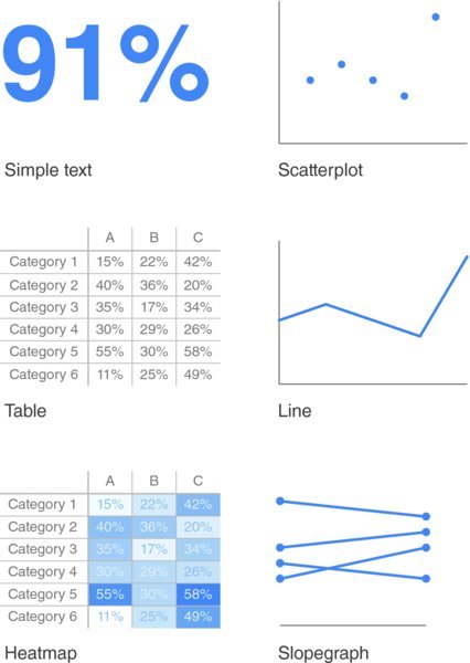
I took those screenshots from Google. In this case, I want you to focus on HeatMap section, many of people are using using tables like this and It's so complicated. If you will use the heat map technique to show your points, it's gonna be better looking.
Of course, there is an animation part. Too much animation is not good, but if you will use properly, it will make your presentation so cool. May be in the future, I can make video about animations. Also in the next section of this series, I want to talk about cinematographs. Actually they are gif images and you can make them via MS Powerpoint. I guess everyone likes to reply with memes. But how can you make it yourself in MS PowerPoint?
Shortly, useful links:
www.behance.net
www.nounproject.org
www.pixibay.com
https://file.army/mertbarbaros
ENJOY!
This post has received a 0.24 % upvote from @drotto thanks to: @banjo.
Thanks :)