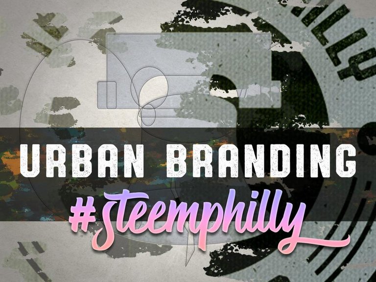
Philadelphia is the birthplace of America. It's also the home of a local chapter of Steem users who do their part to grow and support the Steem community.
@yabbapmatt (who is one awesome dude and deserves your witness votes) asked me to create a branding identity that proved worthy of the gang in Philly. I excitedly accepted the challenge, and what I'm sharing with you is the final result from that journey.
I didn't need to do a whole lot of sketching since we already knew that we'd probably be integrating the Liberty Bell. I also figured we'd want a touch of hipster, a healthy dose of urban, and the feel of something...historic?
I started off by constructing the iconic symbol that would take center stage. The Liberty Bell is a powerful shape that represents freedom and action. It was important that it remained recognizable at any size. Basic geometric shapes were utilized in creating its form.
Next came the surrounding container, a thick border that displays the name of the group while also making reference to its purpose and year of establishment. The overall look and feel was intended to give the subconscious impression of a city manhole cover. Whether you think of a city, a town, a metropolis, or a neighborhood, what they all have in common is a sense of people moving, people building, perhaps creating something great.
The circles on either side give it a sense of balance and strength, as if the design was carefully crafted together and permanently locked into place. Three, curving parallel lines on both sides were reflective of the three wavy patterns of the Steem logo.
Speaking of which, it only made sense that the Steem logo rested at the peak of the border to remind members of the organization's ultimate purpose.
Colors are shades of red and blue for obvious reasons.
The typography was selected for its strength and character (inside the logo) and for its sense of team and pride (in the case of the hashtag text).
It's always a good idea to design with an understanding of what the branding will appear like on both dark and light backgrounds. Always remember to test the effectiveness of your design in both environments. It will save you heartache down the road.
I'm thankful for the opportunity to contribute to the cause (even though I'm all the way in California). Hopefully, someday I'll be in the area so I can hang with the Steemers in Philly! In the meantime, those of you who are closer to that part of the country should go check them out. I bet you'll have a blast!
Hop on over to @steemphilly, follow them, and mark their next meet-up on your calendar!
If you want to read more stuff like this, follow me too!


Amazing
Thanks!
Congratulation nateaguila! Your post has appeared on the hot page after 4min with 4 votes.
Amazing post.. Kudos
Thank you!
New work. It's great! There were no publications for a long time. How are you?
Thanks. I've been so busy lately. But I'm gonna try to get back in the Steem posting groove again!
Great design!! Love the colours used and the typography
Hola realice una ilustración sobre jake the dog de la seria adventure time, creo que te puede gustar aquí te dejo post
https://steemit.com/spanish/@chuchoafonso/adventure-time-jake-el-perro-tatuado-diseno :) un abrazo grande
Thanks so much for making it for us, really makes things official! :)@nateaguilla you did an absoluetely awesome job with this logo! I was so thrilled to see this when Matt told me about it. Really enjoyed seeing the behind the scenes look at its production.