This was a really fun one to work on because I wanted a really colorful rugged character! I may push the boundaries on my next piece as far as costume and design is concerned but I am also into the Star Wars Alien esthetic so keeping the alien head look is also fun. The head is also where people most associate with a character being an alien so it's a simple solution. Like the previous post I will give you another set of steps I took to create this character!

For a while I struggled with backgrounds because I never really thought about how important grounding the character and giving them more context really was. Now I find that they are essential to the character's design! This background came together fairly quickly but I had given myself some time to think about it after finishing the main character. I sat and thought about where I could possibly see this character as far as what would make the most sense. I thought about several options such as a strange lab-like room with oddities in jars with stone walls, a strange alien forest with lots of fog, but I ended up placing my character in an alien cantina. I guess it's the Star Wars fan in me that took over.

This is the result after finishing the background and slightly altering the values on the character to best set him in this environment! I also love the more dimly lit environment with areas of light that put the character in a more dramatic lighting scenario.

For those of you who may struggle with color, this may help you! I try to start off my digital coloring process by figuring out my palette just as I would with a physical painting! The reason why this is important is that it allows you to plan out your color values as well as establish color tones that will ultimately give your painting it's mood!
I really wanted this character to stand out by giving him a vibrant teal or aqua skin tone that contrasts well with his costuming and environment which will be warmer tones!

After some pushing and pulling of warm and cool tones both on the character as well as in the environment, this is what I came up with. Of course, with the warmer lighting, I had to give it a wash of warmth for the final image as well as some value adjustments which is the image you see at the beginning of this article! Again, if you have any questions, I'll do my best to answer them as promptly as possible! Thank you for reading and I hope to hear from you!
Amazing. He looks alive. The colours are awesome, and his face tells quite a story of hardcore adventuring. Great!
Thank you so much! The color of the character was used as a focal point as a contrast to his environment!
It worked out splendidly :)
WOW!!! This turned out great! Omgosh, we need to show you how to livestream.
Thank you! I’d love to learn!
U put too many details on it. It looks so real!
Thank you very much!
Love everything about this Bryan, really like the wrinkly blue skin and the alien jewelry is great design as well. Great post!
This post was shared in the Curation Collective Discord community for curators, and upvoted and resteemed by the @c-squared community account after manual review.
Wicked design! What an awesome creature, totally love all the details you put into his skin :D
Thank you very much! It is always fun doing the details! I was inspired a lot by elephants and reptiles by how textured their skin is. Nature is always my inspiration!
Wow really awesome @bryanpolitte!!! 🎨
👏👏👏 🔥
I´m totally in love with that handsome guy ♥ I really want to see his ship and his crew as well!
🎉 Congratulations @bryanpolitte! 👏, your amazing Artwork has been selected to be featured in my curation post.

😍 No words needed 🔥
He is a very cool character; plenty of personality.
I do hope you come back and post more.
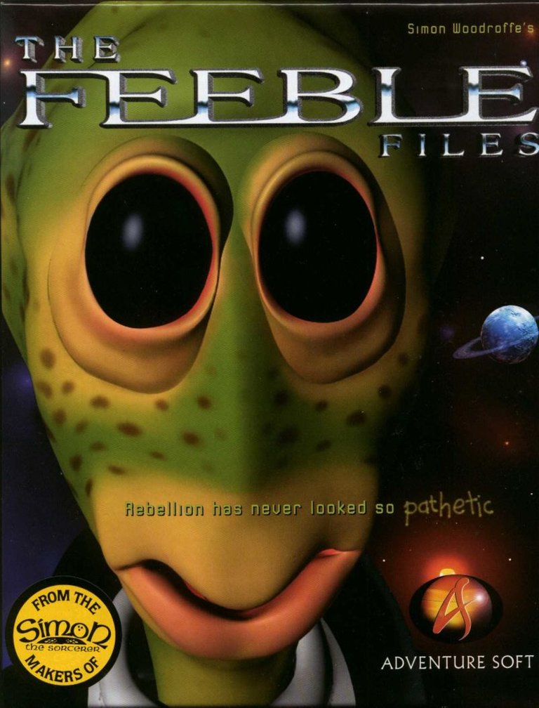
It reminded me of this old compter game, FEEBLE. About friendly alien. This kind of game that gets stucked in half and U spend hours trying to fix it and dying to finish the game. If U know what i mean :).

Congratulations @bryanpolitte! You have received a personal award!
Click on the badge to view your Board of Honor.
Do not miss the last post from @steemitboard:
Congratulations @bryanpolitte! You received a personal award!
You can view your badges on your Steem Board and compare to others on the Steem Ranking
Vote for @Steemitboard as a witness to get one more award and increased upvotes!