by @bryan-imhoff via @spottyproduction
art & writing by Bryan Imhoff
originally published in Seer: Round One
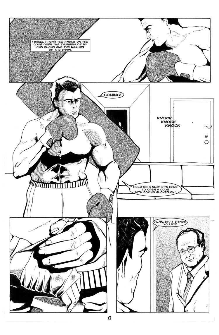
James' morning workout is interrupted by a visitor. Another one of the earliest comic pages I ever produced. It doesn't hold up that well to scrutiny, but it's still fun for me to see all this time later.
This is the first time this story has been available online in a number of years. If you like what you see, please support Seer and @spottyproduction to facilitate the production of future issues!
Spotty Production is proud to re-release it's earliest tale, Seer. You can read about it's history and plans moving forward in this announcement post. "Round One" is a full length first issue, following on the five page introductory story "Perceptions." With "Round One" Bryan Imhoff took over both writing and artwork on the tale.
Love it! Let me know if you ever need any PhotoShop coloring for your work! I'd be happy to collab!
Thanks! And I may just take you up on the offer one day!
Getting some distinct manga vibes here!
I can see it, but it definitely wasn't intentional! More a byproduct of limited art skills... (not to say that good manga isn't good art of course!)
I'd guess the dot tone type shading has something to do with bringing manga to mind as well. Very similar to how you're approaching the color palettes on Ithaqa, I was going to shift to blended greyscale at a certain story point. Of course nowadays I wouldn't be limited to black and white, so would probably do my best to use color effectively instead!
I think you're right, the dot shading is what really evokes manga for me haha. I can't speak to comicbook creation (yet) cause I'm still just a no0b, but in film making your limitations as an artist often lead to the most creative solutions.
"Jaws" is a great example since the robot Spielberg had built for the film broke/looked fake so he had to go back to the drawing board and make a film with tension that hid the shark as much as possible, thereby making it a way better more frightening film.
Perhaps intentionally using a limited color pallette makes your work a little more creative for similar reasons?
The next panel:
I can't get the little manga comment out of my mind now that I read it and re looked because I do see it a little. At first I thought it was the eyes or clean finished line work, which it could be, but I think it also might be the killer shading and dark choices used all over.
Ha! You are absolutely spot on... I was indeed using Jason Alexander as a physical reference for Alan. I should have just named him Art Vandalay and been done with it!
You may also notice the layout of James' apartment is a bit similar to the Seinfeld set too! Envisioning a simple stage setup like that helped me block my shots when I was starting out.
Definitely a smart idea to have like blueprints you are familiar with in your mind of a real place before that pencil even hits the paper.
Random: There is not enough Soup Nazi comic book style fan art.
We may just have to remedy that here on Steemit...
So I was brainstorming and
I forgot my brain
Perfect! You should lobby for a Trial by Comics competition with a Seinfeld theme!
I say why wait
thanks for sharing keep it up