My husband is currently an active duty Marine with 5 years left until retirement. What does he want to be with he grows up? A farmer. So we're getting a head start. Hop vines take about 3 years to reach their full potential. So this Spring we're building a 1-acre hopyard and seeing what this whole "farming" thing is about. ;)
In Virginia, the micro-brew industry is exploding, and the source of locally grown hops simply can't keep up. In fact, in 2014 there were only 25 acres of hops grown in all of Virginia.
In fact, when we were at a locally brewery last year we ran into the owners of Old Bust Head, a very popular local brewery (although possibly too big to be called a micro-brewery). We mentioned we were planning on growing hops and he excitedly interrupted us and said he would buy our entire supply. We had to laugh - it was a good sign that we had interested buyers before we even had any hops!
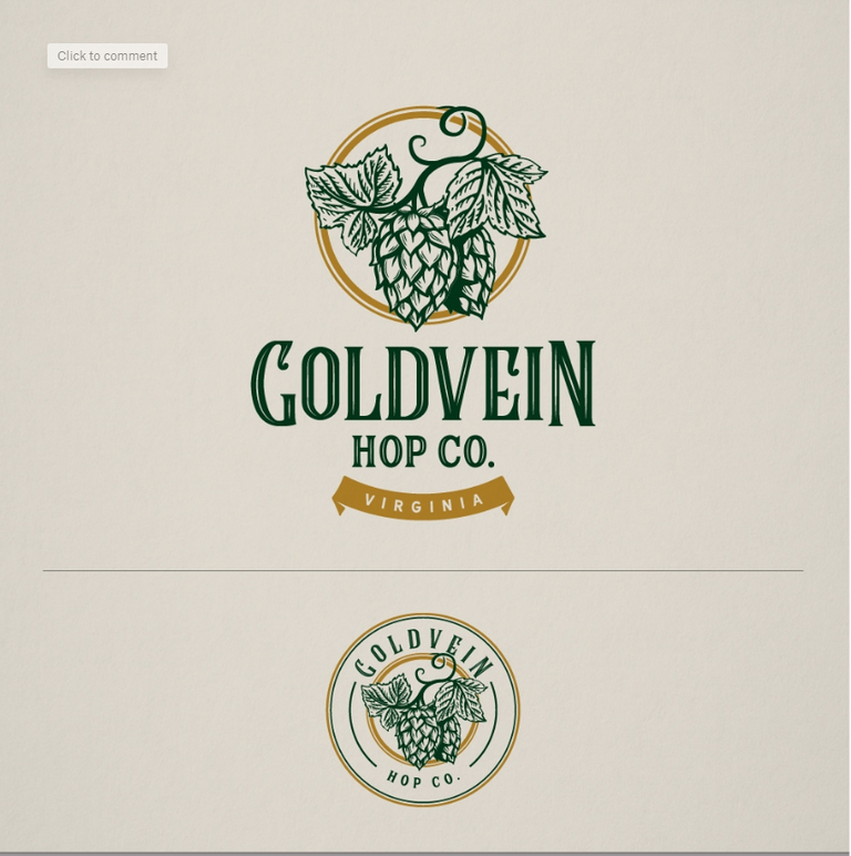
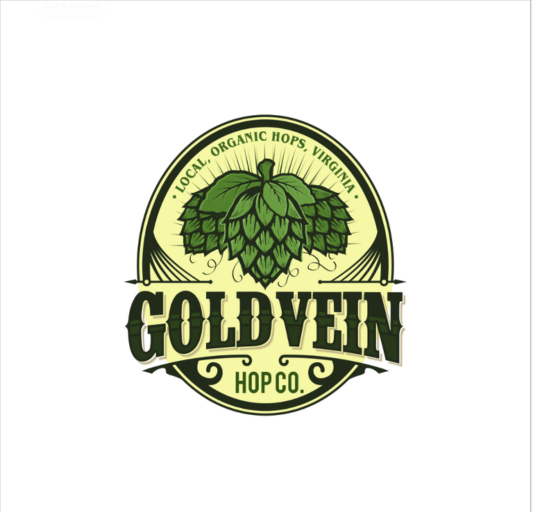
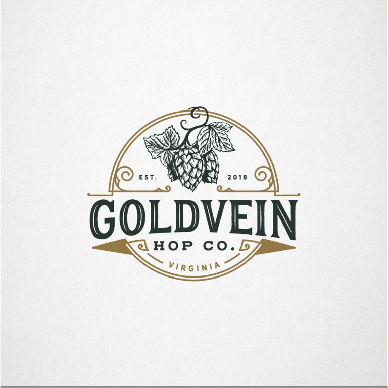
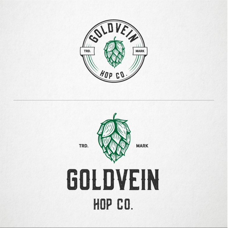
Anyhow - we've started construction on the hopyard (pictures in a follow-up post), but before we get started, we need a logo!! We've worked with a site called 99designs who pitch our logo to their database of designers. We've selected our top 6 favorite, and now need to select a winner! But it's proving to be super difficult! All of these designs are GORGEOUS - so we're asking for your help!!
Comment below with the number for your favorite logo to help us choose! Whichever one gets the most votes, we'll select!
LOVE THIS!!!
If I were choosing, I'd be torn between 2 & 3... they both have a finesse and classic feel to the logos! After looking a second then a third time.. I would pick #3. I like the eloquence of it for some reason.
Number 3 and number 6 I think are my favorite...but then I also love number 1!!! UGH
I love the simple elegance of number 3. :D
Number 3
Mirrors the classic shape for a ‘pump-clip’ and is a lovely design (as they all are)
I think I like Logo 5 best.
My fav is number 3!
Logo #1 and #6 catch my eye the most, and seem the most appealing to me. I have an obsession with logos, I frequently will take pictures of ones that I like, and I could see myself taking pictures of those 2. They have a classic yet modern, clean and vintage feel to them. Very nice!
Thanks @youngwildfree ! The worst part is that each of the finalists have submitted multiple variations on their original logos...making it EVEN harder! Gah!
#1 #4 #6 are awesome!
I would love to say that Virginia is really moving forward in the HOPS business! I love that you mentioned Old Bust Head their near my hometown! I now live in the mecca beer brewing area of Virginia in Charlottesville! If I had to make a choice on your logo I would pick Logo 1 as it is classy looking and its green and gold colors are appealing to my eyes!
Cheers,
Robert
@underthekiltfarm
Where's you're hometown?? We're obviously in Goldvein, VA :)
My home town is Manassas!
Nice! Super close by!
For me its the 1...
But all are truely very good.
Holly cow normally when I see these its quick to say which logo I like best but WOW! These all look super awesome!!!
I think 3 and 6 are my favs they just look like they should be on a bottle and belong to a brewery.
Thank you as well for your service!
Right?? I wasn't expecting it to be this hard!! And you're very welcome...hubby's a damn fine Marine and loves his job.
Number 4 & 6 are my favorite! 😃
Three and five are pretty darn cool. I'd say you cant go wrong with any of them though.
Very cool! I absolutely adore #2. :)
I like #2. Great colors, clear communication of information.