A new post with #covid19 mortality data visualization.
Before we get to the graphs, let's discuss in short what we are visualizing. There are a few changes from previous days.
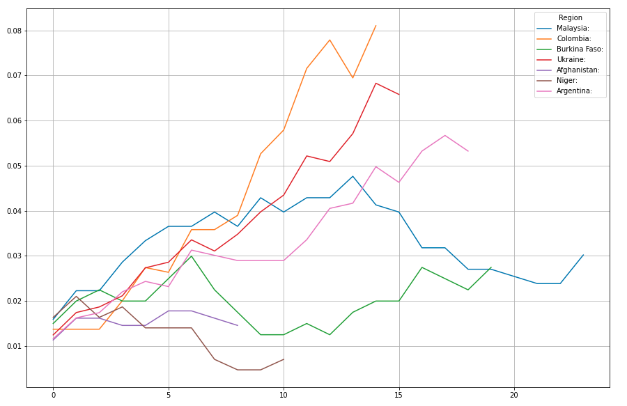
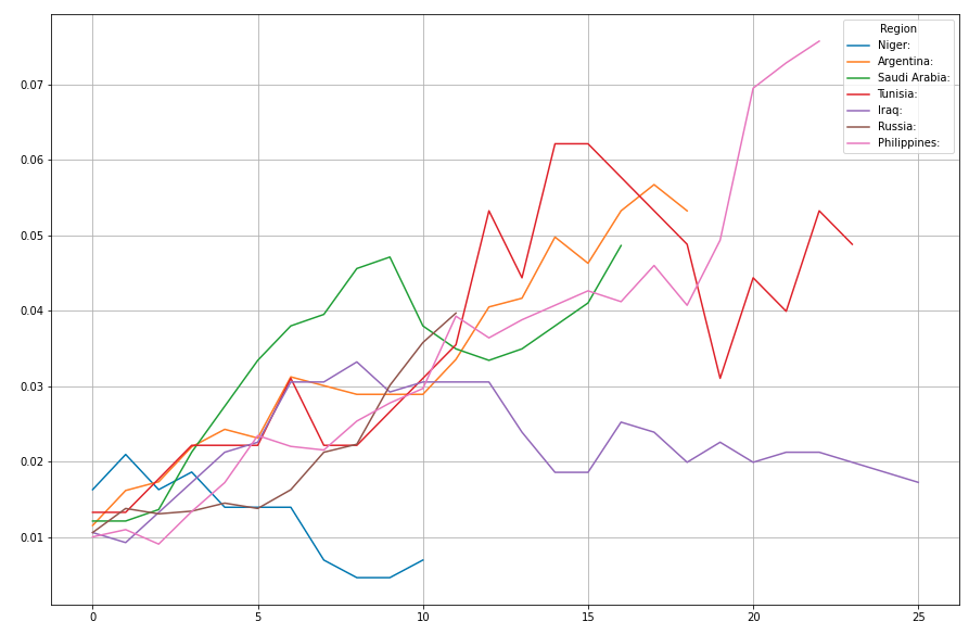
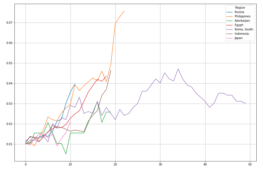
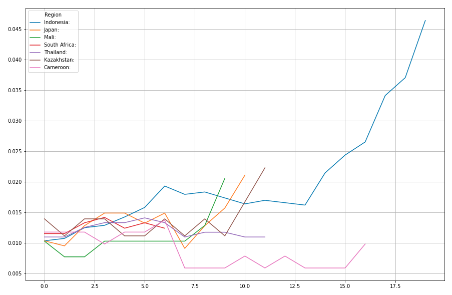
- The graphs below show per-day seven-day-average mortality rate.
- Mortality rates are normalized to deaths per thousand people per year
- The data is re-anchored to the first day the mortality rate in the country or region exceeded the equivalent of 0.01 deaths per thousand per year.
Note: Up until yesterday we used 0.1 as anchoring point. - If the 3th corona death was less than two weeks ago, the country or region is not shown.
- Countries and regions with less than 10,000,000 people aren't shown.
Note: Up until yesterday we used one million as cut-of. - If the mortality rate never reached a value of 0.01 deaths per thousand per year, the country or region is not shown.
- If there are less than six data points after the first day the mortality rate exceeded 0.01, the country or region is not shown.
A little note on the changes from before. By using 0.1 as anchoring point, a lot of countries doing really well weren't shown because, despite early infections, they never reached a 0.1 mortality rate. For this reason we moved the anchoring point by an order of magnitude from 0.1 to 0.01. By doing so however, would create a lot of amplified Poissonic noise from smaller countries moving in the 0.01 .. 0.1 mortality range. To compensate for this, we increased the population size cut-of point by an order of magnitude as well, going up from one million before, to ten million now.
The result is, that we dropped the following countries that were there yesterday:
- Switzerland
- Ireland
- Canada:Quebec
- Moldova
- Slovenia
- Estonia
- Austria
- Denmark
- Serbia
- Panama:
- Mauritius:
- Israel
- Norway
- Finland
- Albania
- North Macedonia
- Canada:Alberta
- Canada:British Columbia
- Hungary
- Croatia
- Lithuania
- Trinidad and Tobago
- Bahrain
- Armenia
- Honduras
In exchange though, there is now a whole set of larger countries that were staying under the radar of this daily visualization.
If you feel any of the above dropped countries are in some way special, please drop me a comment below, or on Twitter, and I'll see if I can work something back in again.
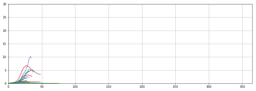
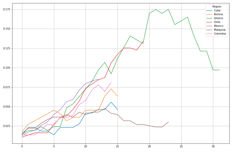
The below graphs show seven countries per graph, with an overlap of two countries between two consecutive graphs. Countries are sorted by the steepness of the tangent of their curve.
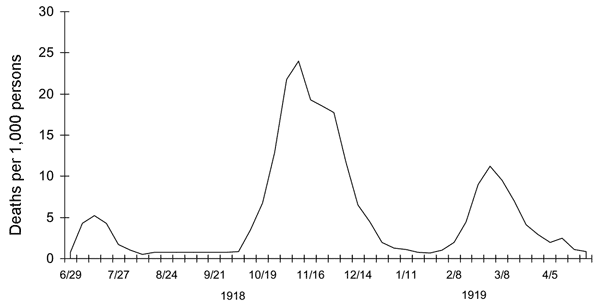
Let's start today with a bit of perspective on the time scale. It is easy to get optimistic about the data when many curves, especially many of the bigger ones, start to go down again. These could be a sign that things are heading to a conclusion. And in fact, they might be, given proper continued and/or additional measures, but lets not get overexcited. Here is a graph for the mortality rate for the Spanish Flu for the UK on the same scale as above.
Now that we have some perspective, lets zoom in to the emerging data.
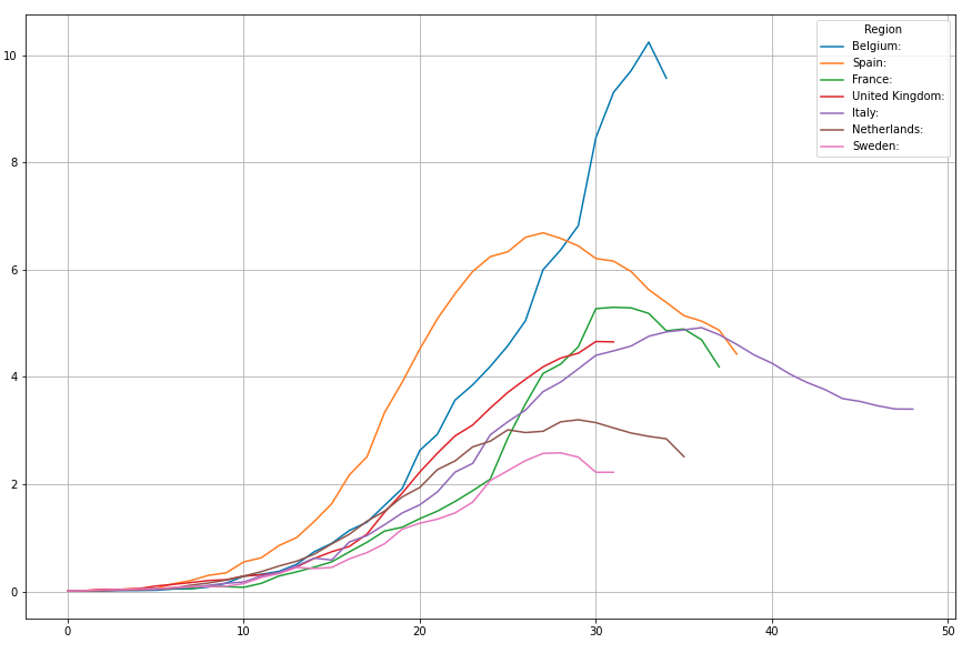
This is I think the first day we see some hope for a ceiling. Belgium, that broke through its own ACM level for seven day average #covid19 mortality yesterday at quite a steep angle, unexpectedly dropped to a lower level today.
And in fact, out of the top seven, only in the UK the mortality rate hasn't started at least a hint of a decline in mortality rate.
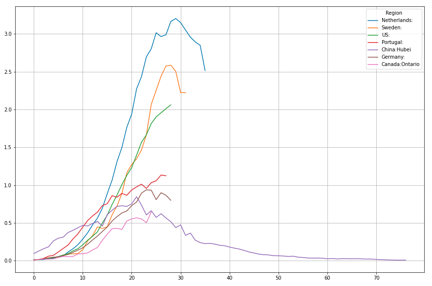
The US is the top country, followed at quite a distance by Portugal, still moving upwards. Netherlands continuing its downtrend. Germany appears to be heading for a Hubei like curve.
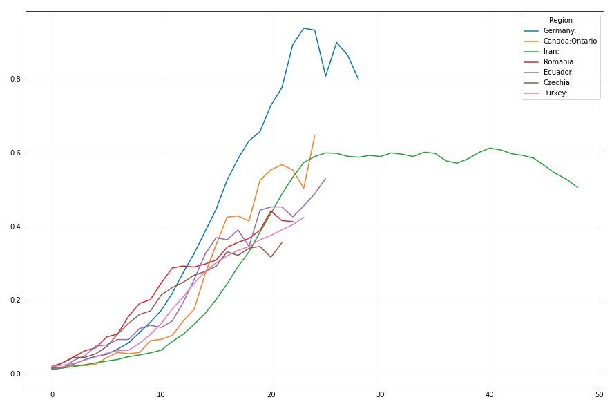
Iran too continues its steady descend.
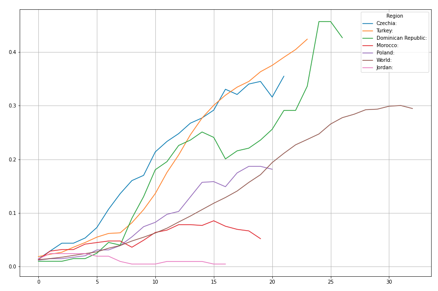
Now for the real silver lining: The world as a whole, for the first time since Hubei started declining, had a minor drop in seven day average mortality today.
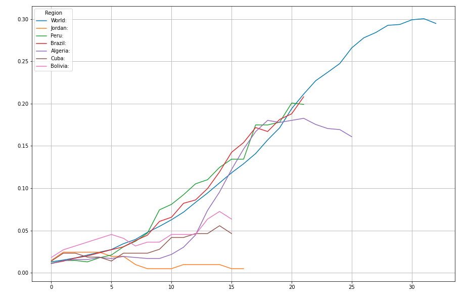
I'll let the rest of the curves speak for themselves.
Hi.. nice work. I would like to see the data from India. We have been testing very less. Have you checked the reproduction number of different countries?
Seems India is doing really well according to official mortality numbers. The current 7 day average #covid19 mortality rate is still below my anchor point mortality rate of 0.01 deaths per thousand people per year. A whopping thousand times fewer deaths per million than Belgium at this moment. Hope those official numbers are genuine. Its a good thing if a high population country doesn't show up in these graphs.
I see. I too hope the data is genuine.
This post has been voted on by the STEMsocial curation team and voting trail. It is eligible for support from @curie and @minnowbooster.
If you appreciate the work we are doing, then consider supporting our funding proposal, approving our witness (@stem.witness) or delegating to the @steemstem account (for some ROI).
For additional information please join us on the STEMsocial discord and to get to know the rest of the community!
Please consider using the stem.openhive.network app and including @steemstem as a beneficiary of this post. This could yield a stronger support.