A new post with #covid19 mortality data visualization.
Before we get to the graphs, let's discuss in short what we are visualizing.
- The data is taken from time_series_covid19_deaths_global.csv
- The graphs below show per-day seven-day-average mortality rate.
- Mortality rates are normalized to deaths per thousand people per year
- The data is re-anchored to the first day the mortality rate in the country or region exceeded the equivalent of 0.01 deaths per thousand per year.
- If the 3th corona death was less than two weeks ago, the country or region is not shown.
- Countries and regions with less than ten million people aren't shown.
- If the mortality rate never reached a value of 0.01 deaths per thousand per year, the country or region is not shown.
- If there are less than six data points after the first day the mortality rate exceeded 0.01, the country or region is not shown.
- The remaining countries are sorted by tangent, this may not always be the most ideal sorting criteria (I'm open to a better sorting criteria to use for these posts.
- The sorted countries are plotter in groups of seven with an overlap of two countries between two consecutive plots.
- Note that due to the reanchoring, and due to differences in peer mortality between countries , the range of both the X and the Y axis may differ significantly.
1..7
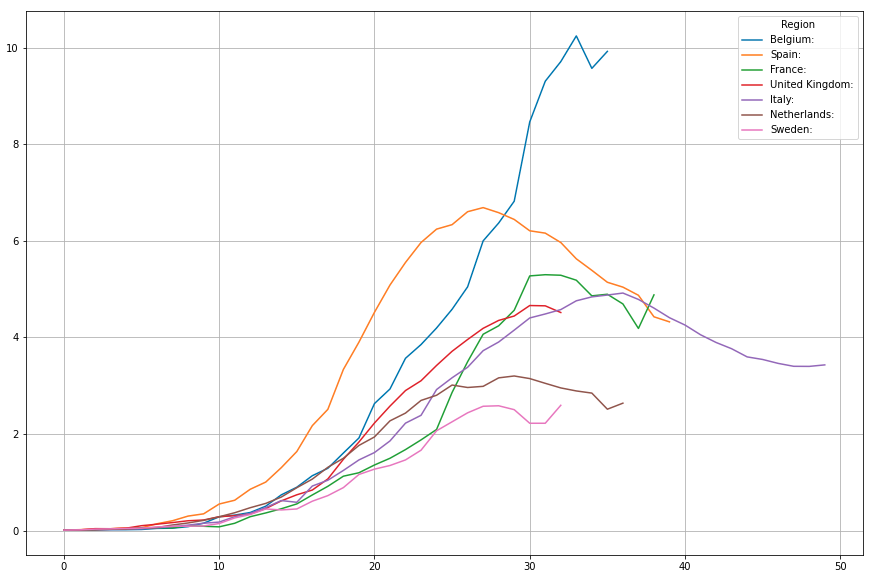
Other than previous days where the UK wasn't going down where other top seven countries where, today it is almost the other way around. UK giving a first hint of a downward movement, spain continuing its downward trajectory, but other countries all seem to take today to hint at something not quite so prommising.
6..12
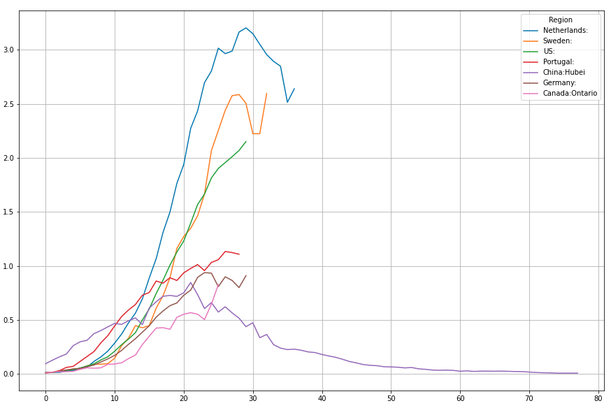
Sweden back to the same level it had four days ago, US accelerating its growth again. Yesterday was not a good day for the most part in the top ten, except maybe the UK and Portugal.
11..17
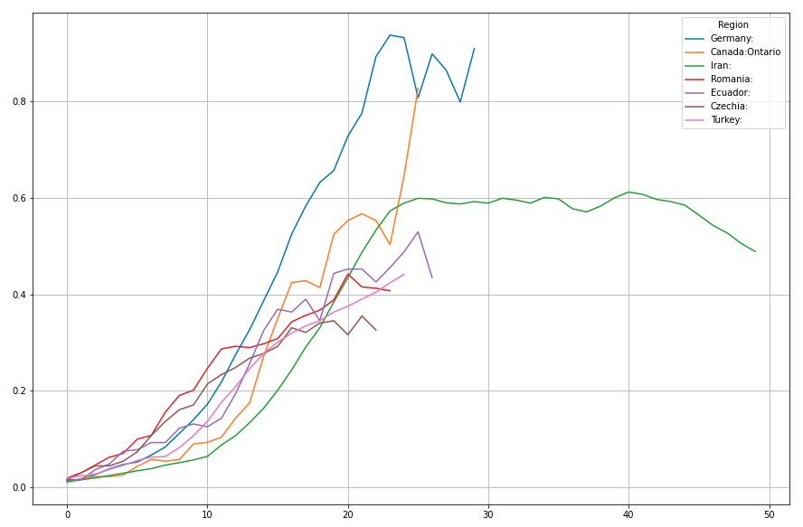
Germany's data looking very erratic, we'll have to wait and see where this is going. Ontario showing all the signs of a composite wave. Iran continues its steady trajectory down.
16..22
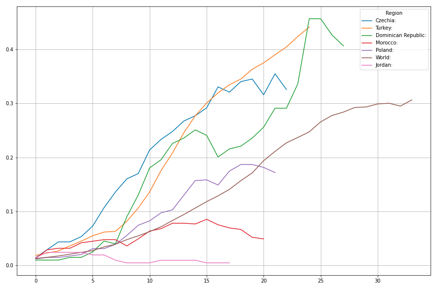
There we see it, in the brown plot. Yesterday wasn't' t a good day at all. The many renewed upward movements translate to yesterdays data point looking like a blib of noise in the upward trajectory.
21..27
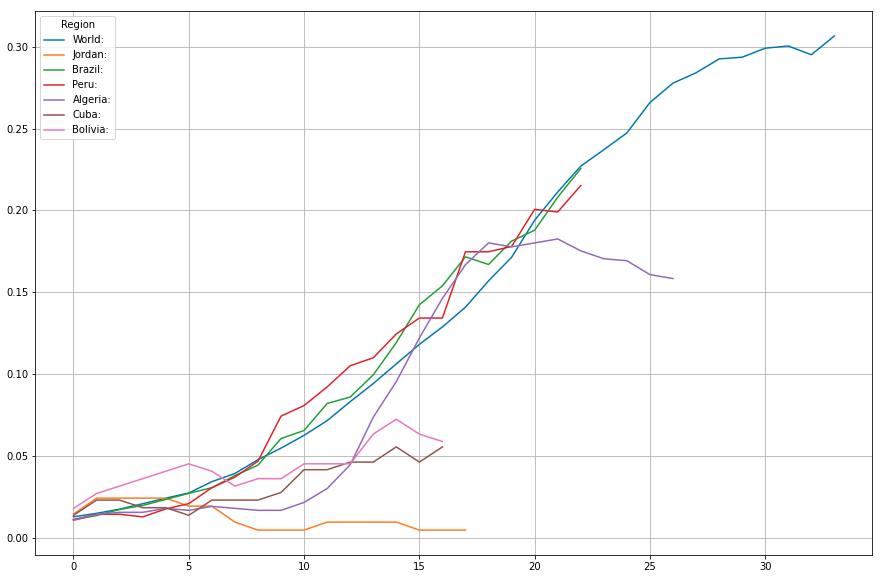
Algeria keeping up its few day old downward trend. Peru and Brazil pretty much tracking with the world trajectory for now. The other sub-World line moving around nice and slow.
26..32
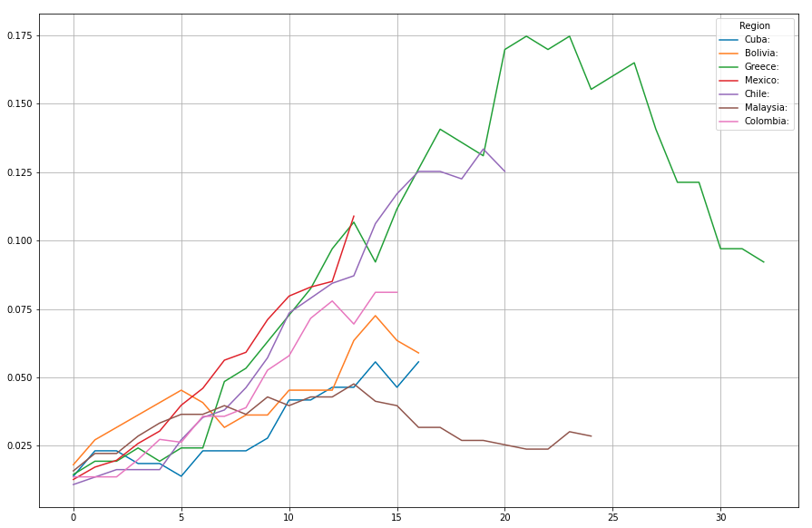
As we move further down the ranks, some real successful countries start showing. Greece coming down from a peek at just 0.175, Malaysia doing extremely well and stable. A lot of upward movers, but all at a really slow rate.
31..37
36..42
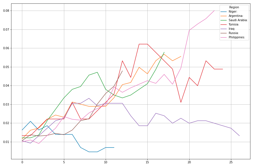
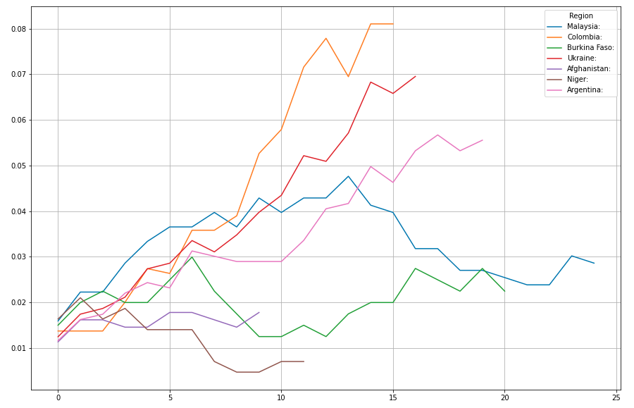
Iraq doing surprisingly well.
41..47
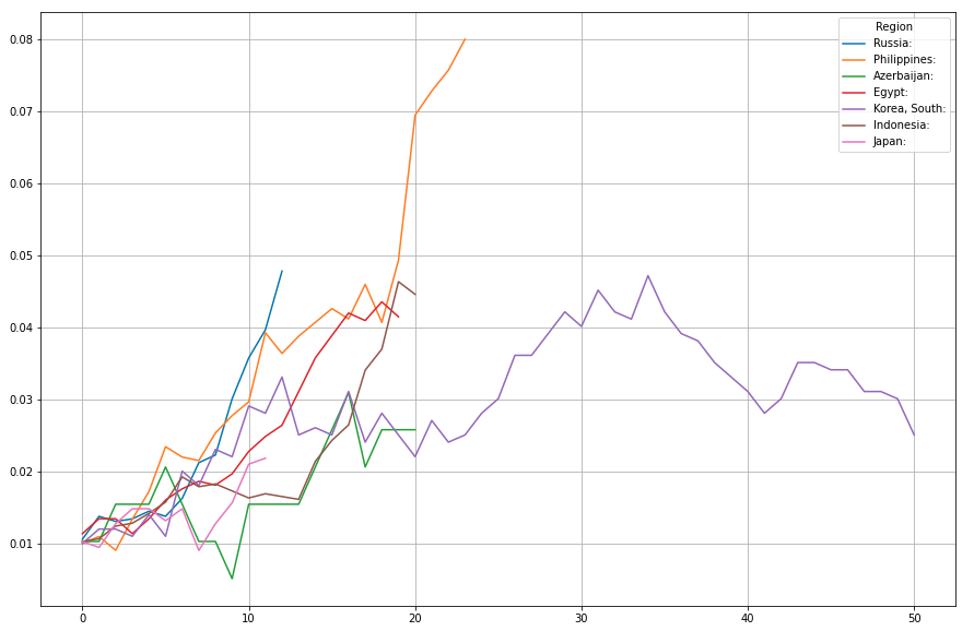
And there is the real superstar of corona control: South Korea. 50 days after hitting 0.01, and it peeked below 0.05 and today dropped below 0.03.
46..52