A new post with #covid19 mortality data visualization.
NOTE: Due to the way the correction in mortality for Hubei province was applied to the data, I had to drop Hubei province from this visualization. I regret having to do this as Hubei is ground zero and therefor valuable in visualizing the data. The correction however as applied to the data and as visualized would hint at a second wave of infections in Hubei province that simply isn't happening.
Before we get to the graphs, let's discuss in short what we are visualizing.
- The data is taken from time_series_covid19_deaths_global.csv
- The graphs below show per-day seven-day-average mortality rate.
- Mortality rates are normalized to deaths per thousand people per year
- The remaining countries are sorted by tangent, this may not always be the most ideal sorting criteria (I'm open to a better sorting criteria to use for these posts.
- The sorted countries are plotter in groups of seven with an overlap of two countries between two consecutive plots.
Note that due to the re-anchoring, and due to differences in peer mortality between countries , the range of both the X and the Y axis may differ significantly.
There are two sets of graphs. One for countries with more than 10 million people:
- The data is re-anchored to the first day the mortality rate in the country or region exceeded the equivalent of 0.01 deaths per thousand per year.
- If there are less than six data points after the first day the mortality rate exceeded 0.01, the country or region is not shown.
And the other set with countries that have 100,000 up to ten million people.
- The data is re-anchored to the first day the mortality rate in the country or region exceeded the equivalent of 0.1 deaths per thousand per year.
- If there are less than six data points after the first day the mortality rate exceeded 0.1, the country or region is not shown.
The data
If you would rather look at the pre-processed data itself, you can fetch an excel of the big and of the small countries.
Countries larger than 10,000,000
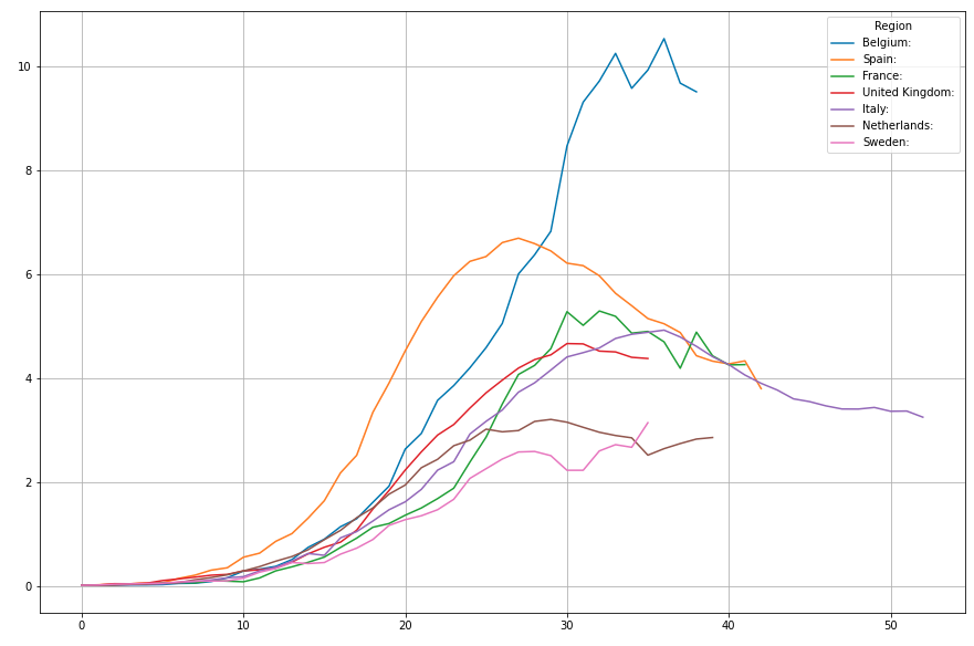
1..7 : Belgium, Spain, France, UK, Italy, Netherlands, Sweden
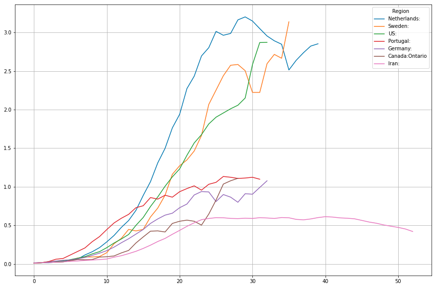
6..12: Netherlands, Sweden, US, Portugal, Germany, Ontario, Iran
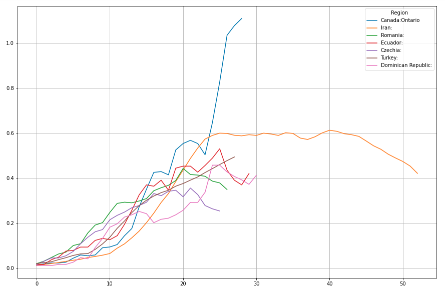
11..17: Ontario, Iran, Romania, Ecuador, Czechia, Turkey, Dominican Republic
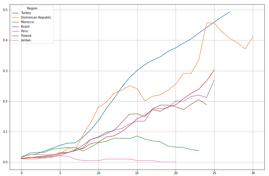
16..22: Turkey, Dominican Republic, Morocco, Brazil, Peru, Poland, Jordan
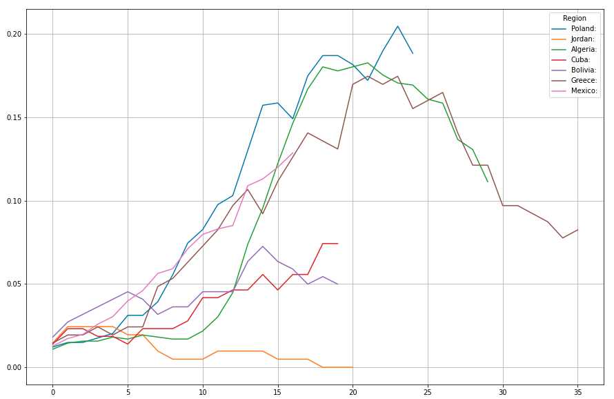
21..27: Poland, Jordan, Algeria, Cuba, Bolivia, Greece, Mexico
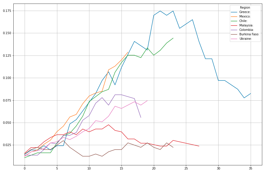
26.. 32: Greece, Mexico, Chile, Malaysia, Colombia, Burkina Faso, Ukraine
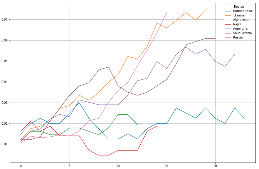
31..37: Burkina Faso, Ukraine, Afghanistan, Niger, Argentina, Saudi Arabia, Russia
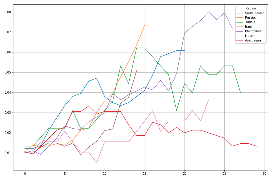
36 .. 42: Saudi Arabia, Russia, Tunesia, Iraq, Philippines, Japan, Azerbaijan
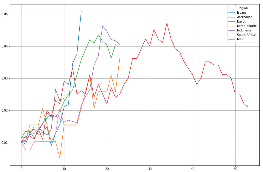
41..47: Japan, Azerbaijan, Egypt, South Korean Indonesia, South Africa, Mali
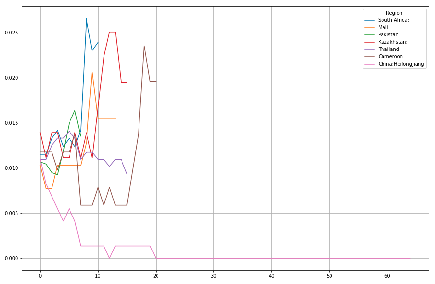
46..52: South Africa, Mali, Pakistan, Kazakhstan, Thailand, Cameroon, Heilongjiang
Countries smaller than 10,000,000
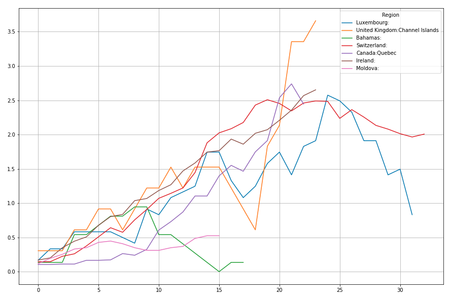
1b..7b: Luxembourgh, Channel Islands, Bahamas, Switzerland, Quebec, Ireland, Moldova
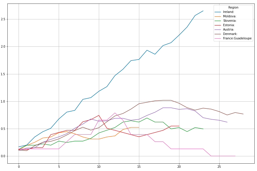
6b..12b: Ireland, Moldova, Slovenia, Estonia, Austria, Denmark, Guadeloupe
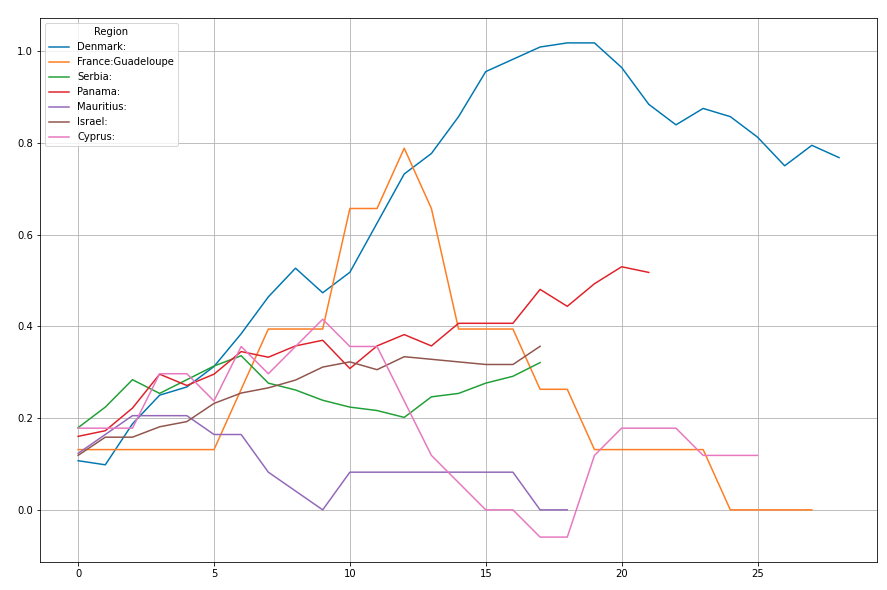
11b..17b: Denmark, Guadeloupe, Serbia, Panama, Mauritius, Israel, Cyprus
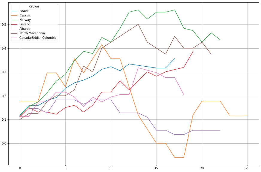
16b..22b: Israel, Cyprus, Norway, Finland, Albania, North Macedonia, British Colombia
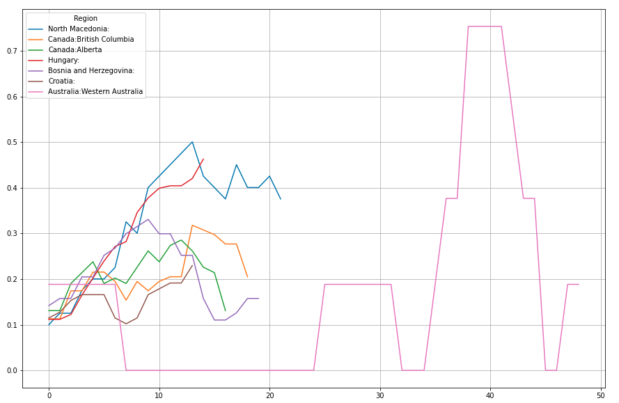
21b..27b: North Macedonia, British Colombia, Alberta, Hungary, Bosnia & Herzegovina, Croatia, Western Australia
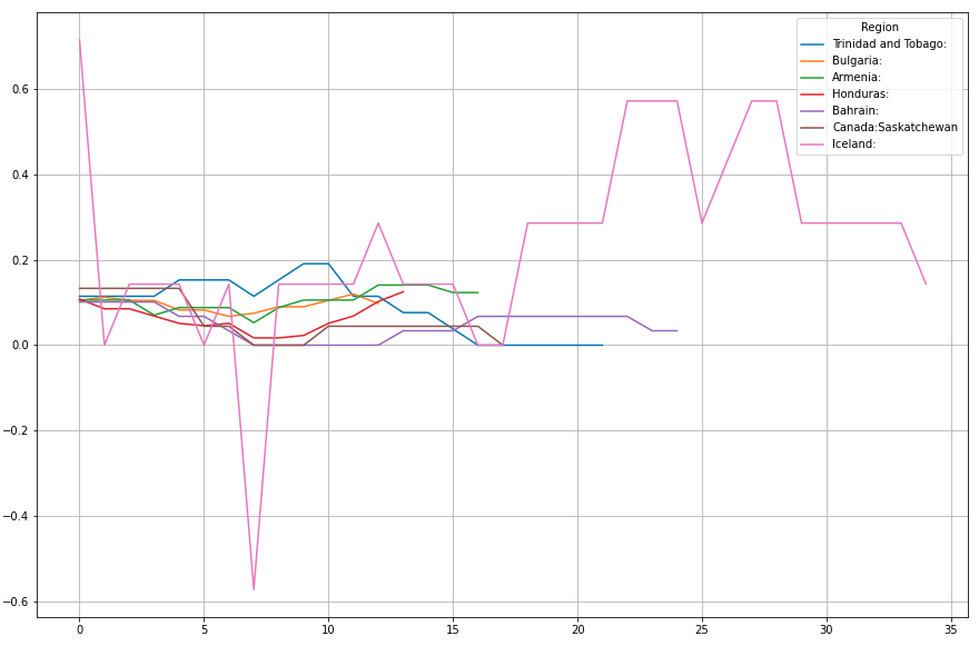
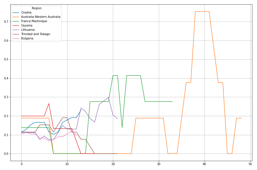
26b..32b: Croatia, Western Australia, Martinique, Guyana, Lithuania, Trinidad & Tobago, Bulgaria
31b..37b: Trinidad & Tobago, Bulgaria,