Seems like everyone are getting drunk on BTC price movement again and are lining up to lease new Lambos. As much as i hope that the price keeps on shooting up and never look back, i still approach this matter in a certain pessimism (don’t get me wrong, i’m a true believer of BTC; Its just that im not 100% convinced yet that this move is the one that that takes us to the moon - or Lambo dealership, if you will).
"Well, Sire, why so negative" you ask?
There are couple of reasons. First, before i jump into the chart and do my “chart whisperer”, there is one big fat fact that i can not miss. BTC price has been climbing up for 19 days (not taking today into account) in a row (with few minor exception here or there), gaining insane 56% since April 16, 2019. And 92% since it broke out of its wedge 43 days ago. During this time we’ve only seen 2 very short 6% pullbacks. We’re due, we’re long overdue!
Chart Whispering? Is that a thing?
While yes it is. Chart always tells a story, it's just a matter how one interprets it. I do not claim this to be the ultimate truth; Moreover, it is definitely not an investment advice; But since i do have my own skin in the game, i keep my eyes on the chart and try to predict the moves. And more often than not it has worked on my favour (except in the beginning, when i chased every single price move and emotions just drove me into the wall while singing "We are the champions my friend" to me)
Big Picture - Daily Chart
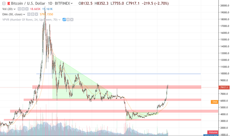
Our big picture shows we’re testing next strategical resistance level, which means all eyes on the price line and it's time to zoom in. PS! Take a look at the volume line. Not too convincing, is it? With this kind of a price move i would expect a helluva higher volume for it to keep on fuelling the growth.
Sharpen the blade - Zoom in - 4h chart
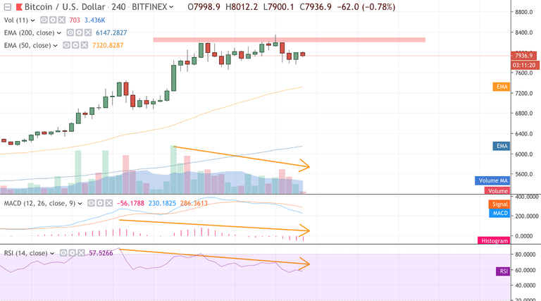
Price - double top. For 2 days BTC price has been struggling to push through the $8K level. Now, on itself there wouldn’t nothing peculiar in this fact, but once you factor it everything else that’s happening on this chart, this is where things get interesting
MACD - MACD histogram is pointing south, altho the price itself goes sideways. Our first divergence
RSI - Same thing as with MACD - tho the price movement has been up and now sideways, RSI is nevertheless pointing south for the last 4 days now (price higher high matching with downtrend RSI indicator is a weakness). Our second divergence.
Volume - Lastly, with double top there is fading trading volume. I wouldn’t be worried if the volume bars would have been higher during the last peak, but it is showing a significant decrease.
“OMG, new crypto winter is here! Sell everything!!!”
No, that’s not what i'm saying; You gotta pay attention! Point here is that altho the price has been climbing well and BTC madness has returned (check twitter feed if you don’t believe me), keep a cool mind and watch out for the traps. Movement has been rapid in a very short time span which should make you question wether we're in the verge of pullback. I might be wrong here, and i do hope i am, but there are just some signs that can't be ignored and i feel i should share this with my fellow crypto-bulls!
And hey, even i'm right and it does happen, keep your head on your shoulders. As i mentioned in the beginning, this is just a pullback. Very big picture (weekly chart) is promising a bright future :)
That's it and i hope my 2 cents of "wisdom" will offer some value
NB! Views and thoughts presented here are my own and does not offer any financial advice.