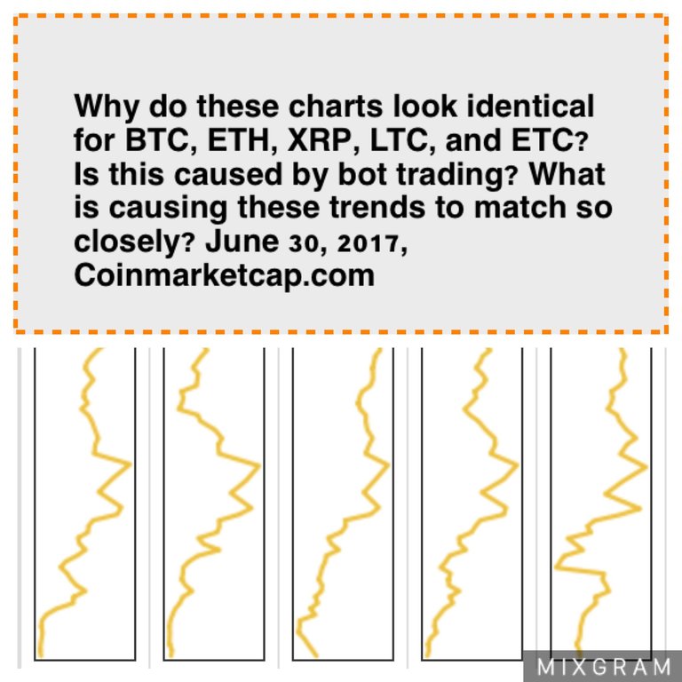

These cryptocurrency charts for BTC, ETH, XRP, LTC, and ETC look very similar, nearly identical? Why? See how BTC, ETH, XRP, LTC, ETC match today. Especially for BTC and ETH in matching the same line on their charts.
I took these screenshots this morning on coinmarketcap at 9:45 a.m. Pacific time. These charts are in order from left to right: BTC, ETH, XRP, LTC, and ETC.
Like :3
That means all alt currencies are tied to Bitcoin, it's like the gold standard for fiat currencies
Oh, I see. It's amazing to witness.
Even with USD to crypto? Not BTC to crypto? I took the screenshot of the USD table.
Great observation cryptokate :) just wonder how long they will dance in the same rhythm ;)
The prediction on eth is amazing ..
watch here :