
As you read in the title, this post is part of a small series of blogs called TRADING FOR DUMMIES, if you did not see the previous part, I invite you to check it. There we talk, in general, about the behavior of the market, the graphs and market ruptures.
In today's post we will talk about the tools that can help us better interpret the market, also called indicators, but since this series tries to teach new people, we will show below the three indicators that are easiest to learn and use as part of a investment strategy or in conjunction with other indicators.
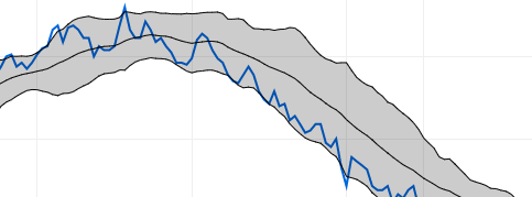
-Bollinger Bands
This is the easiest indicator to understand of the three. It consists of three lines and each one represents an average price in which the market moves. The line above represents that the price is on the rise, the middle line represents that the market is in recession, and the line below represents that the market is on the downside. The above can be seen in the following image, where we go from an uptrend to a downward trend.
IMPORTANT: Sometimes the graph passes the limits of the up and down lines. If the contraction is medium or long, it means that the action is oversold or bought. The above can be seen in the following example:
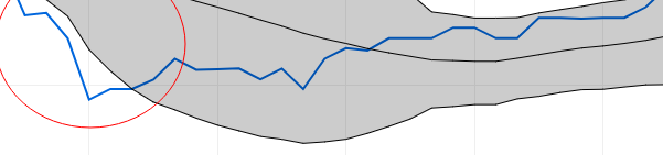
From a downward trend, the price was oversold and contracted to later break the trend and move to an upward trend.
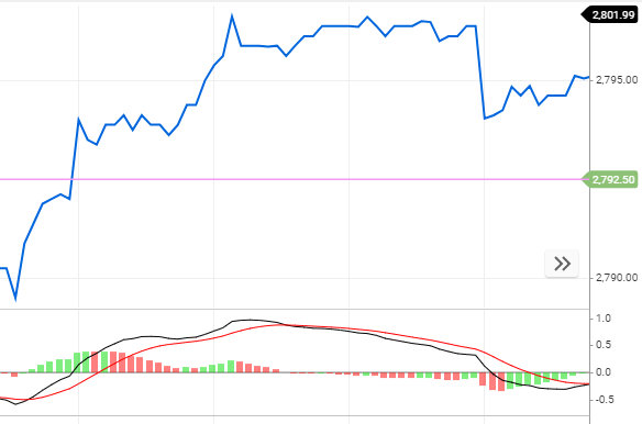
-MACD (Moving Average Convergence Divergence)
This indicator has, in general, a simple use, follow the trend of a market.
Its parts are the following: a red line and a black one, the red line represents the market average and the black one, which when it breaks to form a trend, is positioned above or below the other.
We also have a line and a series of bars that represent the volumes of actions executed (red for sales and green for purchases) that if there is an upward trend, they will look above the line and if they are toning downwards , you will see the volumes below the line.
-RSI 14 (Relative Strength Index)
Shows the strength of the price by comparing all up and down movement. It consists of a black line and its use, at great traits is very simple, when the line is below 20 means downward trend, if it is at a mid point it means recession, and if it is above 80 it means trend to the rise.
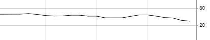
Here you can see that it will move to a downward trend.
IMPORTANT: You need at least 3 indicators to corroborate a correct change of trend.
With the above I finish my second paragraph of three. Remember that if you liked my content, you can share it, give it a vote and also comment; because your opinion is always important. Greetings and keep an eye on upcoming posts :-)
Congratulations @taquitoinvesting! You have completed the following achievement on the Steem blockchain and have been rewarded with new badge(s) :
Click here to view your Board
If you no longer want to receive notifications, reply to this comment with the word
STOPDo not miss the last post from @steemitboard:
Vote for @Steemitboard as a witness and get one more award and increased upvotes!