The first thought that got to my head was bonding, brotherly bonding is a growing community that works tirelessly to produce something of thought. I found this to fit Curie's work well enough. An individual community dedicated to helping the steem community grow by promoting something of value.
This is my first draft. I'm consulting my friend @digitalimaging and we realize that maybe circles should not be a reference in the form of logos, to make them look simpler and easier to understand.
So I thought about it and immediately did it.
Step 1
Step 2

Step 3
Finish
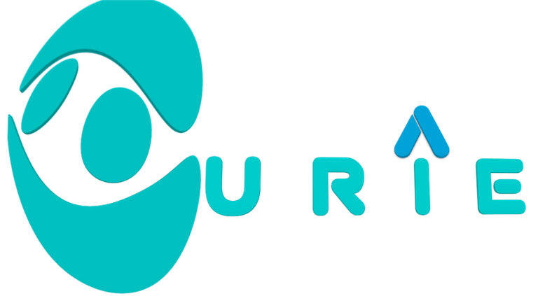
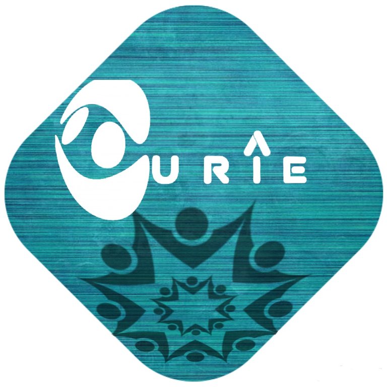
And in the next phase after having a rectangular background with a group of people holding hands to carry out their duties, Be a curie logo.
so many tutorials making the curie logo that I created through my smartphone.
Thanks
Regards, @endatu
Nice submission to the contest!
thanks for the support @brandyb i hope hopefully be the best.
The winner on @curie contest, simple avatar
haha thanks a lot bro i hope thats true 😇
This post has received a 0.07 % upvote from @drotto thanks to: @banjo.
great jobs 👍
thanks for u support @nisa.idris22
i hope u win in contest
i hope so @ikhsan2408