"A good heart is better than all the heads in the world."Edward Bulwer-Lytton, 1st Baron Lytton
 Good day fellow Steemians! Today I would like to share with you my entry for the Curie Logo Design Contest hosted my, of course, @curie the wonderful group of Curators.
I don't know if anyone else reading this has ever been "hit" by a curie (I'm sure you have), but it must have been one of my favorite experiences on Steemit thus far. The experience of being recognized by curie is only really trumped by all the people I have met through Steemit. So thank you @curie, for making Steemit a better place!
Good day fellow Steemians! Today I would like to share with you my entry for the Curie Logo Design Contest hosted my, of course, @curie the wonderful group of Curators.
I don't know if anyone else reading this has ever been "hit" by a curie (I'm sure you have), but it must have been one of my favorite experiences on Steemit thus far. The experience of being recognized by curie is only really trumped by all the people I have met through Steemit. So thank you @curie, for making Steemit a better place!
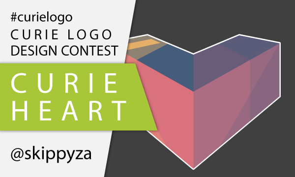
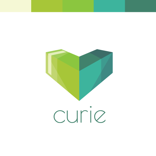
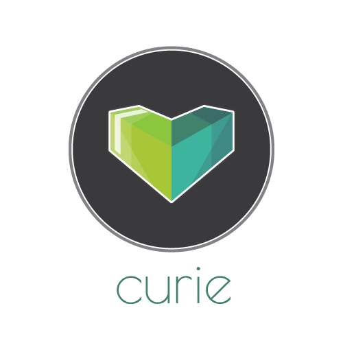
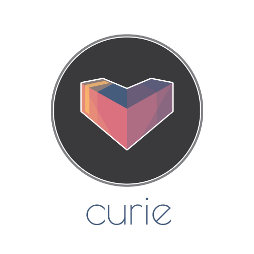
MY ENTRY:
 |  |
|---|
| RadiantGreen Heart 💚 | WarmRed Heart 💗 |
PROCESS AND VARIANTS:
So let me explain a little about what I did. This explanation is three fold, starting with the shape, then the colours, and lastly the copy / font.
The Shape:
At first you might see a heart, or perhaps a 3D "V" shaped box. So what is it really all about? Well, imagine for a second the upvote button was a 3D object, and fell over (right on it's face), you would end up with something like this.
Of course the fact that it then forms the heart shape was also intentional, and I thought sharing some love was a good way of describing @curie as a service and a community.
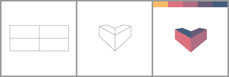
The Colours:
For this logo I couldn't decide, so I made both. The red-purple colour pallet was just based on the face that it's a heart, and red in general can represent love and warmth. The green pallet is based on Marie Curie, and the Radium that she is so very famous for. It's meant to represent that nice radiation glow green.
I also had a quick look at what the icon would look like in terms of usage on Steemit, and came up with a dark colour version.
The Copy / Font:
Firstly, the font I used was a Google Font, namely Poiret One.
I thought this was a beautiful and elegant font that could be used to represent die @curie group. I also tried some varients in terms of how to display the name. I will share a couple below:
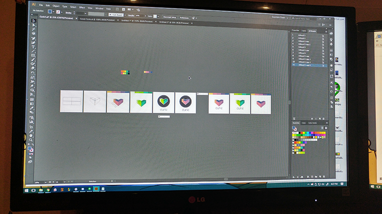
MY TOOLS:
I don't have to much to say, all-in-all it took me a 4 - 5 hours over the past two days to complete. This logo was created by using Adobe Illustrator, Adobe Kuler (for some colour inspiration) and of course Google Fonts.
Thank you for reading!
In general I am not to concerned with votes, and I think that it is more important to have fun and learn, than it is to earn money and get recognition. However I am very proud of this logo I created, and I would love to make it to the top 10. So if you like what I did, and you feel I deserve your vote, please go vote for me in the comment of the Original Post.
Comments, questions and critiques are always welcome.
100% Original Content / Vote / Resteem
Have a wonderful day.
SkippyZA ^_^


Very cool! Got my vote, good luck with the contest!
Thank you @marty-art, can't wait for your next Vagabonds post. :D
Hey, thanks! One more post to finish the story for the last 4 characters of Vagabonds I; making it interactive again (but probably with a lot less adjectives this time :)
I do like the green version of your logo somewhat better - but that may be my personal taste. And a great font, suits the logo very well! Didn't know it, but will make a note of it :) Cheers!
Nice Skippy! :D GOOD LUCK MY MAN
Very nice post and great article.. Follow and vote me back by @atjehsteemit
Clean, modern, stylish and great colors!
Good luck with this design, I fancy your odds ^^
Thanks @zeroooc Hopefully I have some luck with this, that would be amazing. If you want to help you can vote for my comment on the curie post, since that might help get me into the top 10.
FYI, I hate voting systems. :P
done ^^
Thank you. ^^