
I do freelance production work for videos with lots of motion design. That means mostly 2d shapes, mostly vector graphics, moving around in abstract spaces. These visuals are usually an accompaniment to a script that aims to explain some topic.
While giving notes to the animators I work with I've started to notice certain patterns in the stuff I want changing. In this post I'll try to formalise the most fundamental principles that are behind many of the notes I give.
If you're new to motion design, you can think of these as 'sensible defaults'. By adopting these defaults (until you're confident enough in what you're doing to depart from them now and then) you'll have fewer decisions to make and more headspace to focus on the particular problems of your project.
I'm using After Effects, but these principles apply to any software you might end up using.
1. Your movement is too slow!
The most common problem I see is that animated movements take too long to complete. It's an easy mistake to fall into, especially at the beginning when the ability to make something move is new and exiting - you just figured out how to make things move and you want to see as much movement as possible!
How fast can I get away with making this?
Make some movement, then squash all the keyframes so close together that the movement becomes too fast, and then ease back a bit. Otherwise the result is likely to be too slow.
With transition animations the viewer should be feeling "Oh, something changed/appeared!". If they're ever thinking "Mmm. I'm sat here watching this thing being revealed" that means the animation should be over faster. Stick to transition times of 0.5 seconds or shorter.
This one's too slow:

This one uses more overlapping motion and much faster motion in general. Much better:

2. Moving holds to the rescue
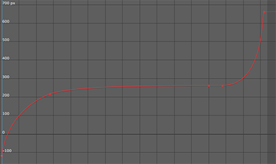
Perhaps you've made your movement nice and zippy, and you now have long sequences with not much going on. You can consider using what's known in traditional animation as a moving hold to add visual interest that's not demanding for the viewer to process. With a moving hold the element slows down at the end of its movement, but doesn't quite stop. It keeps moving very slowly. The slow portion of the movement should be slow enough that the viewer can easily read the element while its moving and tracking it with the eye doesn't feel like a chore.

And here's how the X position value graph looks. Notice that the curve goes almost horizontal, but not quite, in the middle.
An alternative to the moving hold is to introduce slow camera movement towards, or away from the subject.
3. Easing curves: Don't get fancy, two types are enough
Easing refers to the change in velocity of a movement over time. Initially limit yourself to two styles of easing for any movement that happens entirely on-screen. Use either
- Ease in and out: Slow at the beginning and end, but fast in the middle.
- or Ease out: Fast right at the start, slows down towards the end.
Ease in and out most closely resembles how things move in the physical world, with acceleration at the start of the move, and deceleration at the end. Get used to using the graph editor to create these curves yourself rather than relying on the 'easy ease' keyframe helper.
Abruptly starting movements are fine too. There's no acceleration, just instant high-speed movement at the beginning. But if your object finishes the move while visible, don't have an abrupt stop! Always use some kind of easing at the end of a move instead.
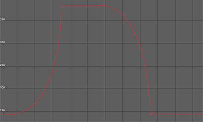
Good reasons to create the kind of movement in this next example are rare, so you probably shouldn't:

Here's what the value graph looks like for the X position.
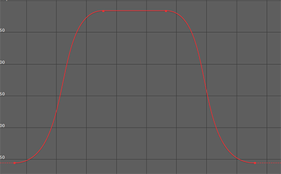
Here's a move with easing at both ends. Much less weird, less likely to draw undue attention to itself:

The exception
If you are moving something from being visible on screen, to an off-screen position, don't ease out of that movement! We don't want the suggestion that the object is slowing down to park itself just out of view. Instead we generally want to suggest whoosh, its off! We're not going to see that thing again!
4. Stick to axis-aligned movement
In a composition of 2d elements, imagine a grid. The grid has a X and Y axis. The grid might have a non-zero rotation relative to screen space. By default, you should only be moving elements in the scene in the direction of one of those axes at once, unless you have a very good reason to move diagonally with respect to the grid.
If you find yourself needing diagonal movement, see if you can adjust the arrangement of elements in your composition so that you can use axis aligned movement only.
5. Synchronise in and out movement
If some things are moving into view as other things are moving out, and they're going in the same direction, attach them to the same parent object and move that thing - so that all the motion is synchronised. That way we avoid imposing extra visual processing on viewer. We don't want any part of the viewers brain to be thinking 'Oh, these are two distinct movements!'.
6. Keep your cuts clean
If you end a scene with a hard edit, don't have elements transition away just before the cut. Just leave everything visible right until the end of the scene instead. It's more peaceful that way and the cut has space to 'breathe'. In the two examples that follow the first one tries to transition things away before the cut, and has another thing transitioning in just after the cut. The result is much more visual information that the viewer is asked to process, without any upside. The second example shows a simple cut with no transitions immediately before or after.


7. Mind the corners
One way of avoid visual complexity is to avoid showing corners of large objects, if you can get away with showing only edges instead. If using large colour fields to divide a composition, avoid transitions that would reveal any corner of those fields - unless the corner is an important part of the composition. Try to keep to edges only, no corners. In the following examples having the turquoise field come in vertically reveals one of its corners, so my preference goes to using horizontal movement instead, where we only see one edge.


Conclusion
The uniting idea behind these principles is to try to minimise the amount of processing the viewer has to do in order to make their watching experience as comfortable as possible - while still suggesting dynamism and energy. Naturally there may be situations in which you do want discomfort, but in my view they're rare, and you certainly don't want to be creating discomfort by accident!
This post hasn't shown you how to do anything flashy. But for anyone new to motion design, I hope these ideas provide a good-looking set of 'go to' strategies that help you focus on the important decisions particular to your project.
Are there any motion design things in particular you'd like me to talk about in follow up posts? Or any other foundational principles you think belong in this post? Let me know in the comments!
--
Here are some other things I wrote that you might appreciate:
- Making Propaganda Videos is Hard, And You Can Do It!
- My animation: How Government Solved the Health Care Crisis
--
I'm Tomasz Kaye. I made George Ought To Help and other pro-liberty propaganda films. You can support my work on Patreon.com. I'm also on Twitter and Facebook.
We muggles never think of this stuff. Riveting.
Hey, glad you thought so at least! This process of figuring out what others here are interested in is quite a challenge.
Woah! So cray!