
|

|

|
Guess some of you have noticed the
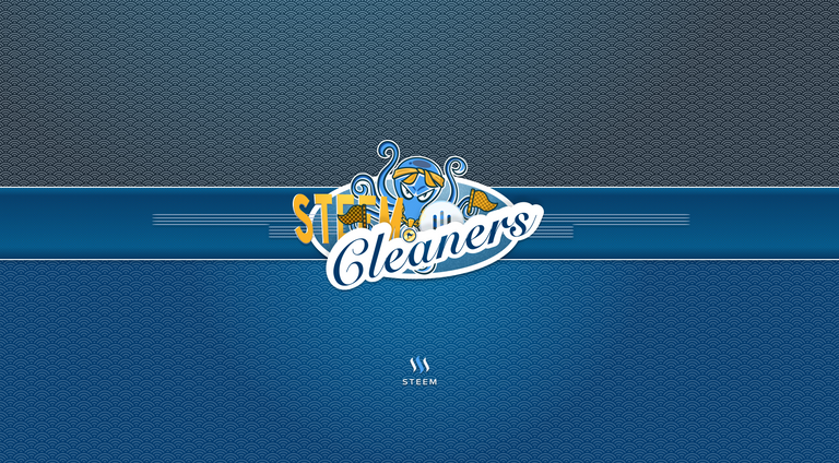
steemcleaners logo earlier today:Announcing SteemCleaners, the Steemit Abuse Fighting Team!
Tried to give this serious topic some sort of funny note - hope it works, enjoy:
Basic idea of an octopus (Sea theme -> whale - etc.) able to act like eight, sure thing and flagging "plagiarism" as well as getting rewarded for response able and respectful acting.
Anyway, as always:
1 IMAGE ♨ > 1000 WORDS
Here you go:
steemcleaners logo concept - plain
steemcleaners logo playground - blue
steemcleaners logo playground - gold
Some Bonus stuff
Some additional wallpaper designsDesktop – 1440x1024
wp--desktophd-1920x1080---steemcleaners 2x
wp--desktophd-2560x1440---steemcleaners 2x
Mobile – 1080x1920
wp--phone-1440x2560---steemcleaners 2x
Other formats just linked here as this would bloat the post size massively. Thanks for your understanding.
…and some more bonus gfx

to support @steemcleaners
…more HOT stuff
STEEMPAY.IO v1.0.1 LIVE! Accept Steem/SBD anywhere! Button generator included!
It's not a very constructive comment but I have to say, you are so damn good at what you do, it's almost annoying ;p
Thanks again cass! Nice to see you getting some love for the logos, they are awesome! :)
Thanks man - AND…
*VOTE is the new LIKE*50% of the SBD rewards from this article i will donate towards
steemcleanersfund!And this is why we all love cass~
Thank you for the support! :D
@cass thank you so much! :D
tough to choose -- they are all solid -- i like the last one best
steem generator button!!!
we'll take over the web!
Loving these designs! Thanks for your work and namaste :)
Let us know how you plan to achieve some outcomes here, thanks!
Really awesome work. If I'm allowed to I would suggest to put the flags (especially those in front of the steemit 'e') and also the logo with the three colored strokes somewhere else. It is a little bit too chaotic in my opinion. Maybe it works better, if you'd put them around the arms of the octopus? The one flag right to the octopus works well, though.
Haha awesome! This is gonna be a fun little side-hobby to do while commenting anyway, so why not make sure to clean it up at the same time when browsing /new.
@cass Great job!
looks good :)
Great job , I like the fifth one best.
💋 @halo 💋
Great stuff @cass... You have great eye for design, Would love to get your eyes on eSteem. btw, great symbol character on title 👍
Good job mate!
These are all great. I know a bunch of others have already told you that, but I'm going to say it again.
Plain one.
Excellent work and great design and concept.
wow... amazing design @cass
Keep up the great work bro.