hi Hivers! I want to share you the process of creating a logo. I am participating in the contest for OCD, but I thought it could be useful to create a post about how to create and design logotypes and the concept behind it.
hola Hivers! Quiero compartirles el proceso de creación de un logo. Estoy participando en el concurso de OCD, pero pensé que podría ser útil crear una publicación sobre cómo crear y diseñar logotipos y el concepto que hay detrás.
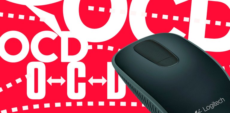
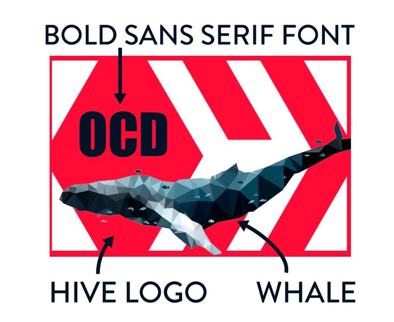
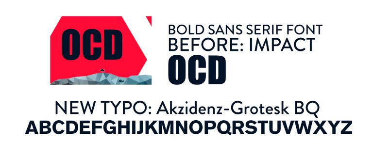
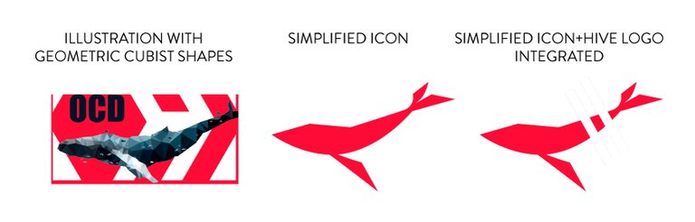
First let's start with the OCD logo. The old logo had this bold sans serif font, we don't want to change the identity of the project so I'm going to keep that. They also want to use the whale as a symbol, but in the cover they use, the whale is used more like an illustration. We need to simplify the figure. Also, the hive logo is important and it must be something related to that in the logo.
Primero comencemos con el logo de OCD. El logotipo anterior tenía esta fuente sans serif en negrita, no queremos cambiar la identidad del proyecto, así que me quedaré con eso. También quieren usar la ballena como símbolo, pero en la portada que usan, la ballena se usa más como una ilustración. Necesitamos simplificar la figura. Además, el logotipo de hive es importante y debe estar relacionado con eso.
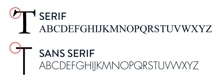
If you don't know what sans serif is, in the ancient greek the letters were carved on walls using chisels. where the chisel was hammered, that mark is the "serif". The typography evolved through the years, until the industrial revolution era, and with the idea of efficiency and minimalism, a new trend on typography took over all designs, the sans serif fonts, typography without serifs (with helvetica and futura fonts on the head). This is why these fonts are related to technology and modernism, while classic serif fonts are related to old and classy stuff.
Si no sabes qué es sans serif, en el griego antiguo las letras se grababan en las paredes con cinceles. donde se martilló el cincel, esa marca es el "serif". La tipografía evolucionó a través de los años, hasta la era de la revolución industrial, y con la idea de eficiencia y minimalismo, una nueva tendencia en tipografía se apoderó de todos los diseños, las fuentes sans serif, tipografía sin serifas (con fuentes como helvetica y futura). Es por eso que estas fuentes están relacionadas con la tecnología y el modernismo, mientras que las fuentes serif clásicas están relacionadas con cosas antiguas y con clase.
we are going to keep the boldness of the font. Remember, thickness is also part of the message and personality of the logo. For example, if you are creating a logo for a light yogurt, you den't want to use a heavy font, but if you are creating a logo for a strong industrial machine, you don't want to use a light font that shows weakness as a concept, you want to transmit that the machine is heavy and strong.
I choose this font, is from the same family than Helvetica, but in my opinion, it has more personality.
vamos a mantener el grosor de la fuente. Recuerde, el grosor también es parte del mensaje y la personalidad del logo. Por ejemplo, si está creando un logotipo para un yogur ligero, no querrá usar una fuente pesada, pero si está creando un logotipo para una máquina industrial fuerte, no querrá usar una fuente liviana que muestre debilidad como concepto, quiere transmitir que la máquina es pesada y fuerte.
He elegido esta fuente, es de la misma familia que Helvetica, pero en mi opinión, tiene más personalidad.
Now, let's create the icon, we need to simplify the whale illustration. Since the original art had influences of cubism, we are going to use strong shapes, we also need to add something related to the hive logo in our new logo.
Ahora, creamos el icono, necesitamos simplificar la ilustración de la ballena. Dado que el arte original tenía influencias del cubismo, vamos a usar formas fuertes y geometrícas, también debemos agregar algo relacionado con el logotipo de hive en nuestro nuevo logotipo.
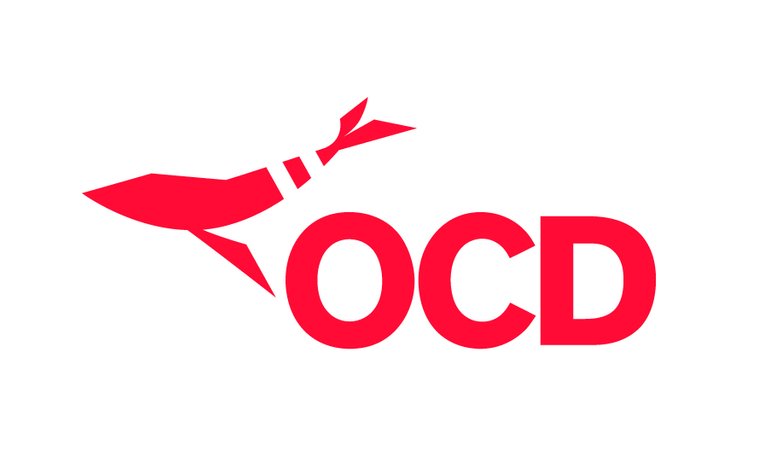
and the final result!:
y el resultado final!:
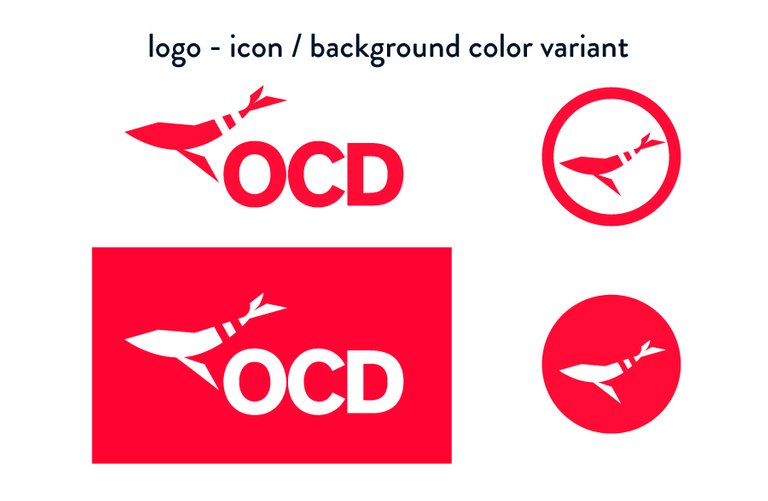
Here you can appreciate the logo working as an icon, and on color backgrounds. Remember, when you create a logo, always test how it works on backgrounds with colors or images, since you don't know where is going to be used.
Aquí se puede apreciar que el logo funciona como un icono y sobre fondos de color. Recuerda, cuando cree un logotipo, siempre pruebe cómo funciona en fondos con colores o imágenes, ya que no sabe dónde se utilizará.
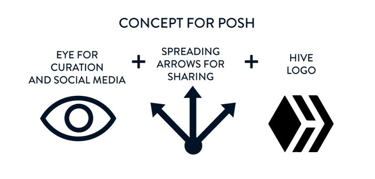
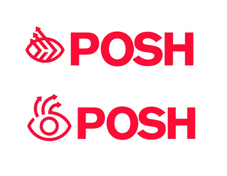
Now, let's do the POSH logo. First, we need to keep this new logo in the same visual system than the other logo, since is part of the same project, so we are going to use the same typography and color, this will make both logos related.
I had chosen this three concept that I want to mix in the logo: first the eye, that represents the curators choosing and highlighting posts and searching for them on social media, the arrows, representing how a shared post spreads on the internet, and finally like on the ocd logo, we need something related to the hive logo.
Ahora, hagamos el logo POSH. Primero, necesitamos mantener este nuevo logo en el mismo sistema visual que el otro logo, ya que es parte del mismo proyecto, por lo que vamos a usar la misma tipografía y color, esto hará que ambos logos estén relacionados.
Elegí estos tres conceptos que quiero mezclar en el logo: primero el ojo, que representa a los curadores eligiendo y resaltando publicaciones y buscándolas en las redes sociales, las flechas, que representan cómo una publicación compartida se difunde en Internet, y finalmente como en el logotipo de ocd, necesitamos algo relacionado con el logotipo de hive.
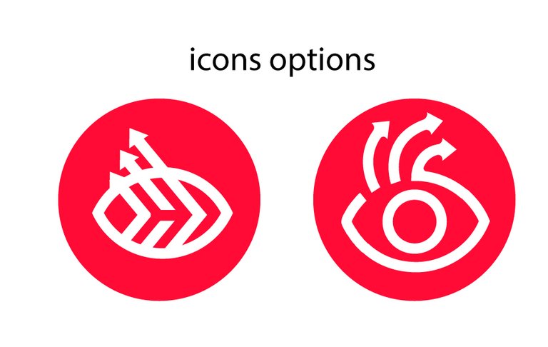
after a lot of sketching I had arrived to this two options, I liked both so I'm going to share you the two options. Is good to deliver more than one option when someone ask you for a logo, it seems more work, but trust me, it will save you a lot of corrections from the clients. Which one do you like more?
después de mucho bocetar llegué a estas dos opciones, ambas me gustaron así que les voy a compartir las dos opciones. Es bueno entregar más de una opción cuando alguien te pide un logo, parece más trabajo, pero créeme, te ahorrará muchas correcciones de los clientes. Cuál te gusta más?
They work well as an icon too.
Funcionan bien como icono.
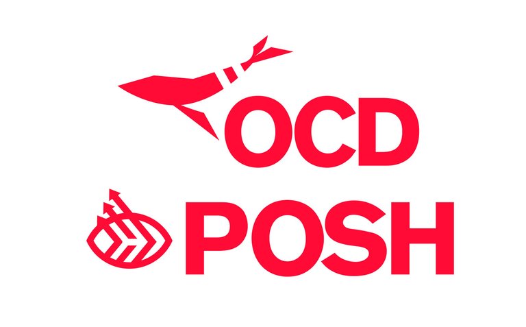
And here the final result. I hope you liked it and this post will be helpful to improve your designs too. I had enjoyed creating it.
Y aquí el resultado final. Espero que os haya gustado y esta publicación te sea de ayuda para mejorar tus diseños también. Disfruté mucho creándolo.
bye!
@delcarmat
Wow these look amazing!
The simplification definitely does wonders in logos, and I think you did a great job.
As opposite as it sounds, your Posh logos are really unique and out of the box (IMO). The arrows along with the eye is super creative, I wish I had thought of that when making mine.
<3 thank you for your words! I appreciate it
I like both of these! I really like the Posh logo. I think that it was a good idea to having both be the matching red colors. Also cool how the Hive logo makes a subtle appearance.
thank you for reading the post! :D wish me luck in the contest!
Al toque roque 😎🤘
Suerte en el concurso ✊
ehh graciasss