Since I started programming I've always suck at designing great user interface. That's a bit frustrating when you spend time creating valuable software but nobody use them because they are complex and/or boring.
I've recently register to Medium a nice website with very interesting, hand-picked content like this article about designing websites.
Here I will show you 3 tricks described in the Medium article that I applied on my website.
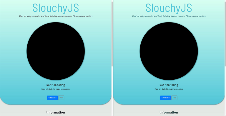
1. Dark Colour Instead of Black
By default, text will be printed in black which make too much contrast to be pleasant to watch. Prefer using dark colour like a dark blue for instance.
On the right, subtitle and instructions are black coloured whereas on the left : subtitle and instructions are coloured using shades of dark blue which seems Smoother.
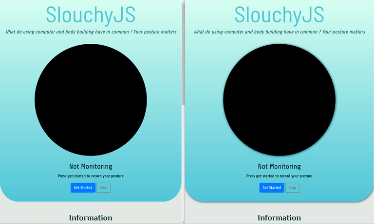
2. Using Shadow to Create Depth
Adding a sense a depth helps the user focus and feel part of your website.
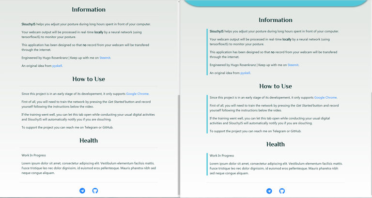
3. Less Horizontal Line
It can be very temping to separate each paragraph using horizontal lines or borders.
However you can quickly become overwhelmed by borders and might want to remove some of them to give an impression of space on your website.
You can use other methods to structure your websites like nice vertical borders.
Made with fun by Hugo Rosenkranz.