I'm not a graphic designer but I want to improve in this skill so if you have any feedback and tips, it would be greatly appreciated as I want to switch into more design-oriented role.
Here, I'm gonna go through my process of creating a Logo for Steemit's The Page Dwellers book club (organized by @heymattsokol.
There were few requirements.
- It has to be a perfect size for Steemit Post thumbnail
- There has to be two colors maximum
- Preferably minimalistic
Brainstorming
At the beginning I just wrote down different words or ideas that came to my mind when hearing 'The Page Dwellers' or "Book Club".
Many things came up, from obvious things like a Book, Community, Page, Scroll.
But also things like mountain, peak, climbing, a hole, etc. (Getting new knowledge, reaching goals, going deeper).
Sketching
With these words and ideas in mind I started sketching.
Here are few of those sketches where I tried to show off those ideas above.
In this one I was trying to visualize the more abstract ideas of reaching a goal and going deeper in your knowledge.
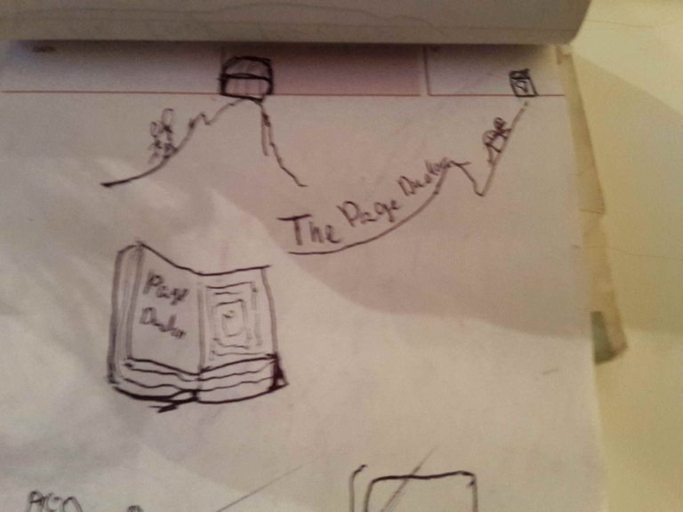
I'd say I failed :).
Then I was playing more with the book and scroll idea.
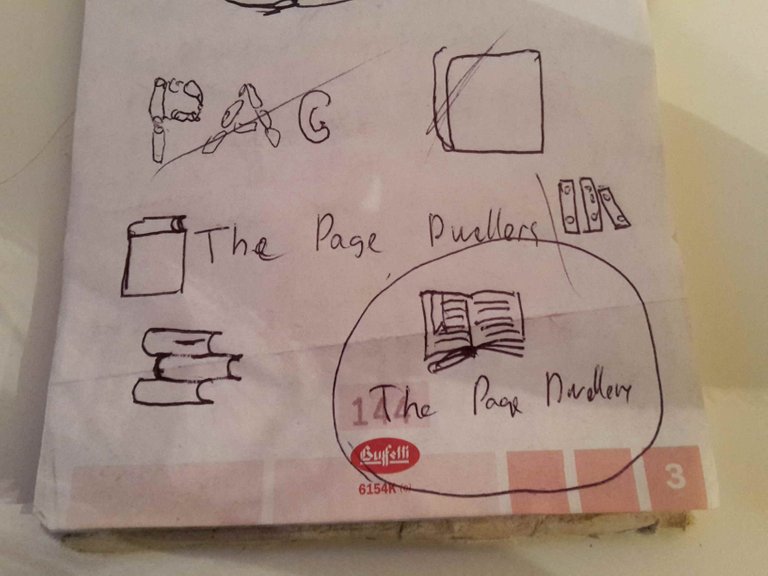
Then I was playing with Library and Books and community idea.
I also made another sketch of a book, just because.
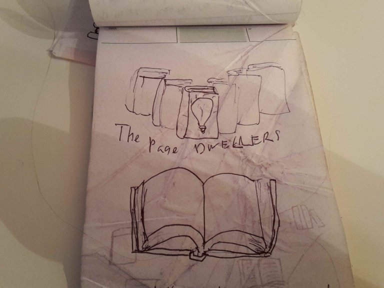
This seemed the best. So then I vectorized few of the ideas not really concerning myself with the details and I sent it to Mat to pick one of the concept ideas.
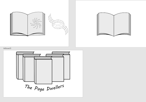
Not too surprisingly, the third one was picked.
Adding Details and Working Toward Final Product
Then I played with it more. I was a bit lost with what colours to use. I picked purple-ish for "wisdom" but even when I have that I wasn't really sure what exact colour to use nad it feels so random to pick one in my Vector Software.
As I also inserted a lightbulb (and a Steem Logo for fun) inside the first book I felt even more lost with the color.
And it didn't feel that nice, anyway.
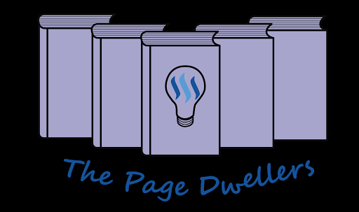
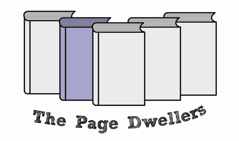
The Final Product
Then Mat suggested that I get rid off the lightbulb and focus on the font, using just one colour (the grey-ish one).
So I did that. I found some nice fonts that I used.
Though the final one was briliant for this as it is basically letters filled in with "sketch-like" stronkes.
Just perfect.
Then I also accidently didn't colour one of the books back to grey. That's when I actually really started to like the logo.
Now it represents
- Community and more books to be read
- Choosing one book out of many
- Hidden Next book that will provide you with knowledge
- Book Club
So here it is again
Please let me know any feedback you might have or tips with my process, etc.
If you want to know how I modify my Images, check out my post about a tool I created
About the Author;
Hi, I am Joe and I love freedom.
Freedom of all sorts, social, financial, emotional, physical, freedom from your stuff or place.
My biggest passion is to show that it is possible to live life being free, work towards my freedom, and help others obtain their own versions of freedom.
I also love exploration and experimentation (of all senses).
My articles are about all of this (Freedom, exploration, experimentation)
as well as my own transparent and authentic experiences.
Cool work! Loved your sketching process. I wish you good luck, and thank you also for linking to #thepagedwellers, didn't know about them. Nice!!
Oh thank you :).
I actually don't think I can sketch so I'm gonna try to learn in next month or two and I'll probably share my process of learning how to do it, etc.
Cause I honestly feel like I can't draw or sketch, but I want to be able to sketch like Da Vinci for example.
Cause who would not want to be as cool as da Vinci?
And I'm glad you found out about something interesting, like PageDwellers :).
@mattsokol will be happy, too :).
Nice! We are musicians and illustrators here, if you need any pointers don't hesitate to ask ;-) We're more than glad to help out.
I'll be making a post about my "master learning plan" on becoming a Designer so I'd appreciate some comments when I'm done :). (Though it takes me ages to write things :D )
Clean, simple, effective...I like it!
Thank you :).
Upvote 🙂
Thank you good sir
Great effort and thankful
Thank you
This post received a 3.2% upvote from @randowhale thanks to @joewantsfreedom! For more information, click here!
buen post, saludos, espero tu apoyo