Greetings ! Since d.buzz has been getting quite a surge of new and enthusiastic users (and gaining traction), today I decided to show you how I made the DBuzz logo you all recognize and hopefully love. So without further ado, let's get started shall we?
First, I research different types of logos and collect any logos that I think matches what I'm aiming to do, or any that fancies me. I then make different thumbnails based on the images that I collected. The colors for this particular logo was red and black (previously yellow and black).
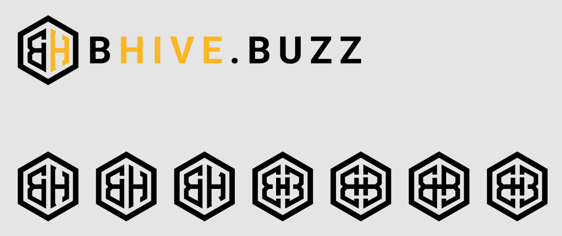
FUN FACT: The original name of this project was bhive.buzz (or at least that was the name I was given). You can see that I designed the first batch of logos based on this name.
I let this one sit for a few days while I do other stuff.
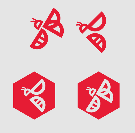
After a few days, the name has suddenly changed into the name you all know: D.Buzz. Now after ruminating about what type of icon I wanted to make, I decided to go for a bee which incorporates the letters "D" and "B". This is what I came up with after probably days of research:
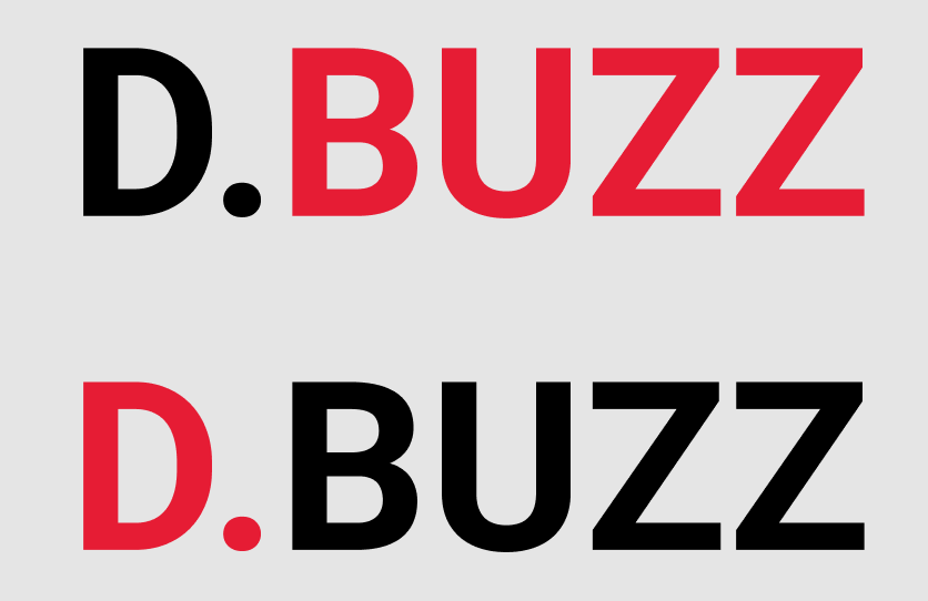
Next is deciding on a font. I already had an idea of what font I wanted to use. I went with Roboto and tried some color combinations:
Then I went ahead and incorporated the two icons I previously made into the font. I also made some more icons in between those days:
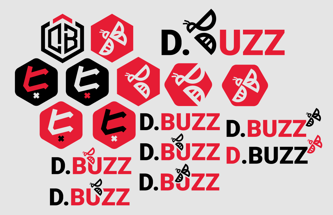
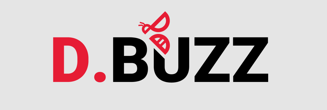
They ultimately decided on this particular combination after some deliberation:
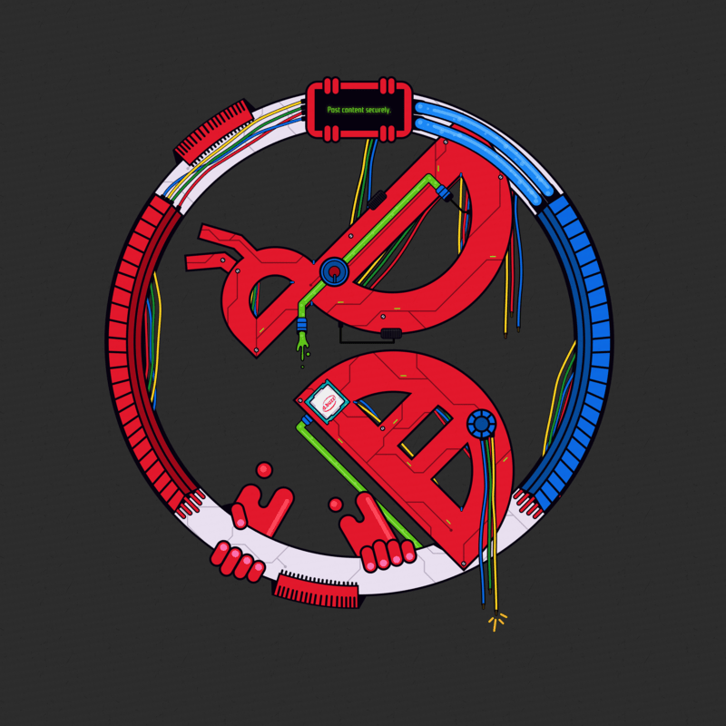
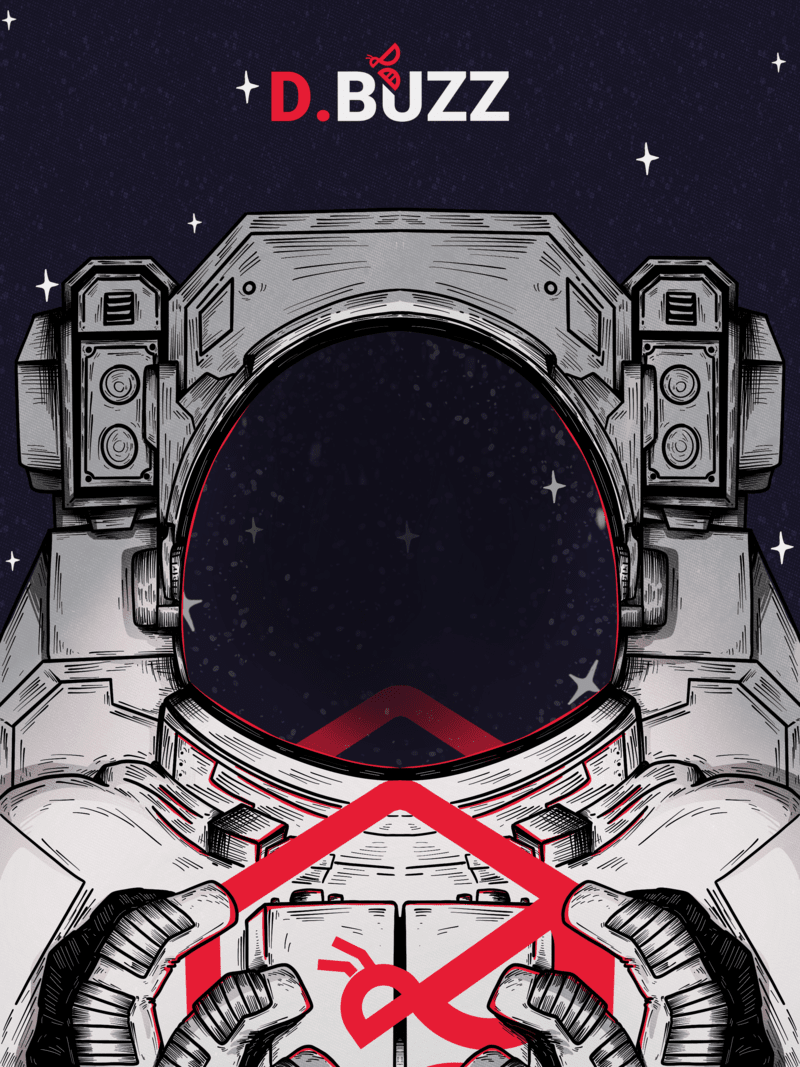
And that's it! Here's a sample of the logo used in promotional material.
I hope you like the final output and had fun reading about the process. Leave a comment, upvote, reblog if you'd like to see more of this.
I bid you farewell for now,
valkangel