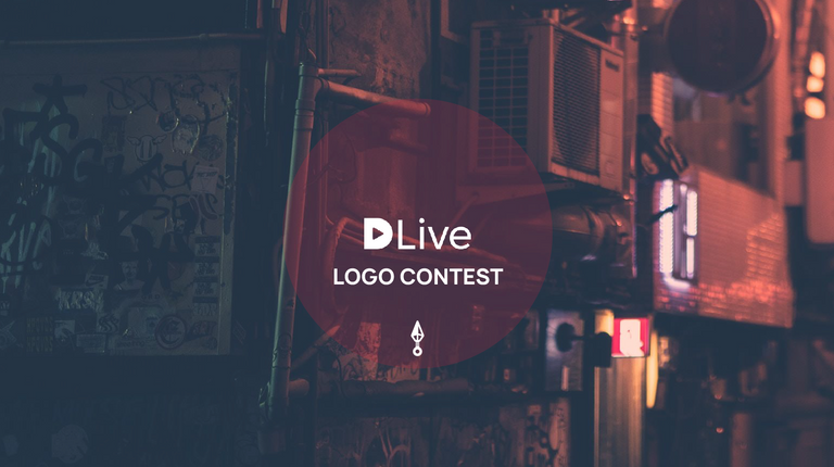
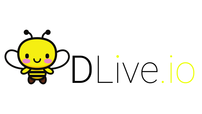
Thank you to everyone that participated in the DLive logo contest as a designer or a voter. We truly do have one of the best live streaming and video communities. With over 100 logo submissions we are pleased to announce the finalists that have been selected by the DLive Team.

A big congratulations to the designers of the 3 logos below.

We are still voting internally between these 3 selected logos. One of these designs will be the official logo for the New DLive. The final announcement will be within the next few days of the winning logo and the top 5 most voted designs, so be sure to watch out for that!
Thanks,
DLive Team

Visit The Official DLive Store!


I apologize for my insolence, but I tried to combine the best.
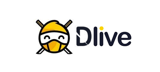
I vote for option three.
This wins my vote
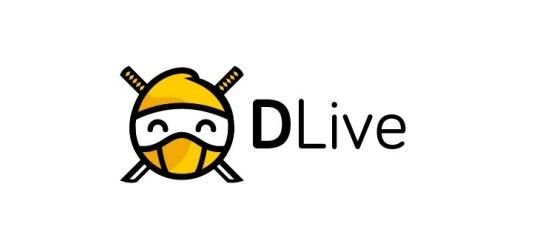
What if we also put a ninja mask on the yellow dot
that would be bad.
I think this ninja might render better in different sizes.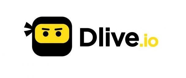
I like this too.
Yes! This one is awesome! Hope it get's to be the new one :)
Hey thank you! I hadn't seen this post.
I like the logo as is
Posted using Partiko iOS
Honestly I feel like further refinement is needed. Seems a bit hasty to rebrand on such a short design process. And a bit too much of a literal interpretation of the breif in my opinion. They feel a bit childish to me. All three have certain charm to them though. If it's not something you feel dead set 100 percent on I don't see harm in another few rounds. Not trying to be negative. it's just an important decision. :)
I totally agree with you. Not to say that these three designs are not good, props to the folks who made them! I really do hope the DLive team raises the bar for these designs on their final versions. Here's to a great rebranding!
There are elements from each I like, bottom logo is cool, not sure on the eyes or crossing swords, could be simplified somehow. I like the touch of shade too. Top has best font. The slice taken out of the text is cool in the middle. Might look better if extended across the whole text ( like the sweep of a samurai sword) could look cool combined with the tops' font. Not a fan of middle font though looks like a childrens brand. Control pad is cool on middle too but gives off the vibe of streaming exclusively gaming. Combining design ideas and hearing various critiques, then refining seems the best way to go. Also all the most famous and memorable brand logos are quite simple. (Sorry for the essay) excited to see what comes out of it though 😂
Hi Dlive and Dlivers! We are a Mother/Daughter team channel here on Steemit. Ava my 10 year old gave it a shot.. this is what she came up with 😊@DLive she is also @girlygamer <3
pretty 😊
hehe thank you! She knows she missed the boat.. but she had some fun with it and that is what counts :D @lebekons
Congrats everyone :)
I think i like the second design whichs eyes remind of an SNES controller (intentional?) best. A bit confused about you simultaniously going for a ninja logo while simultaniously starting to put some emphasis on confirmation of identity (not sure what your further plans in regards to that are)
If those eyes were flipped it would look so good. It's totally a SNES controller and the original D from Dlive logo is the eyes. It's almost like its upside down on accident
They're all so cute! I like elements of all three designs.
I wish I could have helped you guys with the logo challenge but unfortunately I can’t even draw stick people properly lol 😂 involving the community like this was a fabulous idea guys 💜@dlive
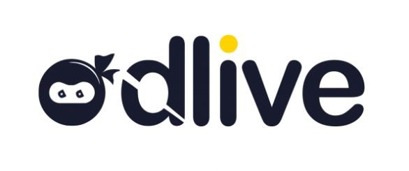
Oh by the way I think number one looks too similar to the lego logo Although I do like it and I think it looks really clean but I have to say two and three are my favourite hard to choose which one😃💜💙💖
I don't know if my vote counts, but my favorite is the third one. it's the most inviting.
I love the colors as well
Congrats to the finalists!
First design reminds me of a lego head and the second design reminds me of imgur's logo.
My personal preference is the third logo - seems the most unique!
Pumped to see which design becomes the next face of dlive.
Well done again!
congrats. 1 2 basic. i love third
I like the second one since it has a huge slice of the "d" missing...lol
Posted using Partiko Android
The logos are very promising. Tough call on these for sure.
2nd desing Gooooooo~d !
My vote is for #2 if it counts. It's simple, easy to re-color for various applications, and it's a modern yet inviting look.
Congratulations to the finalists! They are all unique and awesome. Really excited to see which logo will be chosen as the new logo. Personally, I think I love the third logo it looks cute, clean and inviting to the eyes.
Congratulations @dlive! You have completed the following achievement on Steemit and have been rewarded with new badge(s) :
Click on the badge to view your Board of Honor.
If you no longer want to receive notifications, reply to this comment with the word
STOPTo support your work, I also upvoted your post!
Felicitaciones@dlive te invito visitar mi blog hasta luego
Number 3!😀🔝✌️⚔️
Posted using Partiko Android
I don't comment much but big kudos to the finalists. That being said I do hope there is a refinement process of sorts to either of the three designs. The way they are in their current state doesn't pose much of an improvement when comparing them to the original purple "D" logo.