Youtube Mirror:
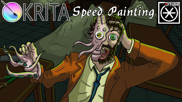
For the Thumbnail of the Call of Cthulhu Let´s Play I had to do some prep Work to do. From Mixamo I downloaded the YBot and adjusted the Rig. Made it possible for the Hand to open and close by copying the local Z rotation of a Bone, added some IK for the Arms and Legs and added some more control Bones. The Difference this time (Compared to the XBot I used in the Video Speedpaint - This War of Mine Thumbnail
) is that the IK has some changes to the Setup.For Example: The last time I used the Hand Bone as Endeffector, this led to some problems with the orientation of the Hand. I wonted that the Hand is Grabbing something and the IK wonted to point the Pointy -Bit of the Bone at the Target. In hindsight it should have been obvious.
Therefore, I added a copy of the Hand Bone as the new Endeffector (same Relations like the Original HandBone), so I can Translate the Hand as wanted. Quick and Dirty.
One of the reasons way I Build a Mockup in Blender, bevor I Draw over it, is that: I'm bad at constructing Spaces. And I am WAY FASTER pushing some Polygons around then building for example a Table in 2D. Anther reason is in 2D-Artistry I have never seen someone constructing cool effects like: distorted Facal Length or Orthographic View, basically everything that cames with emulating banded Glass.
But back to the Thumbnail.
I thought: when I'm making a Image for a Cosmic Horror Game in H.P. Lovecraft (I still think that his Parents gave him a Ironic Name.) Style, I need some Madness. Ergo an Asylum. The Playable Character in the game is Edward Pierce a Detective.
A nosey Detective.
And we know to what curiosity leads in a Lovecraft Story. So we need some Shoggoth on his Face.The Asylum in the game is a nasty 1800 laboratory. So some Tables, bottled Poison in unsealed Shelfs rigth next to the decomposing Bodys and Butcher Equiptment are Tropes that can't be missing in this Image. I added some basic lighting and Materials to the Objects in the sene and exported it to Krita. I played in this Thumbnail with Cloth (a thing I have to practise) and got some acceptable resoltes (for the current Iteration). His Jaked got a little to deformed for my taste but jea it got the basics across.
The last time I thought about Improving the Workflow, I haven't done mutch in prep for this Thumbnail, except for a Brush. The Brush is a Eraser whit a hard transition. The Idea was that I made a Black-ish ShadowMask whit max Darkens (on the layer which it is applied on) and the Eraser made the Transitions. Sadly it only works as intended when the Object is planar to the camera.
JEY Edgecases!
So I had to do it by hand again. I made the Shadows a little bit harder this time so it looks more eery. After I Painted the Thumbnail I added some Green light which increased the contrast. It would have been more logically to mix the White Ligth with the Green... but jea this Image got 1/3 less time then the last one sooooooo. Time == Quality.
For the next time I prepared a basic Krita Project and some Brushes. Hopefully, the Brushes are more useful the next Time.
I also should make some Rudimentary Proplibrarys ... I have to look in to that.
▶️ DTube
▶️ IPFS
Hello @koraktorxv! This is a friendly reminder that you have 3000 Partiko Points unclaimed in your Partiko account!
Partiko is a fast and beautiful mobile app for Steem, and it’s the most popular Steem mobile app out there! Download Partiko using the link below and login using SteemConnect to claim your 3000 Partiko points! You can easily convert them into Steem token!
https://partiko.app/referral/partiko
Congratulations @koraktorxv! You received a personal award!
You can view your badges on your Steem Board and compare to others on the Steem Ranking
Vote for @Steemitboard as a witness to get one more award and increased upvotes!