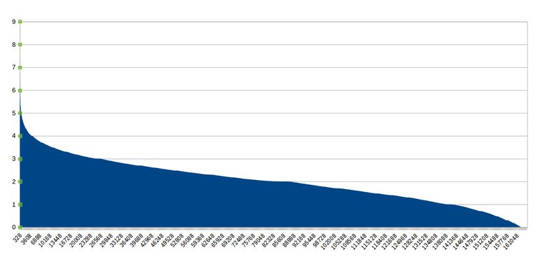
We made the following chart from the snapshot.

The y axis shows the logarithm (base ten) of the amount of EOS in each account. The accounts are arranged in descending order. Besides being a nice shape, this chart immediately gives some insights:
Approximately 55% of the accounts are above 100 EOS, and the other 45% under 100 EOS (Log 100 = 2). The top 15% of the accounts are those with more than 1000 EOS approximately (Log 1000 = 3).
Accounts with at least 1 millon EOS cannot be seen in this graph, but they can be analyzed individually, there are only 70 of those. There are 17 accounts with at least 10 million EOS. I conjecture that most of these belong to exchanges.
Finally, there is just one account with at least 100 million EOS, this is Block.one.
(Note: the snapshot was taken from https://github.com/eosnewyork/snapshots/blob/master/final/2/snapshot.csv )
Very cool! Txs for sharing
De nada, querido Timotteo Gordillo
Thanks @eosargentina.
thank
Can you make the image bigger?
@adrianbye - right click, open in new tab
you can simply zoom in