Few days ago @anotherjoe pointed me towards Trybe as another site where i could post my stuff and do all the fine things you do on sites similar to this.
I say "sites similar to this" because today i read a comment made by @officialfuzzy on Whaleshares that said this:
p.s. you will not find blogs from me on this site (Whaleshares) as it is not a blogging platform in the end vision. once we are out of beta people will understand.
After that comment i went on to read the Whaleshares whitepaper and i still didnt see Whaleshares being something more then a social media blogging platform. But! Since Fuzzy wrote that, i will henceforth use the adjective "similar" to describe what im talking about as to stop myself from being wrong and lacking in understanding. lol.
Anyways…
I tried out Trybe and right off the bat i ran into a number of things that annoyed me.
There were art assets overlapping, the screen load was choppy and parts of the window would move up and down for no reason. The page never loads all at once but rather in parts.
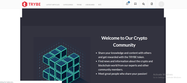
Two screenshots of the same page 2 seconds in-between.
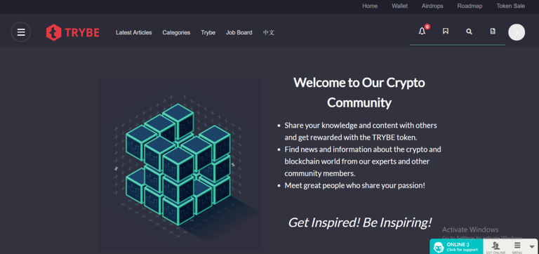
Art asset placement seems very different.
Looking at the initial screen and menus, everything seemed extremely convoluted and instead of me being able to find my blog right away, they placed "job board" on the front page and your blog link is placed somewhere inside the side menu. The right side menu, not the left one.
Even when you get to your blog page theres more clickable links and windows that you can watch slowly load by clicking them. Everything is just too large and hard to navigate and theres at least 40% clickable links that shouldnt even be there that are simply cluttering the UI.
Did i say how annoyingly slowly the pages load? They even change color when they load lol.
Want to see some more dumb design decisions?
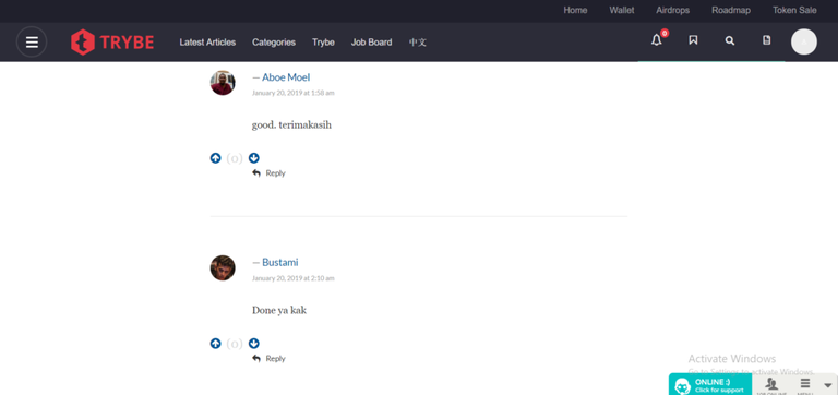
Which designer (and mind you the site hardly looks like its in a alpha state) thought it would be a good idea to have so much spacing between comments that only two 10 word comments fit on my whole screen? You can literally park a bus in the space between those two comments...
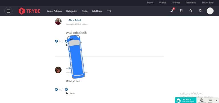
Actual bus caught parked in the Trybe comment section.
Even making a post feels strange. Theres a review process so you always feel like someone is watching. The always present support window doesnt help with that feeling. I dunno, i just dont feel comfortable writing there.
When you do post, your post can be found in 3 states. Published, in review, draft. Click and wait through more page loads to find where you post is at. I counted.. Takes me about 3 seconds to load and i have super fast internet.
There are some rules to follow and im assuming they check the content before allowing you to post something. Hello censorship! (im tempted to try and see the limit of what youre allowed to write about.) You have to meet the 300 word minimum requirement and you have to put a featured image or they reject the post. Why they couldnt simply automate that the text cant be posted if those two requirements werent met so i dont have to wait for the review, is beyond me. I guess they dont want unwanted content on their site.
Browsing content itself is unintuitive as and of course its tied into the slow page loading time so i didnt even bother trying.
And there you have it. Pretty disappointing experience i probably wont repeat.
PS: Im not someone that will speak negatively about a platform because i might hold STEEM or WLS instead of EOS. I would have very much wanted Trybe to be another place to post on and learn new stuff but unfortunately the user experience is simply bad.
Ill see you guys around. ;)
Posted from my blog with SteemPress : https://scrips.io/blog/lordbutterfly/tried-out-trybe-not-impressed/
It's a fair review. Hopefully the new UI will offer a better experience.
When they make it smoother ill have no problem trying it out again. :)
Looks like the Trybe Team provided few answers/comments here:
https://eos.discussions.app/#/e/trybe/5284596720/Tried_out_Trybe____Not_impressed_
Thx for letting me know. As i said to anotherjoe. If improvements come im more then willing to give it another shot.
Posted using Partiko Android
The https://eos.discussions.app provides an option to publish/comment with or without the EOS account so feel free to comment under their reply.
Hi @lordbutterfly!
Your post was upvoted by @steem-ua, new Steem dApp, using UserAuthority for algorithmic post curation!
Your UA account score is currently 3.561 which ranks you at #6189 across all Steem accounts.
Your rank has not changed in the last three days.
In our last Algorithmic Curation Round, consisting of 255 contributions, your post is ranked at #150.
Evaluation of your UA score:
Feel free to join our @steem-ua Discord server