To design good logos (or to be a good designer in general) you don’t have to become a scientist. But the basics of colour science should be part of the knowledge of a designer, as this understanding makes it easier, and faster, to design great results. Let us explore the basics of the colour wheel to get a good foundation on how and why to use specific colours in the next couple of articles.
The basic colour wheel
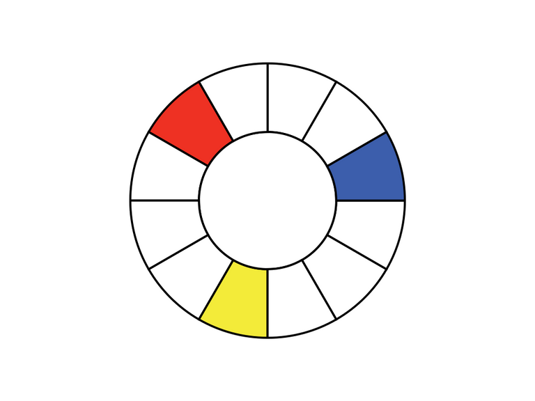
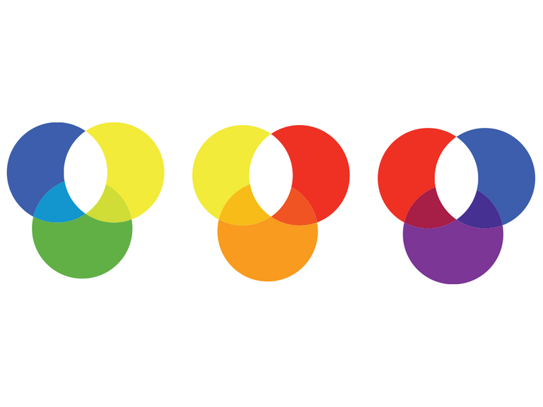
It all starts with the primary colours: Red, Yellow, and Blue. We position these colours on a circle 360°/3 (120°) apart from each other. This is the starting point for every colour wheel.
Some colour wheels show a gradient, some use dozens of blends and even include saturation. For now, we’ll focus only on the primary colours and their first and second tier blend.
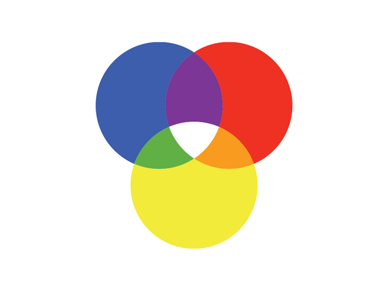
If we blend the primary colours, we’ll get a new set of 3 colours, the secondary colours:
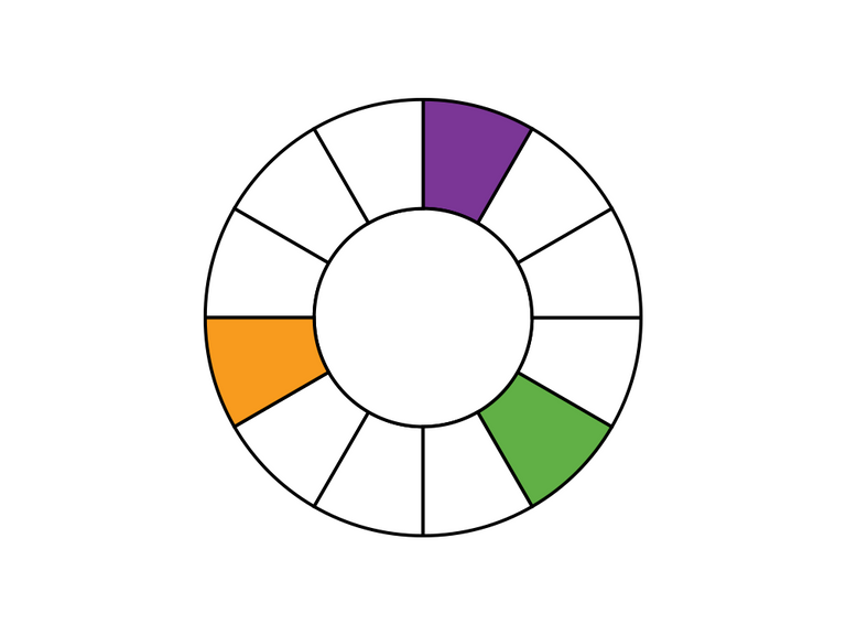
Let us position them on the colour wheel as well.
Now we can go one step further and blend the secondary colours with the closest primary colours next to it to create the six tertiary colours.
These can also placed on to the colour wheel:
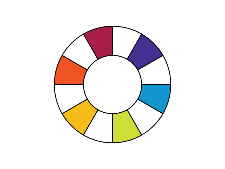
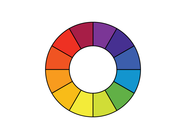
Bringing it all together gives us the basic colour wheel, that we’re going to explore further in following articles: