In the last article we’ve established the basics in theory. But can the colour wheel actually help us in the practical design process? Yes, it can, and even the basics of the practical usage are enough to increase your skills as a designer.
Warm und cold colours
You can split the colour wheel in half and get a palette that works well together. The most basic split is the vertical split from 12 to 6 o’clock.
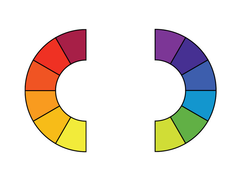
You can easily see, that the left colour palette gives us a warm feeling, while the right gives us a cold one. But this split is only an example. You can split the colour wheel in half almost anywhere and get a palette that works together – depending on where you split it, your palette will become warmer or colder.
Complementary colours
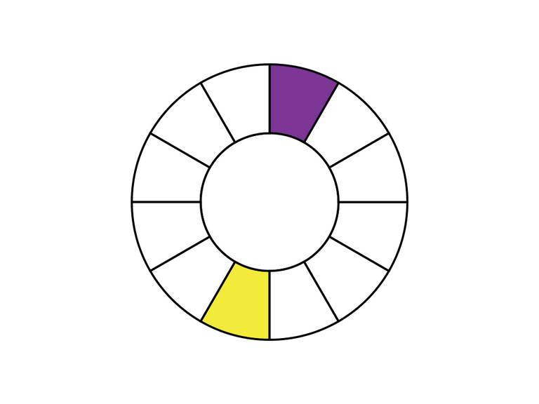
Another approach is to use colours opposite each other. This leads to complementary colours. Even though the contrast between such colours is the biggest possible, they work well together.
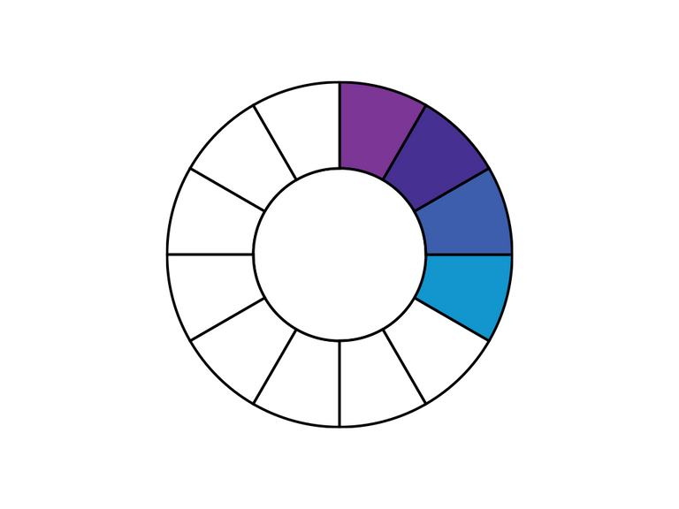
The next step is to use split complementary colours. They give you a little bit less contrast and a bigger colour palette.
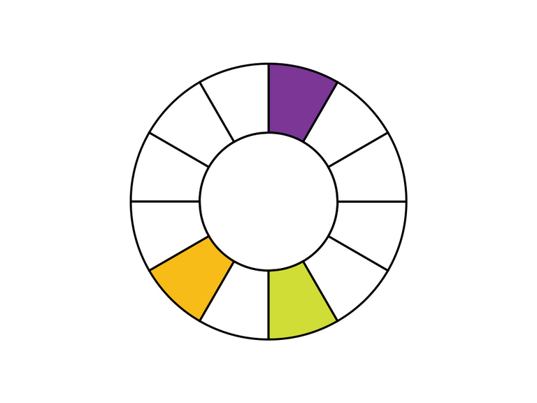
Analogues colours
You can also create colour palettes by working with colours next to each other on the colour wheel. There is almost nothing you can do wrong by using this approach.