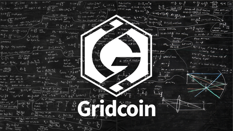
Believe it or not, that was a huge topic of contention as we were working on the project. I agree with you %100: Gridcoin, BOINC, is not only biology. The problem came when we tried to find some sort of imagery that could represent everything that BOINC is used for. Sociology, politics, math, chemistry, physics... there's so much! We could not find the right imagery to depict grid computing while maintaining the ability to scale. The compromise is in the G itself: it uses a transparent background so themes can be placed behind it. Here's an example (an old mock-up used just to demonstrate the utility):

This failure of the simplified logo is where the more complex logo comes into play.
There will most likely be better examples of this combination as we develop the media packs.
Also I like the idea that a person's DNA contains a lot of information to make them who they are. In this case Gridcoin is almost like a foundation which represents so many different things being done. I personally love the new logo also.