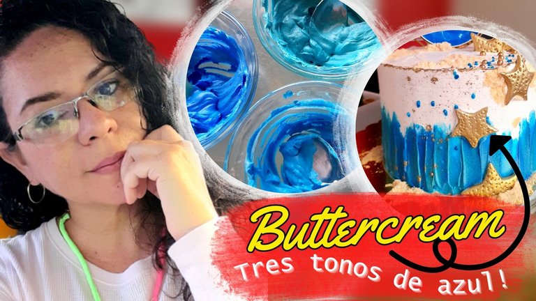
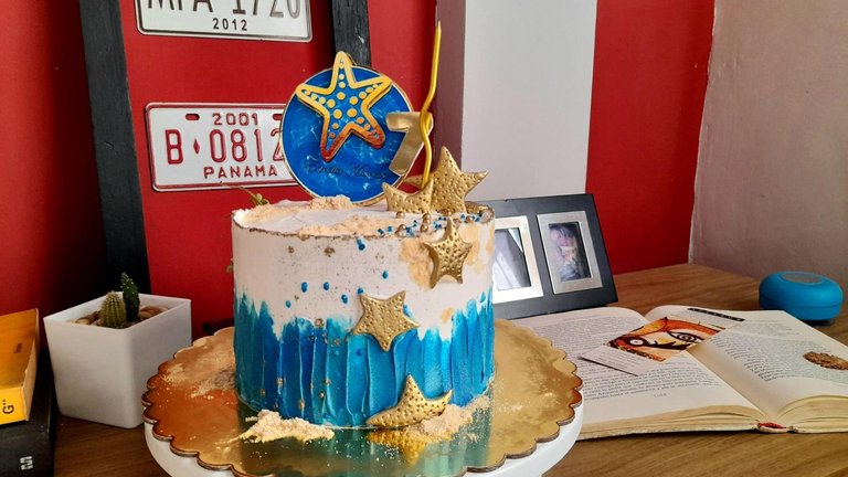
En mi última visita a la comunidad estuve compartiendo con ustedes, algunos trucos sencillos para colorear la buttercream, pero les había prometido regresar para contarles cómo logré los tres tonos de azul que utilicé para el pastel Estrella Marina del cual les he estado hablando últimamente. Así que cumpliendo lo prometido, ¡aquí estoy!
Y ustedes pensarán... "Pues fácil, comprar el colorante del tono que necesitas y ya", pero ojalá fuese tan simple como eso, porque aunque lleves el tono que se corresponde al color que necesitas, muchas veces aplicarlo no resulta suficiente y tienes que recurrir a la ayuda de otros colores, para entre mezcla y mezcla dar con el que necesitas.
Y la verdad no sé si se trata de la marca del colorante, pero hasta ahora he probado tres marcas diferentes, una con mejor fama que la otra, pero la verdad es que no en todos los tonos, cumplen lo que prometen y termino con un color, que no es el que necesito, pero la solución se encuentra a un "clic" de distancia, pues con la ayuda del buscador de Google, puedo encontrar la combinación de colores que me llevará al tono que necesito.
Y ya con el tiempo he logrado recordar las combinaciones básicas para lograr los colores que quiero, cosa que también aplico cuando no tengan un color específico en casa, ya que con tener los tres colores primarios, puedo hacer los otros.
Aprendamos a mezclar colores
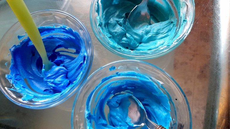
Para el día de hoy les mostraré cómo hice los tres tonos de azul, que utilicé en el pastel Estrella Marina, como lo son: el azul claro, el azul rey y el turquesa.
Azul claro
De estos tres colores el más sencillo es el azul claro, porque es el único que no necesita nada adicional, simplemente separamos la cantidad de buttercream que queremos colorear, agregamos algunas gotas de colorante en gel, y mezclamos bien hasta incorporar todo.

Lo ideal es agregar de a poco el colorante e ir probando hasta obtener el tono deseado. En mi caso como ven, yo tengo varios tonos de azul, por lo que dependiendo del color que quiero, decido cuál usar, cosa que hago de gota en gota, pero no se preocupen, porque si se exceden de azul, con incorporar un poco de buttercream blanca pueden solucionar el problema.
Turquesa
Para este color hice lo mismo que en el caso anterior, separe una porción de buttercream y le di una tonalidad azul claro, para luego agregar un poco de colorante verde. En este punto hay que ser muy cuidadosos con el verde, y agregar una pequeña cantidad, en mi caso como la porción de buttercream era pequeña iba probando de gotita en gotita.
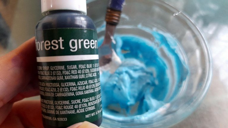
La verdad no quedé muy conforme con este tono, sentí que no quedó tan lindo porque el verde que tenía era un verde navidad, un tono bastante fuerte de verde, así que en casa prueben con un verde más claro y el resultado será mucho mejor.
Azul Rey
Este tono, la primera vez que lo hice, fue un gran dolor de cabeza, de hecho tuve que comprar dos colorantes distintos, incluso marcas diferentes y nada, porque aunque quedaba azul, no era ese azul vibrante, y buscando información por todos lados, encontré una solución que me daba temor probar, y era agregar un poco de morado a la mezcla.
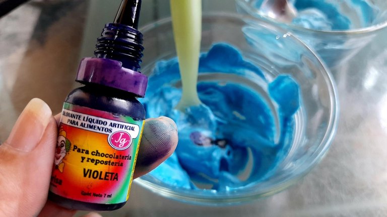
Pero finalmente esa era la solución, y desde ese momento le perdí el miedo al azul rey, así que para esta ocasión, separé la porción que quería teñir, le agregué azul oscuro, y cuando estuvo listo de gotita en gotita fui probando con el morado, hasta que el azul quedó como lo necesitaba, y de esa manera logré conseguir los tres tonos que utilicé para decorar la parte inferior del pastel Estrella Marina.
Como ven, no es ni tan difícil, ni tan sencillo. Lo que puedo recomendarles es que prueben con porciones pequeñas de buttercream antes de trabajar cantidades grandes, para no dañar material.
Otro tip importante es que si el colorante llegase a suavizar demasiado el buttercream lo pueden solucionar agregando un poco de azúcar glas tamizada a la mezcla, hasta que volvamos a sentir la contextura que queremos.
Espero que estos consejos le puedan ser de utilidad, y se animen en casa a crear pasteles hermosos para cada celebración.

On my last visit to the community I was sharing with you some simple tricks for coloring buttercream, but I had promised to come back to tell you how I achieved the three shades of blue I used for the Sea Star Cake which I have been telling you about lately. So as promised, here I am!
And you may be thinking... "Well easy, just buy the colorant of the shade you need and that's it", but I wish it was as simple as that, because even if you have the shade that corresponds to the color you need, many times applying it is not enough and you have to resort to the help of other colors, to find the one you need between mixing and mixing.
And the truth is that I don't know if it is the colorant brand, but so far I have tried three different brands, one with a better reputation than the other, but the truth is that not in all the tones, they fulfill what they promise and I end up with a color, which is not the one I need, but the solution is just a "click " away, because with the help of Google search engine, I can find the color combination that will take me to the tone I need.
And with time I have been able to remember the basic combinations to achieve the colors I want, which I also apply when I don't have a specific color at home, because with the three primary colors, I can make the others.
Let's learn to mix colors
Today I will show you how I made the three shades of blue that I used in the Sea Star cake: light blue, royal blue and turquoise.
Light blue
Of these three colors the easiest is the light blue, because it is the only one that does not need anything additional, we simply separate the amount of buttercream we want to color, add a few drops of gel coloring, and mix well until everything is incorporated.
The ideal is to add the colorant little by little and try it until you get the desired tone. In my case, as you can see, I have several shades of blue, so depending on the color I want, I decide which one to use, which I do drop by drop, but don't worry, because if you overdo it with blue, just add a little white buttercream and you can solve the problem.
Turquoise
For this color I did the same as in the previous case, I separated a portion of buttercream and gave it a light blue shade, and then added a little green coloring. At this point you have to be very careful with the green, and add a small amount, in my case as the portion of buttercream was small I was testing from drop to drop.
The truth is that I was not very happy with this tone, I felt that it was not so nice because the green I had was a Christmas green, a pretty strong shade of green, so at home try with a lighter green and the result will be much better.
Royal Blue
This tone, the first time I made it, was a big headache, in fact I had to buy two different dyes, even different brands and nothing, because although it was blue, it was not that vibrant blue, and looking for information everywhere, I found a solution that I was afraid to try, and that was to add a little purple to the mixture.
But finally that was the solution, and from that moment on I lost my fear of royal blue, so for this occasion, I separated the portion I wanted to dye, added dark blue, and when it was ready, drop by drop I tried the purple, until the blue was as I needed it, and in that way I managed to get the three shades I used to decorate the bottom of the Sea Star cake.
As you can see, it is not so difficult, nor so simple. What I can recommend is that you try with small portions of buttercream before working with larger quantities, so as not to damage the material.
Another important tip is that if the coloring should soften the buttercream too much, you can solve it by adding a little sifted powdered sugar to the mixture, until you get the texture you want.
I hope you find these tips useful, and that you will be encouraged at home to create beautiful cakes for every celebration.
Waossss jajaja. Muy buenos tus tips, amiga. Todo nos lleva siempre a la teoría del color
Very waos!!!! Jajaja no puedo con ese novio tuyo!
Gracias por pasarte Bani. Abracitos
Agradecidas por el apoyo! En cuanto pueda les estoy delegando. Es una promesa ♥️
Definitivamente no es nada facil lograr una combinacion de colores deseada, a veces loc colorantes en verdad no ayudan mucho que digamos jaja yo compre uno rojo y resulto que salia rosa, por mas que le pusiera mas cantidad, nunca se veia rojo 😶
Estos colores que lograste son preciosos, el azul ya de por si es uno de los colores mas lindos para mi, debe ser porque me recuerdan mucho al mar que me fascina jaja Muy buena tu explicacion, super clara y concisa 👏 gracias por los tips ❤️
Amiga, gracias por pasarte.
El rojo es otro color que provoca llorar, y como le gusta a la gente jajaja.
Probaste dejándolo en la nevera unas horas y luego mezclar otra vez?
A mi me ayuda, y si lo dejo de un día para otro mucho mejor. Esto en el buttercream, en merengue no sé qué brujería hacen jajaja. Nunca me queda!
Abrazos
jajaja que brujeria hacen, me hiciste reir con eso jajajajajaja 😂😂
No lo habia probado asi como dices pero obviamente lo tendre en cuenta cuando vuelva a usar rojo, si no sale, bueno, chau rojo jajaja ok no, gracias por el tip 👌
Jajajajaja a mi me funcionó, seguro a ti también!
Cariños
Woow amiga me encanta, uno se queja de los "precios elevados" de las tortas y no se da cuenta del trabajo que hay detrás...
Felicidades amiga, está torta te quedó bella y esos colores están divinos...
Hola ami bella! Exactamente eso amiga, es todo un proceso y un trabajo de horas y horas. Quizá muchos piensan que tenemos una varita mágica jeje.
Desde que comencé a trabajar con esto, no me quejo del precio de ninguno de estos productos, porque se lo que hay detrás.
Abrazos mi bella
~~~ embed:1716802478115607004?t=E0bpxVQ9D_Bx40-N0jMG_A&s=19 twitter metadata:Ul9sYXRodWxlcmllfHxodHRwczovL3R3aXR0ZXIuY29tL1JfbGF0aHVsZXJpZS9zdGF0dXMvMTcxNjgwMjQ3ODExNTYwNzAwNHw= ~~~
Estos tips de colorimetría sin duda son súper útiles.
Gracias por compartir.
Gracias amiga bella. Abrazos
@tipu curate 8
Upvoted 👌 (Mana: 0/75) Liquid rewards.