That was actually pretty informative for me. I don't have the excel program, but I have been using LibreOffice, and while it may not have all the tools, such as trend lines for the stock charts yet, I still learned a bit. It was funny to see the post today, as just a couple days ago I was scrolling back and looking to see what chart options since I was just starting to play with the charts in Libre.
Ashers pie charts really got me going today, so I have my first two charts. First my May earnings chart:
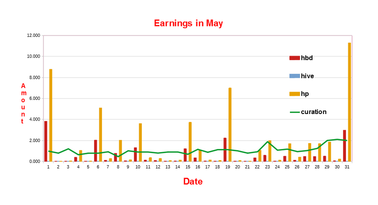 I found that to be a little bit hard to read, so I tried a pie chart, prior to making my pie chart I looked in the market to conver all my HBD's that were earned into Hive, so that it would be more representative of my earnings:
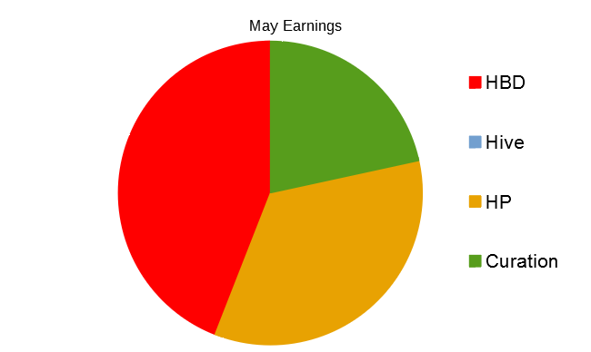
A little bit more work and I might figure out how to get amounts shown in the sections. I could not find a tool for doing like Asher and having the little boxes with percentages, that would have been a nice way to show the actual amounts.
I am learning, thanks for the free help vids and post.
well done you. Your pie chart is nice and round :-)
Although with Libre I do not know how to add amounts to the sections. In Excel you would use the option to add data labels. You can get a free trial version of Excel here https://www.microsoft.com/en-ie/microsoft-365/excel
About an hour or two after replying, I found the data labels, and percentage, so I was pretty happy to learn that, I haven't found how to move the labels but do know how to change them. So On my Friday Progress report post I am going to have the full blown pie with label toppings. ;-}.
way cool. Where are you grabbing the data from? are you manually keeping track or using a service?
Manually, getting the numbers from the peakd tools page, and putting them in a spreadsheet, Asher gives me my monthly vote total, and leofinance has hivestats for the APR. So every couple of days, I enter them, and then on Fridays I make my weekly progress, which helps a lot when it come to the end of month report. Here is the pie chart with the labels and data:
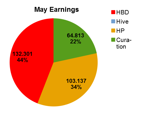
No Hive earned in the Month, and I converted all the HBD to the equivalent of Hive in the wallet market place, to see how the comparison would look.
It took some digging to find how to use the tool, and I hope I don't forget.