So under this idea I wanted to make the design.
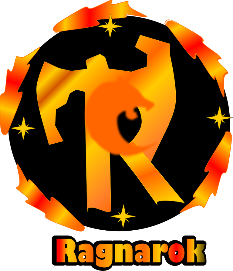
The idea came to me taking a Nordic ax and transforming it into the letter R of ragnarok, then make the silhouette of the wolf and incorporate it into the R. To represent the wind, use the cardinal points in the star that I make, where I place them showing both north, south east and west.
Regarding the color palette, I decided to use the colors that represent fire, between yellow, orange and red.
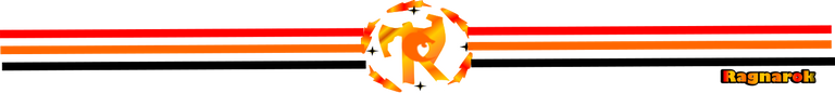
I tell you that making the design was modified since during the design there were strokes that I did not like and in the end I managed to get what I wanted. I share the design process, which also makes a small banner and separator.
Design process.
Trace of the R with the shape of a nordic ax
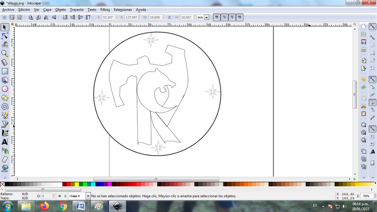
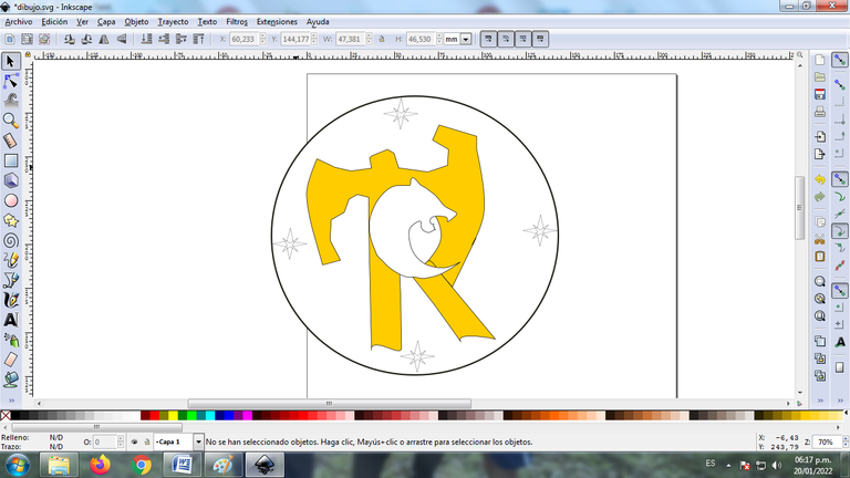
Here place the circle and trace the elements you would need, stars and wolf silhouette
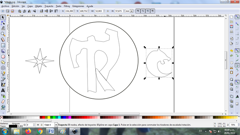
Already here I joined the three elements forming the design of the idea
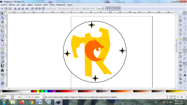
I began to place the colors to the letter R
Here I color all the elements
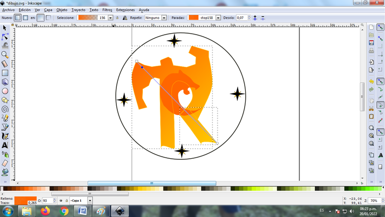
I begin to play with shades of yellow, red and orange gradients
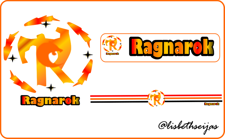
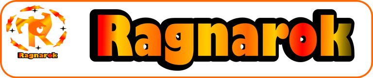
I show you the final logo, where you place two different backgrounds
Final Logo
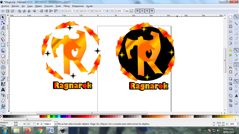
#Logo 1

Logo 2
Banner and separator
I hope you like it
See you in a next publication
Thanks for reading me

Versión Español
Hoy quiero ser parte de las propuestas de logo para ragnarok, me gusta muchas inventar con los diseños, y viendo que es un nuevo juego para hive, quise dar mi aporte.
Para poder realizar el logo me llevo a investigar a que se refiere entonces conseguí que se refiere a las mitologías nórdicas y que usaban el viento, el hacha y el lobo.
Entonces bajo esta idea quise realizar el diseño.
La idea se me vino tomando una hacha nórdica y transformarla en la letra R de ragnarok, luego realice la silueta del lobo e incorpore dentro de la R. Para representar el viento utilice los puntos cardinales en la estrella que realizo, donde las ubico mostrando tanto el norte, sur este y oeste.
En cuanto a la paleta de colores decidí utilizar los colores que representan el fuego, entre amarillo, naranja y rojo.
Les cuento que realizando el diseño fue modificando ya que en el transcurso del diseño había trazos que no me gustaban y logre al final conseguir lo que quería. Les comparto el proceso del diseño, que además también realice un pequeño banner y separador.
Proceso del diseño.
Trazado de la R con la forma de hacha nórdica
Aquí coloque el circulo y trace los elemento que necesitaría, estrellas y silueta de lobo
Ya aquí uni los tres elementos formando el diseño de la idea
Empece a colocar los colores a la letra R
Ya aquí coloredao todos los elementos
Comeinzo a jugar con degradados entonalidades amarillo, rojo y naranja
Les muestro el logo final, donde coloque dos fondos diferentes
Logo Final
Logo 1
Logo 2
Banner y separador
Espero les guste
Nos vemos en una próxima publicación
Gracias por Leerme
The rewards earned on this comment will go directly to the person sharing the post on Twitter as long as they are registered with @poshtoken. Sign up at https://hiveposh.com.