ENGLISH
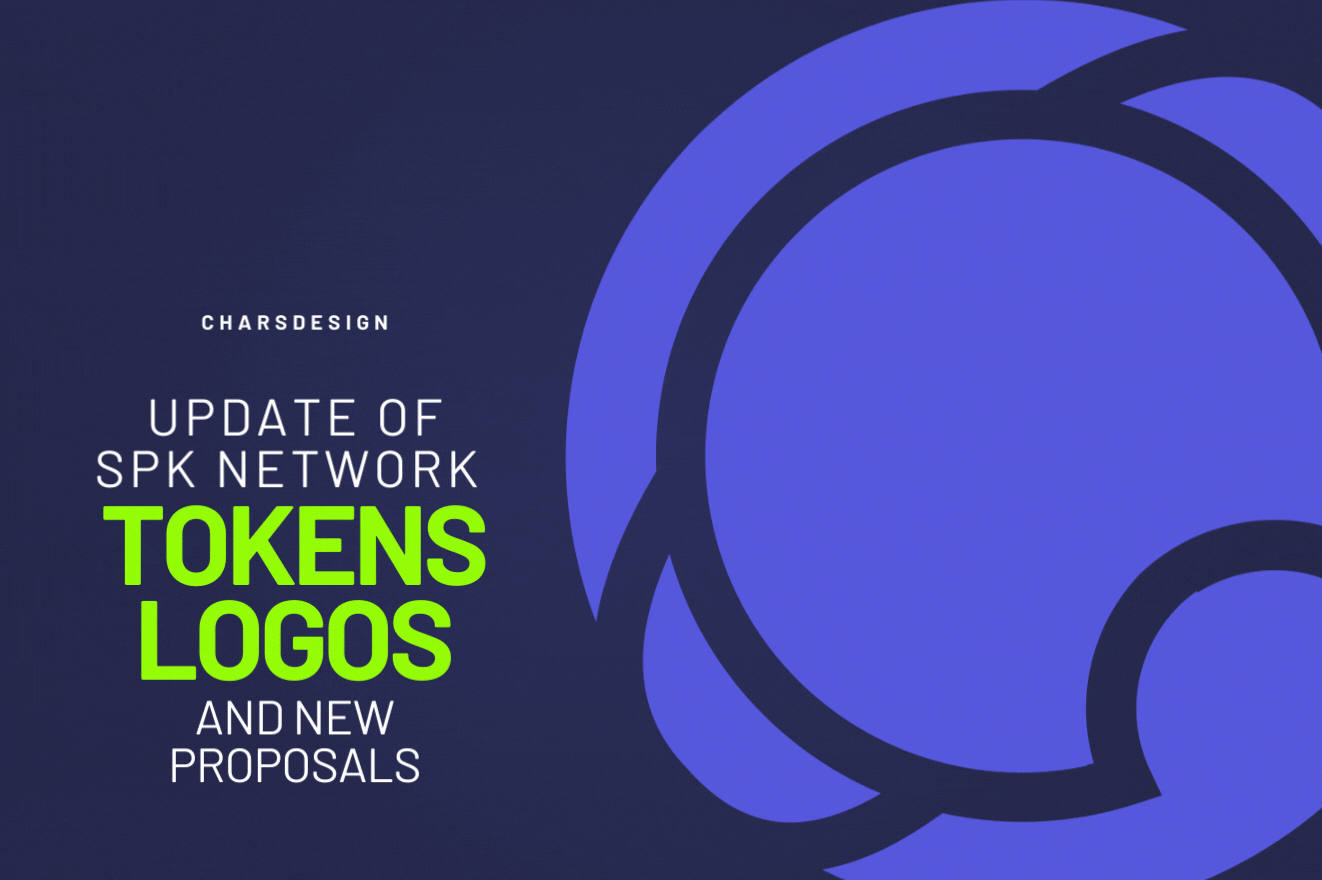
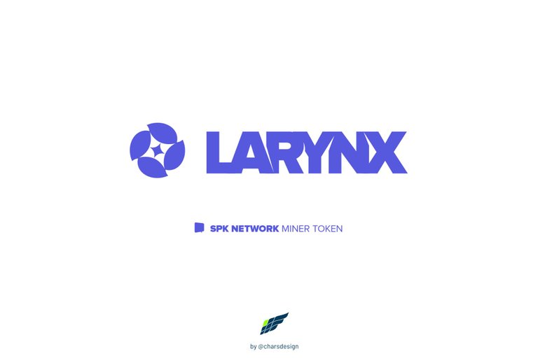
As I mentioned in previous posts in this post you will see some updates and refreshes of the logos that I initially showed you as well as some very interesting new proposals for the SPK Network platform tokens: SPK, LARYNX and BROCA.
ESPAÑOL
Como comenté en las publicaciones anteriores en este post verán algunas actualizaciones y refrescamientos de los logos que inicialmente les mostré así como algunas nuevas propuestas bien interesantes para los tokens de la plataforma SPK Network: SPK, LARYNX y BROCA.
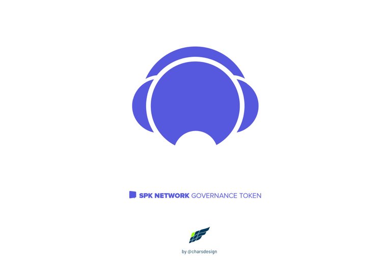
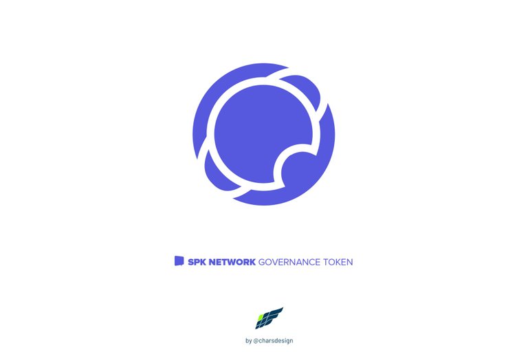
UPDATING VERSION 1
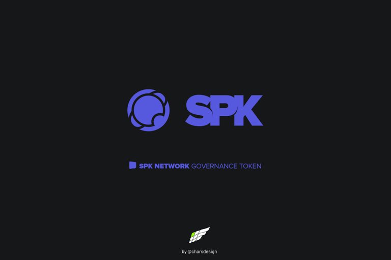
SPK TOKEN LOGO
Based on the first logo proposal I made, the new isotype of the SPK token shows a slightly more developed and dynamic speaker.
ACTUALIZACIÓN VERSIÓN 1
LOGO TOKEN SPK
Basado en la primera propuesta de logo que realicé, el nuevo isotipo del token SPK muestra un speaker un poco más desarrollado y dinámico.
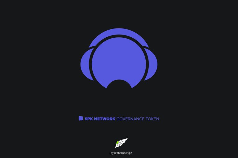
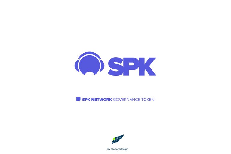
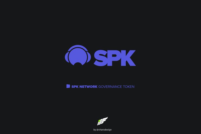
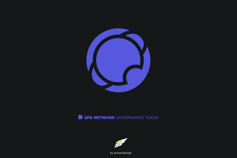
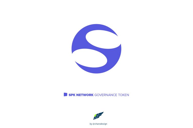
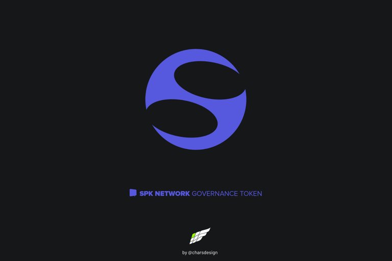
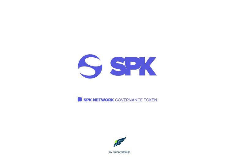
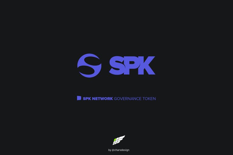
UPDATING VERSION 2
SPK TOKEN LOGO
In this second version, the graphic concept is more compact and with a certain inclination, which gives it greater dynamism.
ACTUALIZACIÓN VERSIÓN 2
LOGO TOKEN SPK
En esta segunda versión, el concepto gráfico es más compacto y con cierta inclinación, lo que le confiere mayor dinamismo.

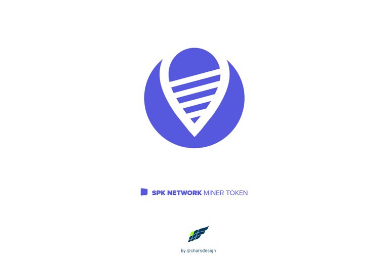
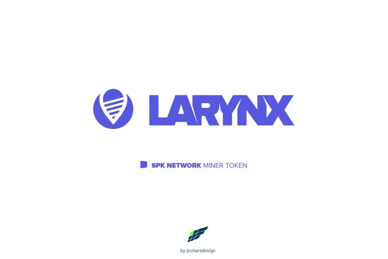
NEW PROPOSAL VERSION 2
LARYNX TOKEN LOGO
This new proposal is still based on the mining process. Thus we see a graphic that emulates a kind of drill that is making its way, as do the large earth drills in search of minerals.
NUEVA PROPUESTA VERSIÓN 2
LOGO DEL TOKEN LARYNX
Esta nueva propuesta sigue estando basada en el proceso de la minería. Así vemos un grafismo que emula una especie de perforador que se está abriendo paso, como lo hacen las grandes perforadoras de tierra en busca de los minerales.
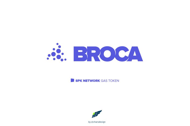
NEW PROPOSAL VERSION 1
BROCA TOKEN LOGO
The concept of regeneration can also be seen at the cellular level and this proposal tries to show that concept in which the cells of a body are born when others die, so that the functions of the organism can continue to be carried out. Logically, it is based on the fundamental premise of BROCA and its function within the SPK Network.
NUEVA PROPUESTA VERSIÓN 1
LOGO DEL TOKEN BROCA
El concepto de la regeneración también puede verse a nivel celular y esta propuesta trata de mostrar ese concepto en el que las células de un cuerpo nacen al morir otros, de modo que se puede seguir cumpliendo con las funciones del organismo. Lógicamente esto es basado en la premisa fundamental de BROCA y su función dentro de la red SPK Network.
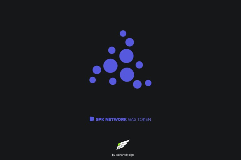
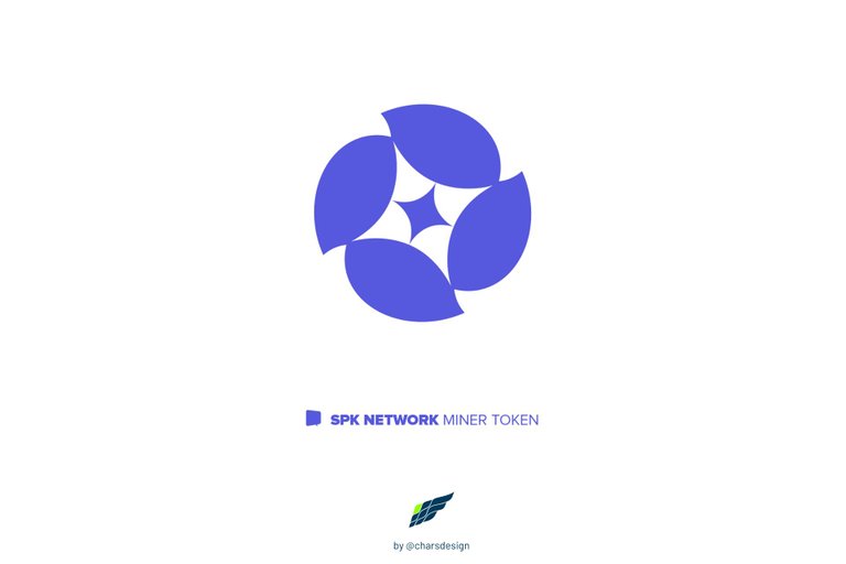
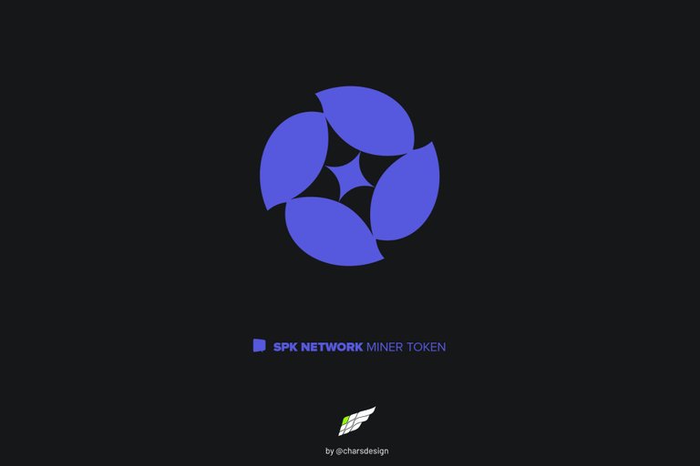
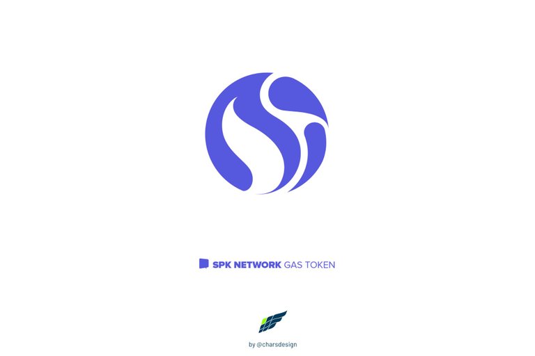
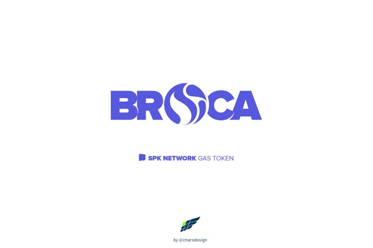
NEW PROPOSAL VERSION 2
BROCA TOKEN LOGO
In this new proposal, the concept of the isotype is focused on energy, more specifically on a flame. However, I did not want to focus on gas or any other non-renewable energy because that differs from the concept of regeneration that Broca wishes to convey. As in my proposal in the previous post, this isotype consists of two parts, the left is the energy that makes it possible to interact on the SPK Network platform and the left shows two elements that go up and that emulate the moment a publication is loaded, vote or comment.
NUEVA PROPUESTA VERSIÓN 2
LOGO DEL TOKEN BROCA
En esta nueva propuesta el concepto del isotipo está enfocado en la energía, más específicamente en una llama. Sin embargo, no me quise enfocar en el gas ni en ninguna otra energía no renovable porque eso difiere con el concepto de regeneración que broca desea transmitir. Como en mi propuesta del post anterior, este isotipo consta de dos partes, la izquierda es la energía que hace posible poder interactuar en la plataforma SPK Network y la izquierda muestra dos elementos que suben y que emulan el momento en que se carga alguna publicación, se vota o se comenta.
I hope you find these drafts of the SPK Network tokens isotype and imagotype interesting. If so, I invite you to followme.
I have also participated in the following contests:
• OCD logo contest 1 • OCD logo contest 2 • OCD logo contest 3 Winner!
• POSH logo contest Winner!
• artECENCY contest Winner!
If you want to see other of my professional designs in the Editorial, Web and Advertising areas, I invite you to see my portfolio at Upwork.com
Espero que estos borradores del isotipo e imagotipo del token BROCA le resulten interesantes. Si fuera así le invito a seguirme
También he participado en los siguientes concursos:
• Concurso OCD logo 1 • Concurso OCD logo 2 • Concurso OCD logo 3 ¡Ganador!
• Concurso POSH logo ¡Ganador!
• Concurso artECENCY ¡Ganador!
Si quieres ver otros de mis diseños profesionales en las áreas Editorial, Web y Publicitaria, te invito a ver mi portafolio en Upwork.com
All designs, images and concepts shown in this post are my authorship.
All rights reserved @charsdesign.
Vectorization: Adobe Illustrator
Images edition: Adobe Photoshop
Banners: Canva
Translation: DeepL • Google Translate
Todos los diseños, imágenes y conceptos mostrados en este post son de mi autoría.
Derechos reservados @charsdesign.
Vectorización: Adobe Illustrator
Edición de imágenes: Adobe Photoshop
Banners: Canva
Traducción: DeepL • Google Translate • Corrección y estilos propia
Wow eres un genio! Excelentes tus propuestas!
😊 Gracias mil! No soy un genio, pero estoy satisfecho con los diseños que estoy proponiendo.
This is beautiful, my friend @charsdesign ❤
I love your design concept. Nice logos
Much love😍
Hi, @chosenfingers! Thank you for your appreciation. These are a specific kind of design very minimalist that has an original concept and that offer more value to the identity. I saw your proposals and I'm sure that you and your team go the correct way, success!
Wow de verdad que te quedó espectacular.
¡Gracias, brother! Fue un esfuerzo interesante por presentar diseños con concepto, lo que implica ir más allá de lo visual.
Si me di cuenta pero todo muy funcional y ordenado. Espero ganes porque este trabajo realmente tiene "con qué"!
Gracias por tu apreciación al respecto hermano, realmente aprecio el apoyo. 🙏
No hay de que, este es el post de splinterlands:
Link
The rewards earned on this comment will go directly to the person sharing the post on Twitter as long as they are registered with @poshtoken. Sign up at https://hiveposh.com.
Congratulations @charsdesign! You received a personal badge!
You can view your badges on your board and compare yourself to others in the Ranking
Check out the last post from @hivebuzz:
Hurrah! Thanks, @hivebuzz! I'm happy because of my first year on Hive. Happy Hive Birthday to me! 👏😎🎉
Happy Hive Birthday @charsdesign
🎉🎈🎂🎉🎈
Thanks, my friend! 😁
What is the font used here?
Hi, @dalz.shorts
The font is Gotham.