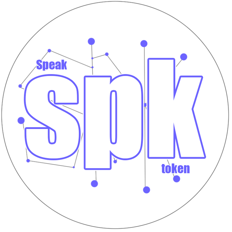

Hello creators and friends of hive, I bring you my small contribution to this contest, I hope you like it, made with great humility and I hope for you.
What inspired me to make this logo?
For reasons related to the rules of the contest, my attention was drawn to continue investigating this content. I came across a post which talks about the different tokens that this speak platform has and I decided to take this initiative within the image in the content that I read.
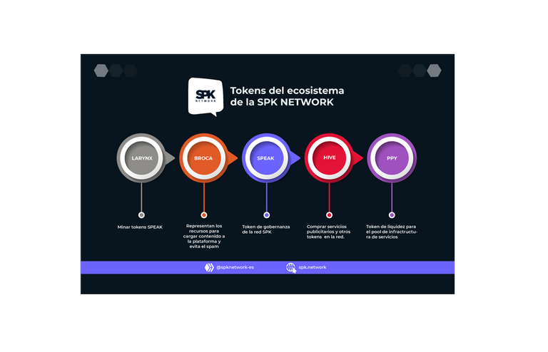
When I found out about the contest, the first thing I asked myself was what color I should give the design, and this blog inspired me.
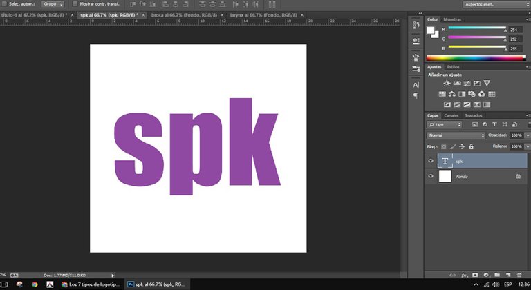
The suggestion of the contest led me to make a monographic logo in SPK. To do it, I focused on the letters S, P, K and, since it is a new network, I placed their meanings giving a personalization point in the background.
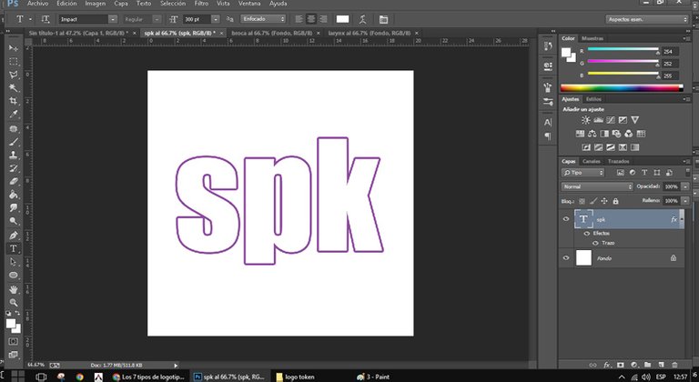
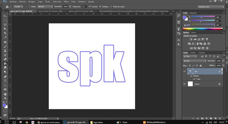
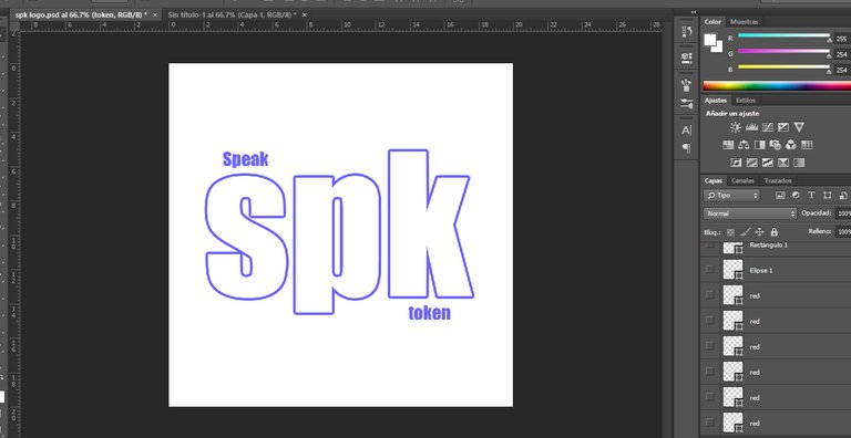
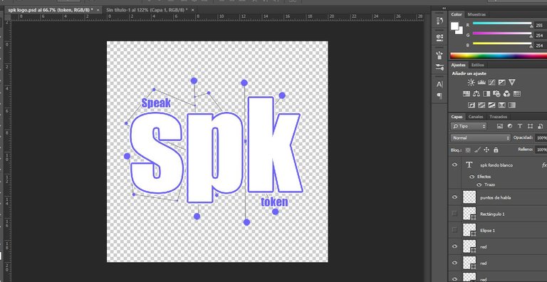
I put decentralization in the background to reinforce the token in the logo.
and so in this way I end this SPK logo.
I will be creating the following logos, larynx and drill. To be continue...
👌🏻 truly amazing
Thank you, I also liked your logo, it looks very fresh and elegant at the same time.
Thank you.
I noticed the colour preference just now after reading your post. It's very bad that they didn't mention anything about colours in the contest.
Hey! I liked your logo!
Just a tiny observation, the contest is for the logo of SPK, the token, not for SPK Network, the incentive layer. We already have a logo for SPK Network.
Hello greetings, thanks for your observation, I will take it into account but the publication is already done. I don't think I can edit.
Yes, posts can be edited.
But only of you wish, of course.
many thanks. already edited.