Greetings, fellow sentient beings!
Less is more, less is more,
Have I said that less is more?
Sorry, that was an awkward but inevitable association with a little poem from my youth...wait, that should still be on...
Anyway...
My meaning is another,
My point is clear,
...and I have already written about this in a lesson on composition...months ago.
...
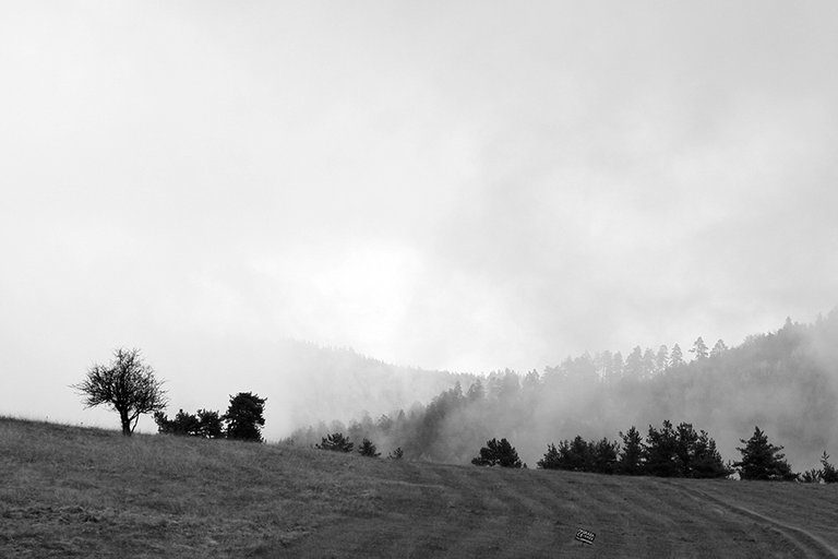
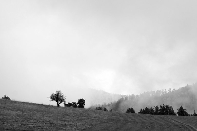
An example here,
That
Less Is More.
Or is it? It's how I felt while editing the photo and decided to lose some of the visual information in order to...
...there's only one thing I do it for...
...not distract.
And that by a dude who distracted you all the way while leading you to this point.
Camera Settings:
Aperture F 5.6; Shutter Speed 1/500 sec.; Light Sensitivity ISO 400; Focal Length 98 mm.
Well, 98 mm was the original uncropped version. The one that felt too much.
Taken from the car. I just saw the window of opportunity in the sky and I had to pull over and take the shot.
On the other hand, though, I can absolutely understand you if you prefer the uncut version. It has more space and giving the scene some air is also an important composition guideline.
It was a matter of choice.
Personal.
Personally, I love to choose the wrong option, no?
Cheers to that!
Yours,
Manol
Right, there's a color version, too.
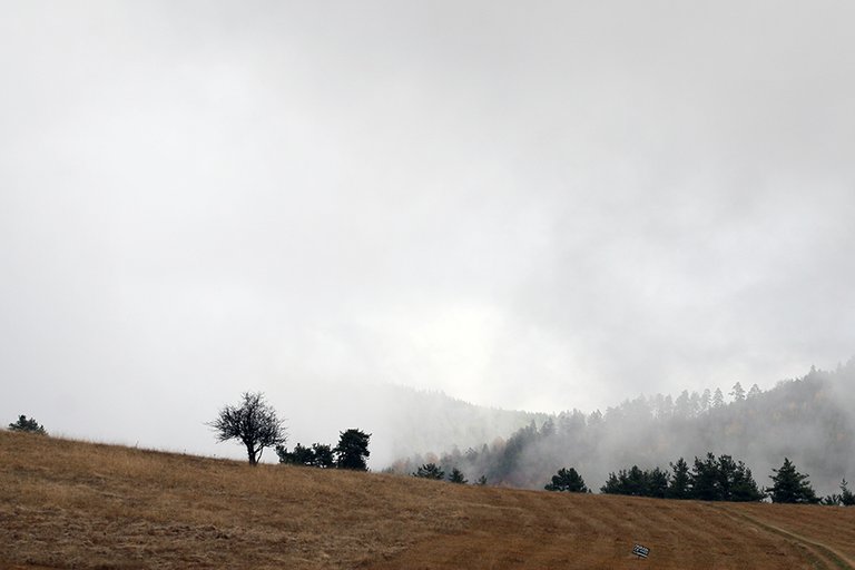
It's even more useless visual information, according to me. This one should be about contrast only and B&W is the way to go.
Then again, that's just me.
Peace!
View or trade
BEER.Hey @manoldonchev, here is a little bit of
BEERfrom @pixresteemer for you. Enjoy it!Learn how to earn FREE BEER each day by staking your
BEER.