In this post, we take a look at How to Create 2D Historgram Plot in Python. Previously we have tried the Violin Plot in Python using Matplotlib. So this previous tutorial for the violin plot which is pretty interesting graph and also worth checking out on the design as well as on the data. So if you have followed the tutorial, I am sure you would experiment with the data and the variety of the checks that you can try it out wiht. So do check the previous tutorial too.
2D historam is 2D version of the histogram chart which is pretty cool as most of the time the 3D version of the same is cool. I have not tested and tried the data outside the example as of yet. But if you are into the experimentation, then definitely check out the kaggle datasets as they tend to be pretty cool with the design and also they would be pretty good for the design for most of the 2D charts too. Apart from that there are tonsof the datasets that you can try from the internet for this chart.
You can setup the jupyter notebook online with sites like codeanywhere and few others. Like say those who want to try out the VPS they can also have one instance of the VPS running and that would be a good option for you to work with as well. Like that is one of the things that I can tell you that histogram of this type is easy chart and all you have to do is have either desktop setup and or you can use the cloud. If unsure just do it on the desktop and no need specifically set the cloud notebooks.
And I have created a video to give you an overview on How to Create 2D Historgram Plot in Python. You should give this one a try.
First thing we are going to do is make sure to setup the python. And then check the version if you wish to see if the python is there.
python --version
Next thing we are going to be setting up some of the libraries.
pip install numpy, jupyter matplotlib
And now we would be needing the sample data which would help us with data points to plot onto. Meanwhile make sure to do the references in python for libs.
import numpy as np
import matplotlib.pyplot as plt
Now that we have called the libs, let's get some sample data.
np.random.seed(4)
x = np.random.normal(0, 1, 100)
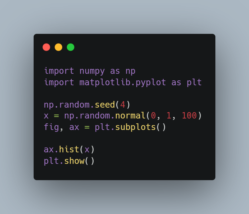
Now we will think over all the code and try to put it in the perspective there.
import numpy as np
import matplotlib.pyplot as plt
np.random.seed(4)
x = np.random.normal(0, 1, 100)
fig, ax = plt.subplots()
ax.hist(x)
plt.show()
Currently the code that you see would be plotting the output in the vertical orientation and then you can also change the orientation as you please. Mean while you can try out the horizontal too. And also below is the code in image form for your references.
Now it's time to execute the code and you can check the output. That would get you into the output that you desire here and also it would be pretty cool for you to work from this point onwards. So here are the commands that you would be needing for executing.
python example.py
You can check out the output below so that you an get an idea on how the plot is going to appear.
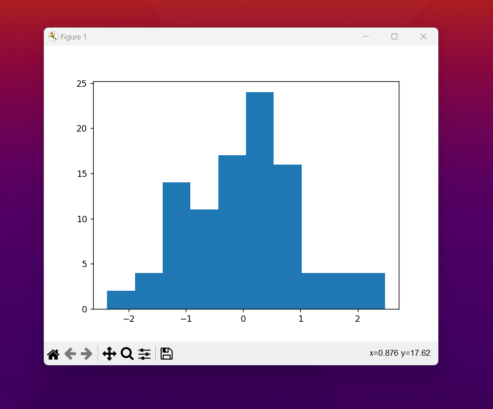
and then there would be more such options on how to change colors, output and also the amount of the changes with the orientation and others. that would give you enough room to experiment. it's one of the simplest plots that you can try out and they can be pretty cool for population, influence and few other types of the charts that we have seen so far in the past tutorials. Find different data sets and experiment as much as you can for this.
Another thing that I have not covered is the grouping of these charts. They can be super helpful if you have multiple data sets and by groups you can draw them. Like say if you want to also change legend and also variety of other labesl that would make the chart look different you can do so. For example you can also seperate the bars but still they appear like an histogram. so on that note I would recommend a bit of experimentation and that would be something you can explore over as well. That is what I have found out so far.
Few more tutorials left of this series but overall not a lot of added. I have to switch the focus towards the cloud. And that would help with the variety of other topics that I have plans to change over a period of time. Like say I may cover some of the cloud database too. So overall that would add up with my content and also variety of things that I wish to add up over in general that seems to be the plan as of now. Lets see where this takes off for me. I have to experiment with few other topics and that is where I wish to go ahead.
Please do subscribe to the channel and the content over ther ealso needs your comment and if none of that, I'd appreciate even a single like. That would go a long way for me to get my content adopted and also that would add up over the point that it can make pretty cool interesting setups for my further journey over the youtube. That is the plan so far as well. But till then make sure to share my content on the whatsapp and telegram if possible.
If you happen to like this content, do give me feedback over there and that would help me improve my efforts in near future.
Congratulations @devpress! You have completed the following achievement on the Hive blockchain And have been rewarded with New badge(s)
You can view your badges on your board and compare yourself to others in the Ranking
If you no longer want to receive notifications, reply to this comment with the word
STOP