In this post, we look at How to Create Lolipop Chart in Python. Previously we looked at Stacked Area chart in Python using Matlplotlib. This was one of those chaart which usually shows the population, spread region, growth and also time specific charts there. And ifyou happen to have data specific to the things like that it would be a good idea to try that tutorial to learn more.
I am currently using the Visual Studio Code along with the Python local setup. You can use the cloud environment like coder, gitpod too. It all depends on how you wish to write the code and exxecute completely over cloud. I think that is a good option for many in near future. I also think that those who have installed the jupyter environment can make use of the same in their desktop too. I think it would work and get the code executed pretty easily.
So here I am assuming that you are making use of the jupyter notebook, latest python, and also matplotlib library. I would be pointing out the install commands too. So do keep an eye on the same. I know there are some people who commented on youtube about the cloud setup. I prefer that too but it's still few more years we have to rely on desktops for the setup of such types in data science. And till then I guess we are good enough to work with the current setup explained here.
And I have created a video to give you an overview on How to Create Lolipop Chart in Python. You should give this one a try.
Let's first get some of the libraries installed into the windows. This should get you properly settled and also you would get better results in the mean time if you are having such setup properly done in the cloud itself.
pip install numpy, jupyter matplotlib
And once you install these libraries, you can check their version just like you did with python. Just to make sure everything is working properly.
python --version
Let's create two variables of the sample data before we write our final code.
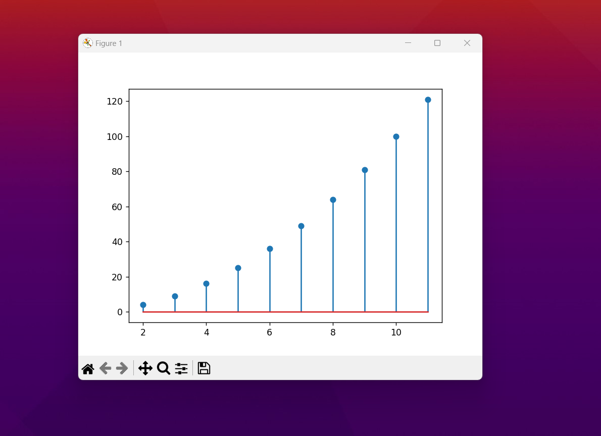
x = np.arange(2, 12, 1)
y = x ** 2
This should suffice for our lolipop chart. Now let's write entire code so that you can get the idea on how it works and how it can generate the output.
import matplotlib.pyplot as plt
import numpy as np
x = np.arange(2, 12, 1)
y = x ** 2
fig, ax = plt.subplots()
ax.stem(x, y)
plt.show()
You can check out below image for the code too for the reference in future.

Now as you can see you have to save this file with the name and extension .py. That would get you saved with the current code. And now we can execute the same code with the following command.
python example.py
That's the name of my file and I am executing the same. This should prouce the following output.
Now that we have accomplished the task. There are plenty of things to explore. Like say changing the color.Changing the labels.You can also work with larger data. All of such change in configuration would give you something better to work with. I have realized that making small changes to such charts would change a lot of things. Some of that would work around and in short it would help you build the chart as per your data. A lot of variations of this chart can be done but it all depends on your changes in the attributes being passed.
For example, what we have drawn the vertical orientation of the lolipop bars.And if you want to show the horinzontal orientation of the bars that is also possible.It could be giving you a good approach towards the overall chart design. It can also be a good idea to mix the chart with different type of the data say like area chart has it's specific type of the data which you can show it in the different ways and that would also give you a good chart output for the lolipop.
I have more than 5 different chart types left in this tutorial series. I have been covering the topics on the data science and that has been continued for months now. I have covered specifically in the R language and the Python. Out of which the python one has the matplotlib series going on. You can check my channel and also confirm the tuesday specific videos where I am putting out the new content every tuesday on the charts in r and python. So this should help you and you would get an idea on things as well.
For those who wish to keep tab on my content on the powerbi and the Python data anlytics, you should check these videos. And I am sure you would benefit out of them. And also there would be plenty of the content that you would love to explore as well. Be sure to check out the channel and also subscribe if you like. I would love to see in the comments and if you benefit from the content I have posted you can comment below as well. As that would help me produce more content and that is what I want for more content development.
If you happen to like this content, do give me feedback over there and that would help me improve my efforts in near future.
Congratulations!
✅ Good job. Your post has been appreciated and has received support from CHESS BROTHERS ♔ 💪
♟ We invite you to use our hashtag #chessbrothers and learn more about us.
♟♟ You can also reach us on our Discord server and promote your posts there.
♟♟♟ Consider joining our curation trail so we work as a team and you get rewards automatically.
♞♟ Check out our @chessbrotherspro account to learn about the curation process carried out daily by our team.
🥇 If you want to earn profits with your HP delegation and support our project, we invite you to join the Master Investor plan. Here you can learn how to do it.
Kindly
The CHESS BROTHERS team
Congratulations @devpress! You have completed the following achievement on the Hive blockchain And have been rewarded with New badge(s)
You can view your badges on your board and compare yourself to others in the Ranking
If you no longer want to receive notifications, reply to this comment with the word
STOPCheck out our last posts:
@tipu curate
Upvoted 👌 (Mana: 4/54) Liquid rewards.
Thanks for your contribution to the STEMsocial community. Feel free to join us on discord to get to know the rest of us!
Please consider delegating to the @stemsocial account (85% of the curation rewards are returned).
You may also include @stemsocial as a beneficiary of the rewards of this post to get a stronger support.