In this post we discuss, How to Create Pie Chart in Python. Previously we discussed How to Create Scatter Plot in Python. You can check out the linked video post here. That would give you idea of the previous tutorial that we discussed here on Hive.
Now coming back to the Pie chart. I have covered this chart in the R language too. So I thought why not cover the same with the Python. It'd make the life lot easier when you do it with some simple data that can be read in the python. So let's use some simple example here so that you can get idea.
I am making use of the simple python code here.And you can use the Visual Studio Code for executing the code explained in this tutorial. You can use variety of other Jupyter notebooks too. I would be covering that install idea here.
And I have created a video to give you an overview on How to Create Pie Chart in Python. You should give this one a try.
First thing we would be making use of the libraries that we make uses of for plotting the pie chart.
pip install numpy, jupyter matplotlib
You can now check the version of python and other libraries too.
python --version
and then we can open the jupyter notebook if you don't want visual studio code based traditional code writing.
Now lets talk about the sample data. We are collecting the orders in each month and we are displaying as a pie chart in the data.
x = [15,25,35,45]
mylabels = ["March", "April", "May", "June"]
Let's write entire code here now.
import matplotlib.pyplot as plt
import numpy as np
x = [15,25,35,45]
mylabels = ["March", "April", "May", "June"]
plt.pie(x, labels = mylabels)
plt.show()
Now we can run the code in the terminal. And we will get output when we type in below command.
python example.py
Below is the output of that chart.
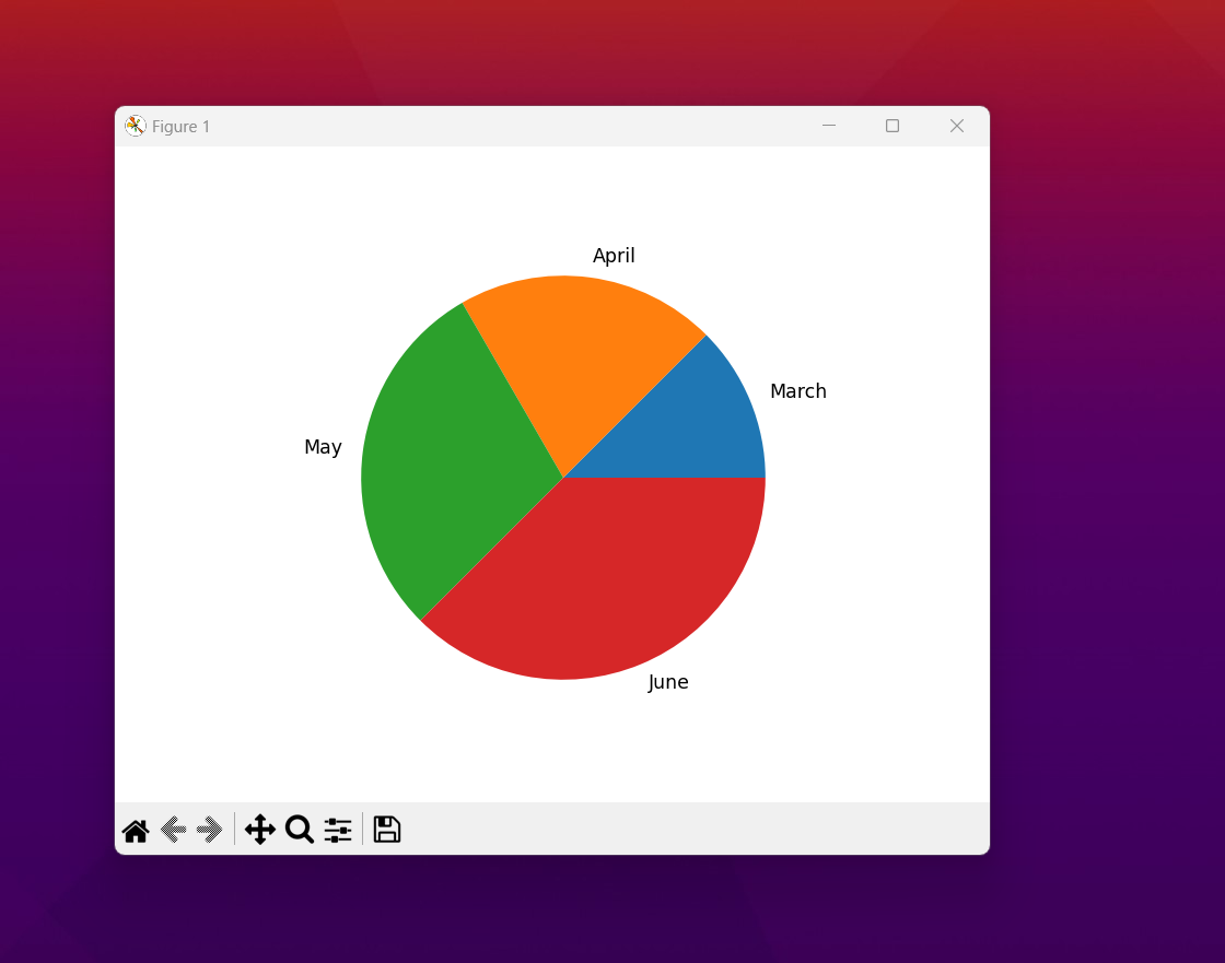
That's just the sample data. You can add your own data. You can have as many variables and the percentage. I think this can be a good option for anyone who wants to draw specific performance and also get the out there. If you can get that manually and also get proper charting there it would make a good output chart.
Next two plots that are going to be covered now are the line plot and the histogram plot. These two plots are good plots to work with and also you can use them for drawing the right set of the values there in the chart. In case of the output that suits you it would be reasonable to learn through those tutorials.
I have been working hard on these tutorials.So if you happen to subscribe and also share these tutorials that would be much appreciated. And another thing is that if you happen to link or share within the Whatsapp group that would be also appreciated. Most of the university syllabus cover these tutorials too you can share in those forums.
If you happen to like this content, do give me feedback over there and that would help me improve my efforts in near future.
Congratulations!
✅ Good job. Your post has been appreciated and has received support from CHESS BROTHERS ♔ 💪
♟ We invite you to use our hashtag #chessbrothers and learn more about us.
♟♟ You can also reach us on our Discord server and promote your posts there.
♟♟♟ Consider joining our curation trail so we work as a team and you get rewards automatically.
♞♟ Check out our @chessbrotherspro account to learn about the curation process carried out daily by our team.
🥇 If you want to earn profits with your HP delegation and support our project, we invite you to join the Master Investor plan. Here you can learn how to do it.
Kindly
The CHESS BROTHERS team
Thanks for your contribution to the STEMsocial community. Feel free to join us on discord to get to know the rest of us!
Please consider delegating to the @stemsocial account (85% of the curation rewards are returned).
You may also include @stemsocial as a beneficiary of the rewards of this post to get a stronger support.