In this post we look at How to Create Count Plot in Python. Previously we learned how to create Line Plot in Python using Seaborn Library. It was a good plot with the simple data that would bring good sets of the results. And now things have changed to teh count plot in the python. You should take a look at the same.
So what are some of the reasons why you would be making use of the count plot? You are using the count plot just like the bar plot. And there are some of the observations that you wish to plot. In each categorical bin using bars you have to learn to make use of the same. In such case you can consider making use of the count plot in python. That is what I am going to show you in the tutorial. You should consider making use of the below example and expand upon later with your own data.
I suggest also making use of the below tutorials commands to setup your jupyter python. Once you do that you can either use the desktop setup or use the online notebooks which are on the sites like paperspace and others. That would be some of the really good options if you ask me. Some really good things would come out there. But overall I would say that it's easy tutorial to try out as well.
And I have created a video to give you an overview on How to Create Count Plot in Python. You should give this below video a look.
First thing make sure to have the python installed and once you do, make sure to have the python setup and you can verify that using the command.
python --version
and another thing is that you have to setup the libraries that we are about to make use of for this tutorial.
pip install numpy jupyter seaborn matplotlib
and then we are going to be taking a look at the sample data. So in case of seaborn there is this tips database that you can try here. And this should look something like that.

Now after that we make the references of the imports for the code.
import seaborn as sns
import matplotlib.pyplot as plt
and then we are going to be using the dataset.
df = sns.load_dataset('tips')
sns.countplot(x ='sex', hue = "smoker", data = df)
and now the plot would be done like this.
plt.show()
So the entire code would be like this.
import seaborn as sns
import matplotlib.pyplot as plt
df = sns.load_dataset('tips')
sns.countplot(x ='sex', hue = "smoker", data = df)
plt.show()
You can check out the below image for the reference.

Now the next thing would be make sure to click on the Run button in the notebook that would make it possible foryou to run the code. And it would generate the output like the below one.
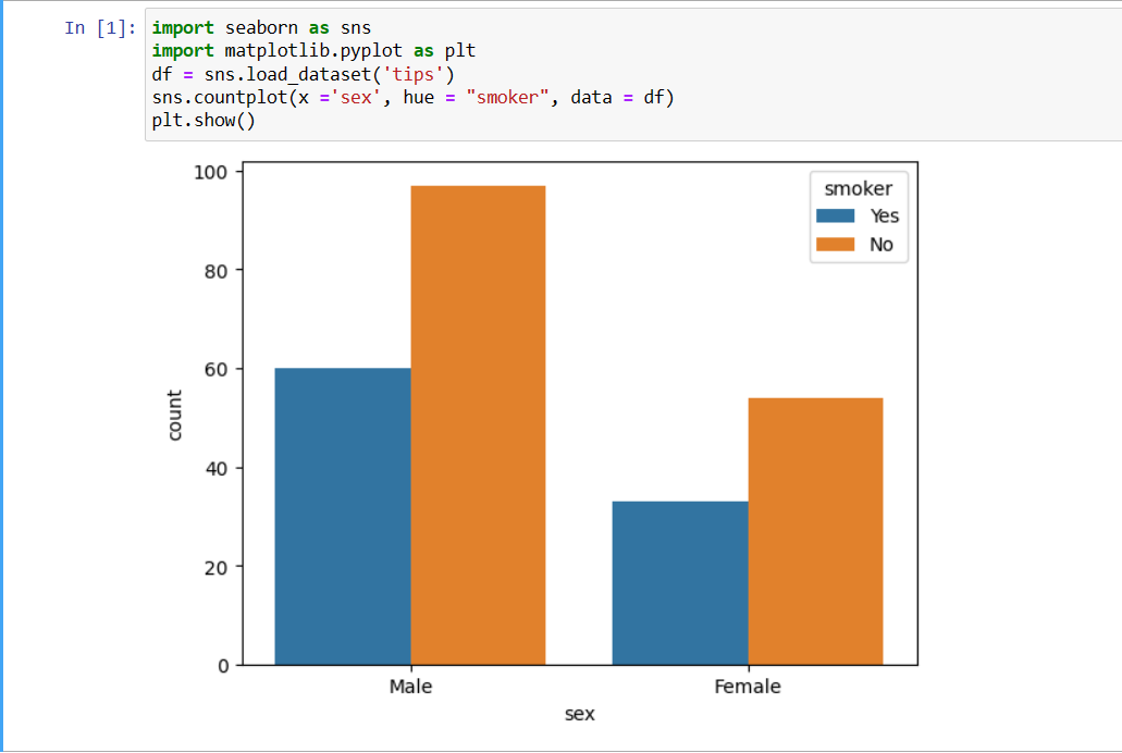
As you can see this shows you the count plot for the tips data. And this would make the life lot interesting too. Some of the really good things would come out of the interesting output on the note there. I also feel that it can be reasonable to say that this would be showing lot different results set when you change the data that you are supposed to feed there. I have found this to be pretty good and true there for many other small changes that you can do and present differently.
You can add the values for the palette variables like the below.
palette = "Spectral"
Another option is making use of the color too.
color="salmon"
I have taken enough time to make these videos. And as of now the amount of the views that I am getting and also the amount of the content being consumed it is not that high.So I am feeling that it seems like it is getting slow for me there. I have to make sure to keep on changing new content. But I need your help in getting some likes. So do please like, share and subscribe. I would also consider making sharing this on Whatsapp and the Telegram. This can bring some good results there. I hope that checks out and also helps in general.
If you happen to like this content, do give me feedback over there and that would help me improve my efforts in near future.
Congratulations @devpress! You have completed the following achievement on the Hive blockchain And have been rewarded with New badge(s)
You can view your badges on your board and compare yourself to others in the Ranking
If you no longer want to receive notifications, reply to this comment with the word
STOPThanks for your contribution to the STEMsocial community. Feel free to join us on discord to get to know the rest of us!
Please consider delegating to the @stemsocial account (85% of the curation rewards are returned).
You may also include @stemsocial as a beneficiary of the rewards of this post to get a stronger support.
Su publicación ha sido votada por @Edu-venezuela, se trasladará a otros proyectos de curación para obtener más apoyo. ¡Sigan con el buen trabajo!