In this post, we take a look How to Create Ridgeline Chart in R. So where does the chart of this type is being used? A lot of people make use of it for the resource based datasets. Like say in 1995 something had specific amount of the resource and then with the time that resource went down. So like this you can see the ridgeline can help with that type of data.
Previously I shown you how to create the pie3D map in R. And that time it was good for the small set of the dataset and the data which you often use for the quicker view. So if you want to do on that sort of the note. You should take a look at that tutorial and also make sure to try out on your own dataset.
So I made these tutorials using the RStudio IDE. And the IDE seems to make use of the datagrip and the dataset it helps out. Some of the simple type of the dataset. It can be a good option for the learning too. I am going to hopefully cover power BI too but with enough gap from these series.
I have created a video to give you an overview on How to Create Ridgeline Chart in R. You should give this one a try.
Let's take a look at the libraries required for the ridgeline plots in R.
install.packages("ggplot2")
library(ggplot2)
As you can see we are making use of the ggplot2 library. And we are making use of the library for the ridgeline now.
library(ggridges)
Now let's consider making use of the sample data for the ridgeline.
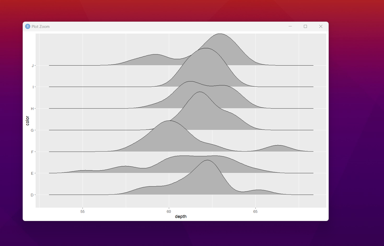
dt <- diamonds[1:100, c("color", "depth")]
Now let's try to get the function for the plot.
ggplot(dt, aes(x = depth, y = color)) +
geom_density_ridges()
We take a look at the plot in the plot tab. You should be able to view the data through this function.
Now that we have managed to get the output. There are variety of the customization. Like say you can add the colorbar. And also the thing is that you can also make use of the colors simple way. Like say the type of colors we can get using the gradient.
Now once we do the basic customization. You can scale, cut the corners and also do variety of other changes where things can be easily put up for the visualization. I suppose there are some of the good type of the content. I realized that it is a good stuff for you to check out the documentation.
You can see that in the next tutorial, I am going to be making the plot for the donut chart and the curve function. I completed that tutorial. And if you want you can check them out on the channel already. A lot of interesting content that you can use and also make use of the tutorial directly before they appear here.
I hope that my tutorial series helps you. And you can take a look at the variety of the options that we have for the design. You can make use of the tutorial trail and it would be a good learning for you. I suppose if things work out the right way we can do a lot of interesting things for the design. Do sign up and subscribe to the channel and support me.
If you happen to like this content, do give me feedback over there and that would help me improve my efforts in near future.
Thanks for your contribution to the STEMsocial community. Feel free to join us on discord to get to know the rest of us!
Please consider delegating to the @stemsocial account (85% of the curation rewards are returned).
You may also include @stemsocial as a beneficiary of the rewards of this post to get a stronger support.