In this post, we take a look at How to Create Stripchart Plot in R. This plot is often used with the dataaset specific to sports, distribution of certain observations and the data in the distributions. You can make use of the same for plotting the stripchart.
In previous post, I covered how to make the box plot in R. You can check that particular post if you are interested. I am sure you would find some value out of some of my past posts too. So do keep tab on the same.
Make sure to download the RStudio IDE. That IDE would help you create the stripchart plot in R that would be easily visible and also you can make use of the same for plotting and jotting down variety of the data observations too.
I have created a video to give you an overview on How to Create Stripchart Plot in R. You should give this one a try.
Let's start.
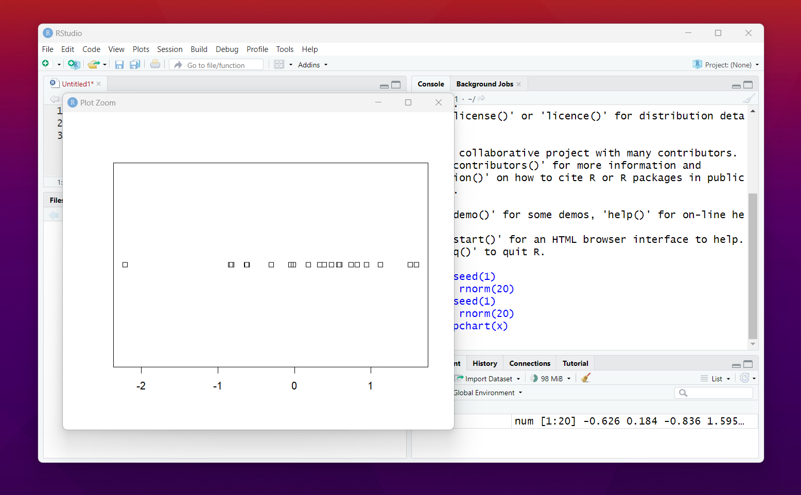
Here's the sample data that you should be making use of.
set.seed(1)
x <- rnorm(20)
In RStudio execute this.

Now once you do this, next step would be plotting the stripchart and for that we make use of the respective function.
stripchart(x)
You would have the following chart that would be plotted against the data values that you are about to see here.
You can also play with the orientation, like vertical and the honrizontal. This way you would get some really good results in the plot.
stripchart(x, vertical = TRUE)
There are also different methods to draw the data. You can try it out in your own and see what these methods would do for your observation that you add.
stripchart(x, pch = 19, col = 4, main = "method = 'overplot'")
There are variety of the values in the configuration of this function that you can change. This way the output of those plots would change too. like for the methods you would find the value being changed. And that would be something worth exploring on your own.
That's all for this tutorial. Here we managed to create one plot which is something often being used for the distribution. And you can use it for variety of other specific scenarios which could be a good option for you to explore. I would recommend you to try it out.
I have been continuing the plot and the charts that are specific to the R and the Python libraries. Something you would be exploring and also getting on the right note. Some of the things that you can set up and also get properly in the output if you choose the right chart for the right job.
I have to continue this series as much as possible. I will be covering the power Bi too. But I am not sure if I would be adding that any time soon here unless this series is ending with most of the charts covered in this space. So keep an eye out on the charts of this tutorial series.
I hope this guide helps and you can bookmark this and come back to it later. I have to also create index of past charts but that would wait for now.
If you happen to like this content, do give me feedback over there and that would help me improve my efforts in near future.
Thanks for your contribution to the STEMsocial community. Feel free to join us on discord to get to know the rest of us!
Please consider delegating to the @stemsocial account (85% of the curation rewards are returned).
You may also include @stemsocial as a beneficiary of the rewards of this post to get a stronger support.
Congratulations your publication has been chosen among the best of the day.
KEEP CREATING GOOD CONTENT.