In this post, we look at How to Use Draw functions in ggplot2 in R. Earlier I covered how to create the line chart in the R language. Some of these drawing functions explained here would be specific to the ggplot2 library. And it would be reasonable to make use of the library for drawing things quickly.
Now previously covered Line chart in R is easy to use and also explore. So you should consider making use of the data explained over there for plotting the line chart. Most of the time when you go with this approach is that you would be able to draw a good set of the charts in these functions.
I am making use of the RStudio for doing these charts. You can also use the POSIT service for the hosting in the R language. Like you can also use this on the cloud. so using it on the desktop is lot better and also it would be reasonable for using it for the data as well.
Let's take a look at the new curve function in this tutorial. And I have created a video to give you an overview on How to Draw functions in ggplot2 in R. You should give this one a try.
Let's take a look at some of the draw functions in the ggplot2.
install.packages("ggplot2")
library(ggplot2)
Now let's make use of the ggplot2 for drawing the line into the RStudio. So you would be able to use below function for drawing the line chart.
ggplot() +
xlim(c(0, 5)) +
geom_function(fun = cos)
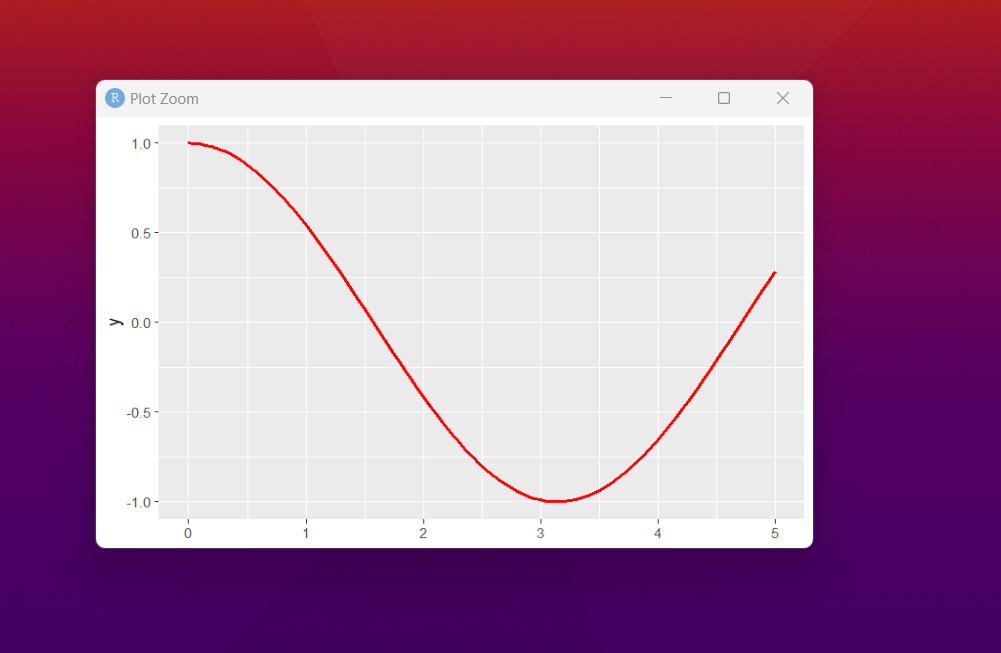
You can also do some form of the customized options like say color of the line. Output would be something like this and it would show up.

ggplot() +
xlim(c(0, 5)) +
geom_function(fun = cos,
colour = "red",
lwd = 1,
linetype = 1)
You can take a look at the output below for each of these charts now.
That's it for now. And if you want to customize even more further, you can make use of the variety of the functions for plotting and also that would give you an idea on how things would work and also how that would be used for plotting as well. So in that case there are things that can make things a bit easier.
I have covered some of the really good visualized plots and the charts need to be checked out if you have come this far with the data. Like say some of the plots specific with the plotly and the ggplo2 are two libraries that I have covered for plotting the charts. And if you look at them things would be much easier to check with as well.
Now if you happen to like these tutorials, and you wish to support me. You can make use of the chart for the learning and if you need any syllabus specific content, you can let me know. Do check out the above video on the youtube and make sure to subscribe and share for the content. That would surely help.
If you happen to like this content, do give me feedback over there and that would help me improve my efforts in near future.
Thanks for your contribution to the STEMsocial community. Feel free to join us on discord to get to know the rest of us!
Please consider delegating to the @stemsocial account (85% of the curation rewards are returned).
You may also include @stemsocial as a beneficiary of the rewards of this post to get a stronger support.